Superfried
Manchester
ABOUT
Dr Sam Bampoe and Dr John Whittle approached Superfried to help them develop a new, not for profit web based education resource in the rapidly growing field of Perioperative Medicine – medical care of patients from the time of contemplation of surgery through the operative period to full recovery. They required a new brand identity and the development of a complex web based platform that was fun and vibrant to connect with their target student demographic.
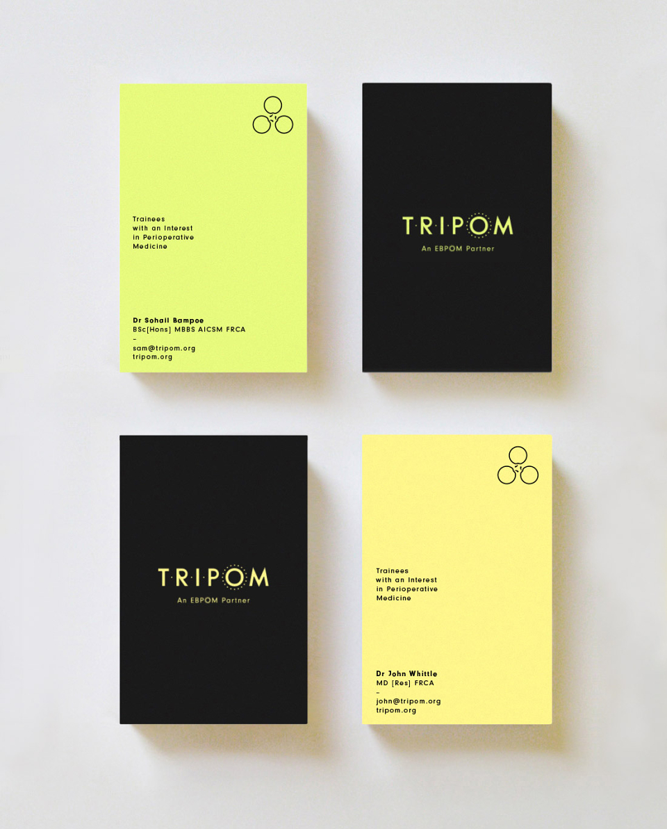
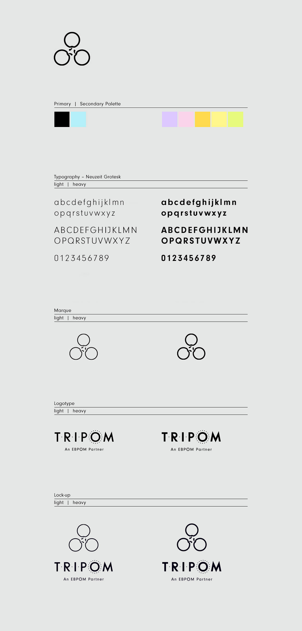
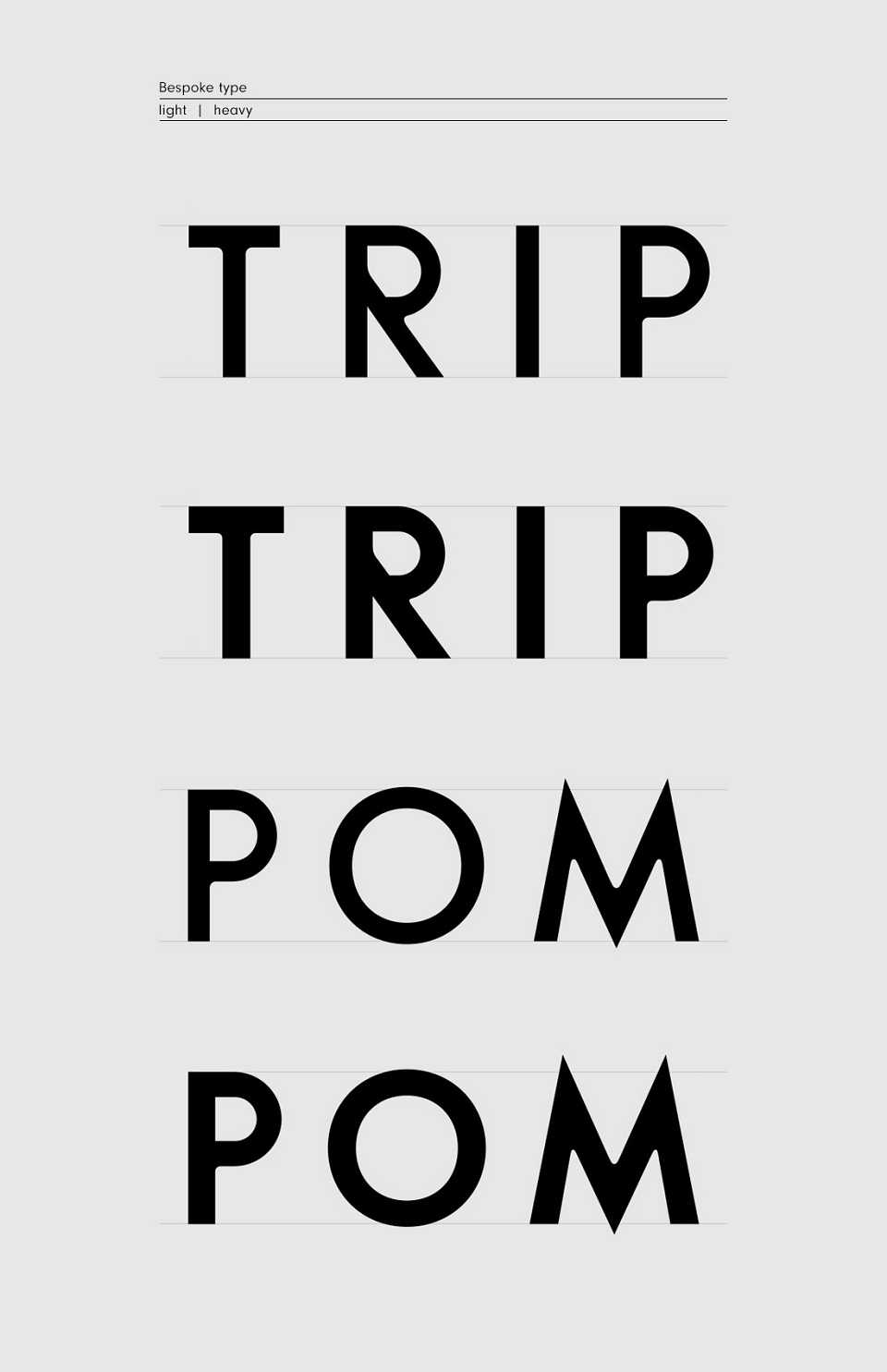
Called TRIPOM [TRainees with an Interest in PeriOperative Medicine] their existing DIY identity played on the pun TRI [Three] + POM [Apple in French]. This was a great idea and established standout from medical cliches. Numerous arrangements and styles were explored, but a triangular/ rotational form was selected – having an apt chemical/ medical diagrammatic feel.
For the logotype bespoke uppercase lettering was developed with the subtle addition of dots to convey it's acronym nature. The holding organisation, EBPOM, had requested the identity conveyed a connection to their brand. To achieve this, the circle of dots that surround the 'O' in their logotype were employed in the same fashion – the best compromise available to appease all parties. The final logo and wordmark were tested thoroughly, stack/ horizontal lock-ups developed and a light and heavy version of each developed to ensure versatility across all digital/ print media.
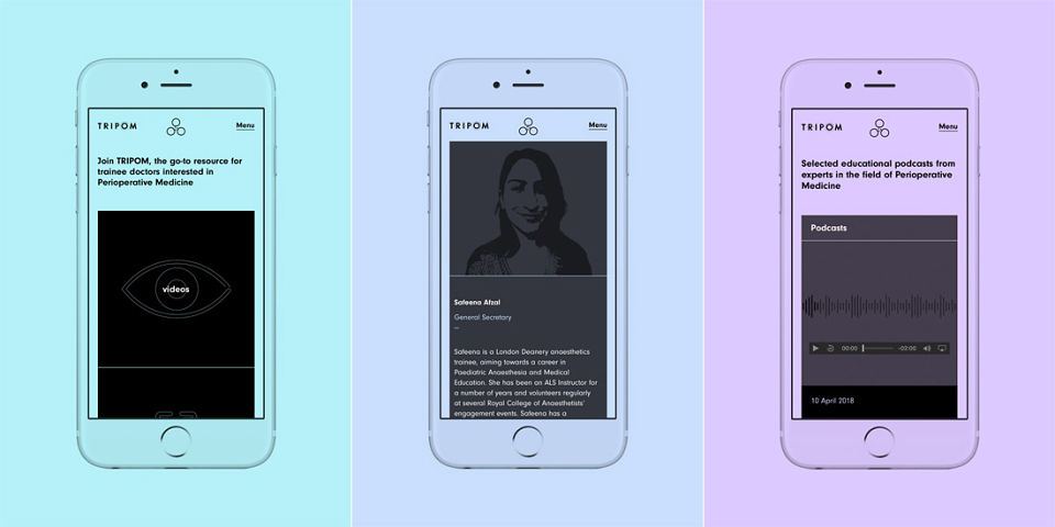
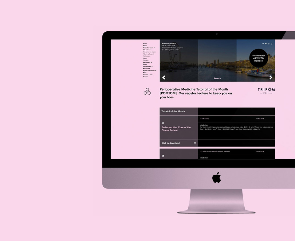
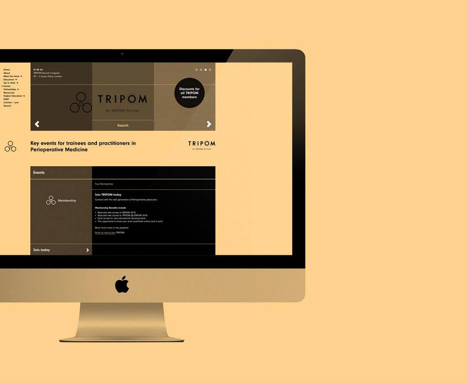
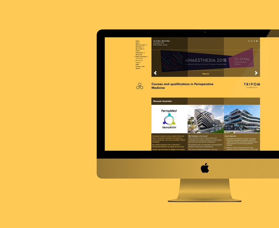
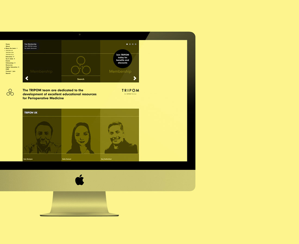
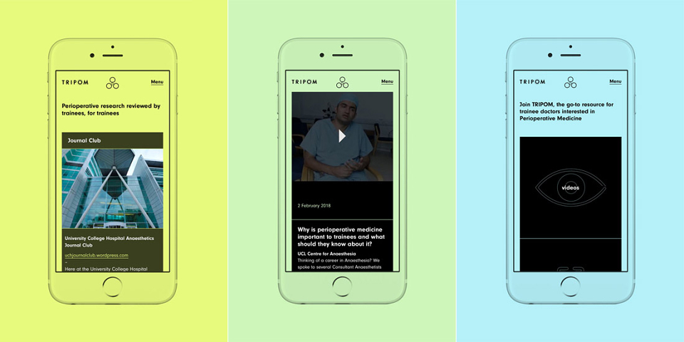
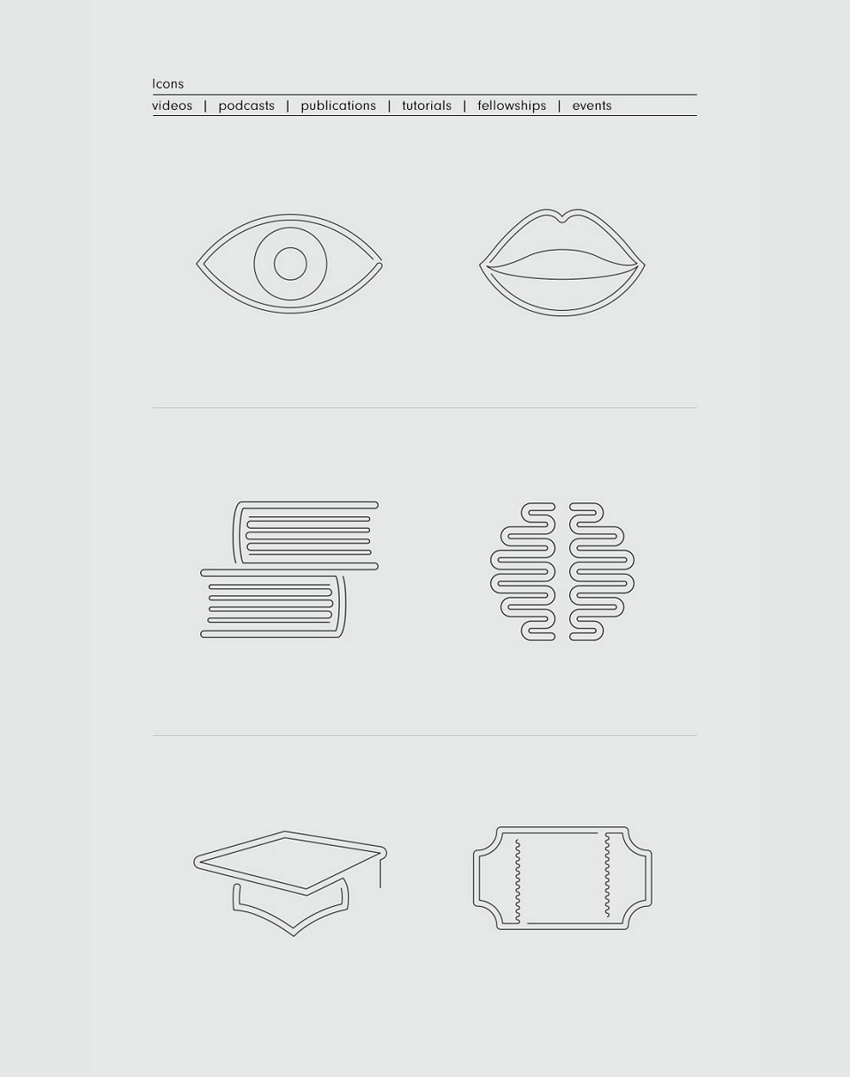
For the styling of the brand-led material and website, based on the name I employed a versatile 3 column grid system. To maximise usability and speed, the home page focused on 6 quick access icons linking directly to the key site content.
The site would be complex – time to call in the expertise of my regular developer James at Cotton – and required to feature an eclectic mix of searchable content including pdf tutorials and research, resource links, podcasts, videos and details of fellowships and courses. Consequently, delivery of information was key, so with this in mind clean layouts and simple usability were employed. Images were also kept to a minimum to avoid distraction and ensure simpler updating for team members short on time and appropriate software.
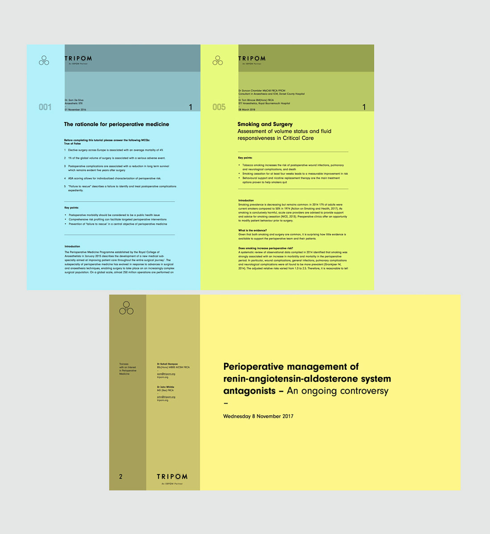
This worked well, but as requested, I wanted to avoid the common, sterile feel of information led literature whilst ensuring content remained a priority. To create vibrancy without compromising the data, the page backgrounds were coloured, ensuring content remained minimal without looking dull. A pastel palette was selected ensuring colours did not become over bearing. Rather than assigning a separate colour per category – the number of which may change/ increase in the future – an alternative approach was sought. The desired the ambitions of Perioperative Medicine is for all patients to experience the same consistent care and smooth transition from pre-op through to recovery. What if this could be reflected in the user experience? A system was developed so that their path through the site always followed the same sequence of page colours regardless of the route taken. The palette was based on a perpetual spectral loop – blue – green – yellow – orange – pink – purple and then back to blue, ensuring colour transitions were less abrupt.
The client had previously created monthly tutorials in word. To ensue brand consistency the existing files were re-created on a new brand-led template that would also enable the team and guest academic contributors to create on-brand documents from that point forward. All future files would be saved and uploaded to the site in pdf format to maximise user accessibility and ensure formatting is maintained.
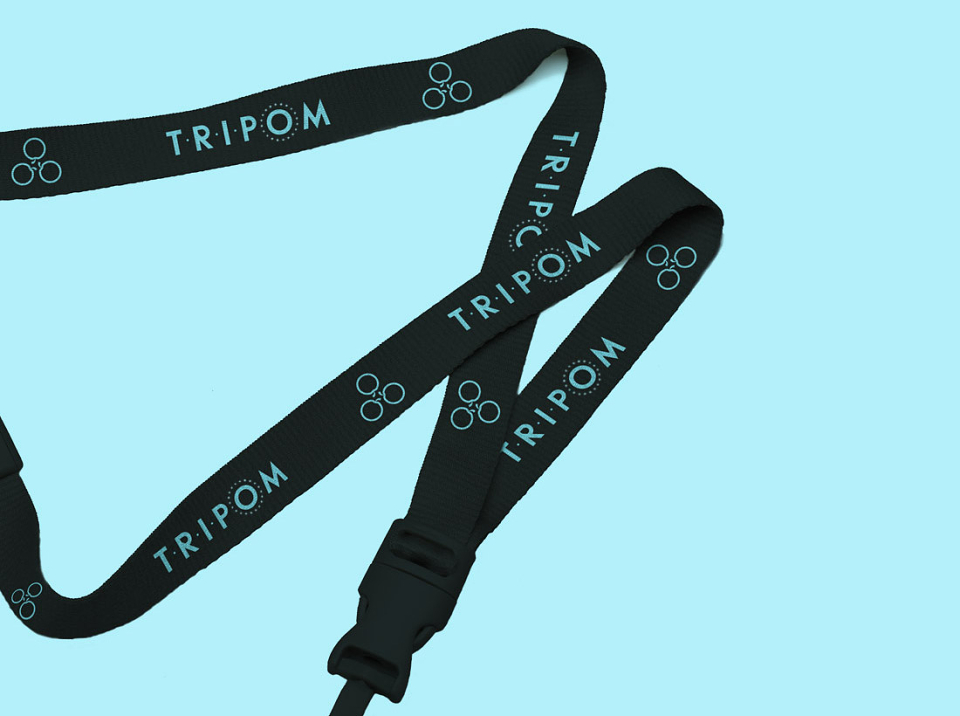
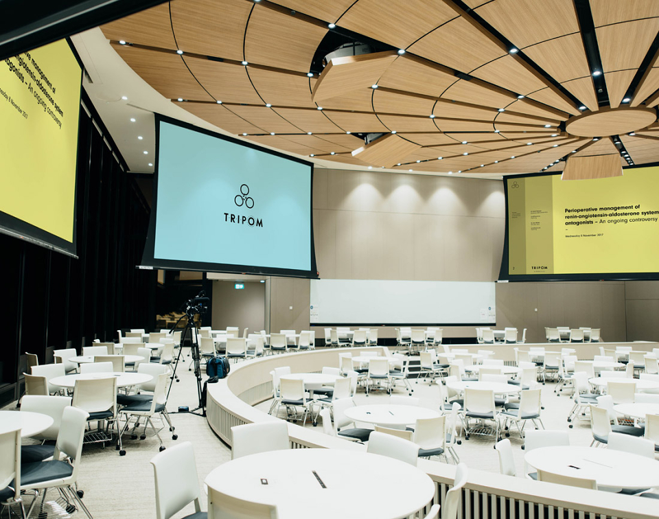
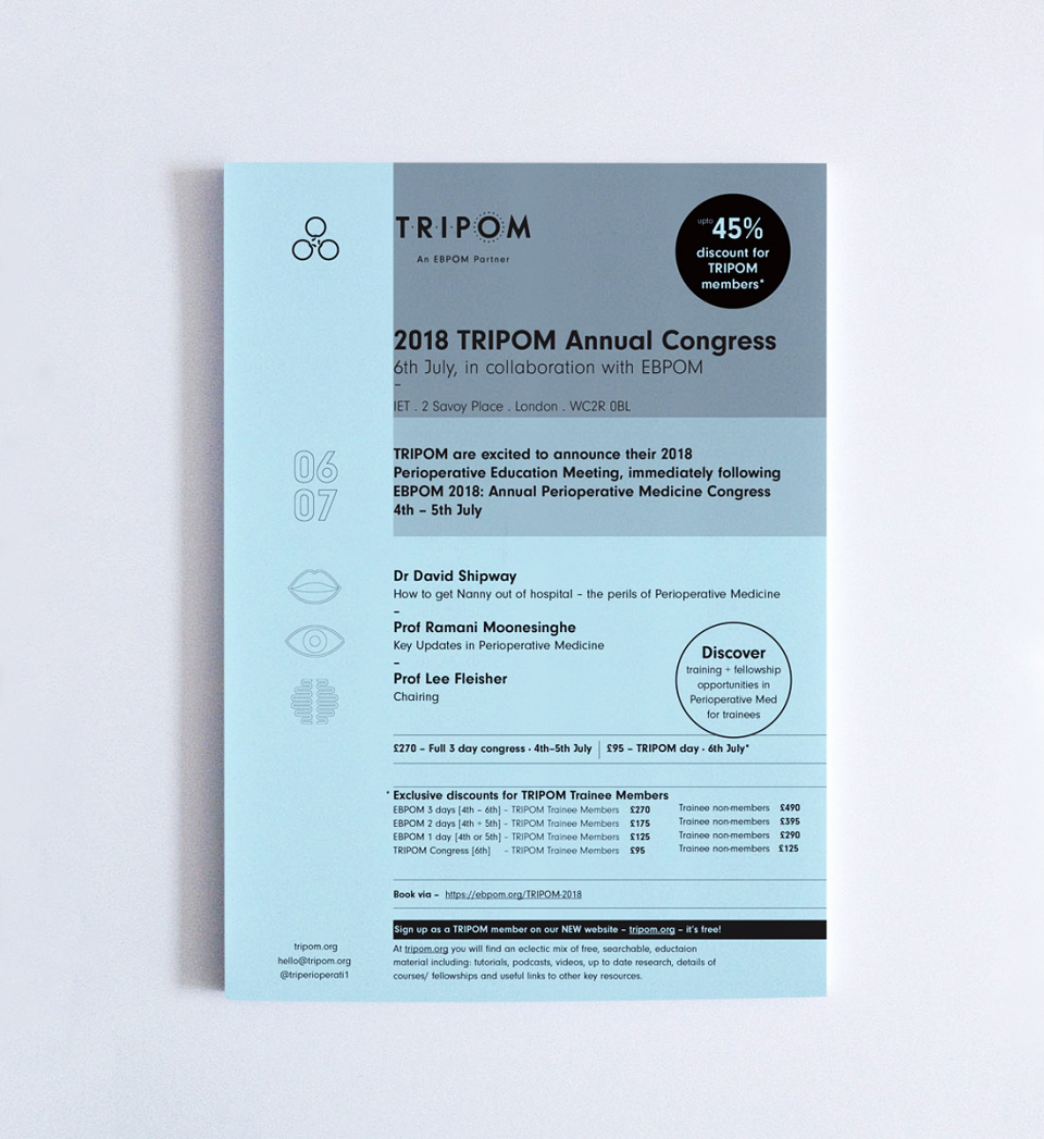
The styling was also applied to a Keynote presentation template. For use in presentations and future videos a simple animated version of the logo was developed as an ident. Additional print material in the form of event flyers, posters and branded lanyards were also produced.
Conference room mock-up shot by chuttersnap on Unsplash.