Ted
Art/Creative Director/Packaging/Branding Designer
ABOUT
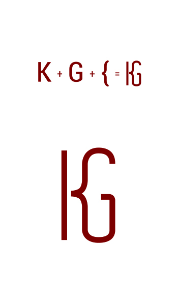
Logo design for Dr. Karen González, GP in Ajijic, Mexico.
When I started the project I really wanted to keep clear from the common doctor icons, I simply focused on a typographic based logo but with a bit of manipulation when looking at it. Just to give it a twist and make it unique, because a logo is the face of the company, it's the identity, it must be timeless and memorable.
I was strictly sticking to "K"and "G"" for 'Karen González', after a number of concepts I kept pushing further because I was just not happy. Honestly the idea for the open brace came from my keyboard when I was typing..... I believe I saw what I was looking for and a few concepts in come out with the final logo