Tony Clarkson
Brand Consultant
ABOUT
Commonwood Vineyard is sited approximately two miles out of the small market town of Wem in Shropshire. First planted in 2002, the vines are well established and have been farmed organically from the start.
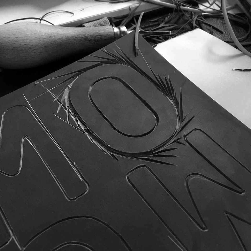
The new identity was designed to fit in with the organic farming methods and minimal manipulation; we stepped back from technology and created it by hand.
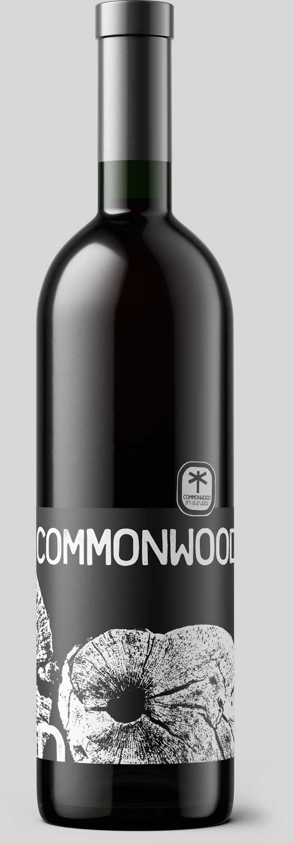
The wordmark
Created with linocut characters based on the Platelet typeface, chosen for its rounded corners to give a softer form and extra detail to a monospaced setting.
The Emblem
The vineyard reached 20 years old in 2022. For 19 of those years, Commonwood used a watercolour dragonfly as their emblem. Abundant in their rural setting, they asked for the new branding to keep a reference to the dragonfly.
Our findings: focus on the dragonfly's wings, and it looks like a dissection. If we stick with a complete illustration, it's a Victorian anatomy drawing, so no.
Instead, we simplified the dragonfly to fit in with the inked texture of the wordmark, illustrating a representation using just these three lines to create a potent symbol for the brand.
The incidental nod to a rural signpost led us to a new tagline…
MADEIT CREDITS


studiopro:Tony was verified as a studiopro on 18th March 2022
Annual 2022 SilverCommonwood Vineyard IdentityBranding
Project featured: on 18th January 2022
Pro member:
Contributor:
Invite
x3
Pro accounts have added benefits for Creativepool members. To get your Pro account go here.
Tony Clarkson has been a Contributor since 9th September 2020.