Jones Knowles Ritchie
London
ABOUT
Losing the generic
Over the years, Domino’s packaging had become overloaded with generic messaging that had little impact with consumers, and the brand mark had become relegated to a small endorsement on pack. Our task was to make Domino’s the definitive article once more by redesigning its delivery boxes in the UK.
Simple and definitive
We wanted to celebrate Domino’s distinctive and unique brand character by making it bold, simple and charismatic. We started by removing all the generic category communication from the boxes, focusing only on what Domino’s owned: its once iconic red and blue domino logo.
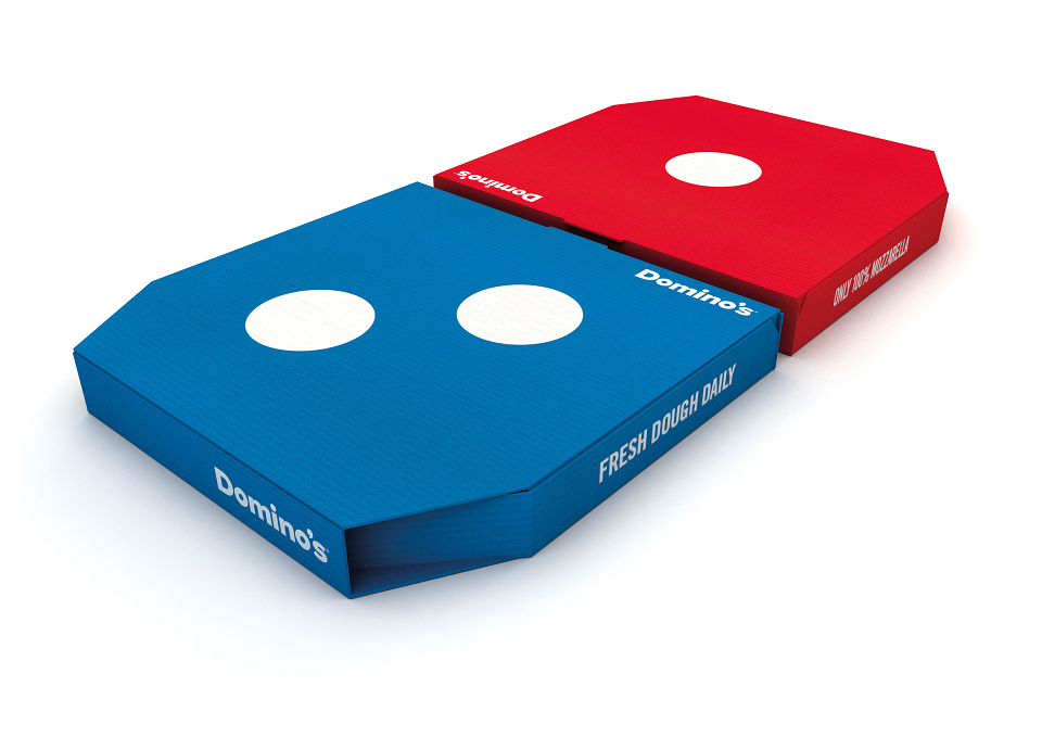
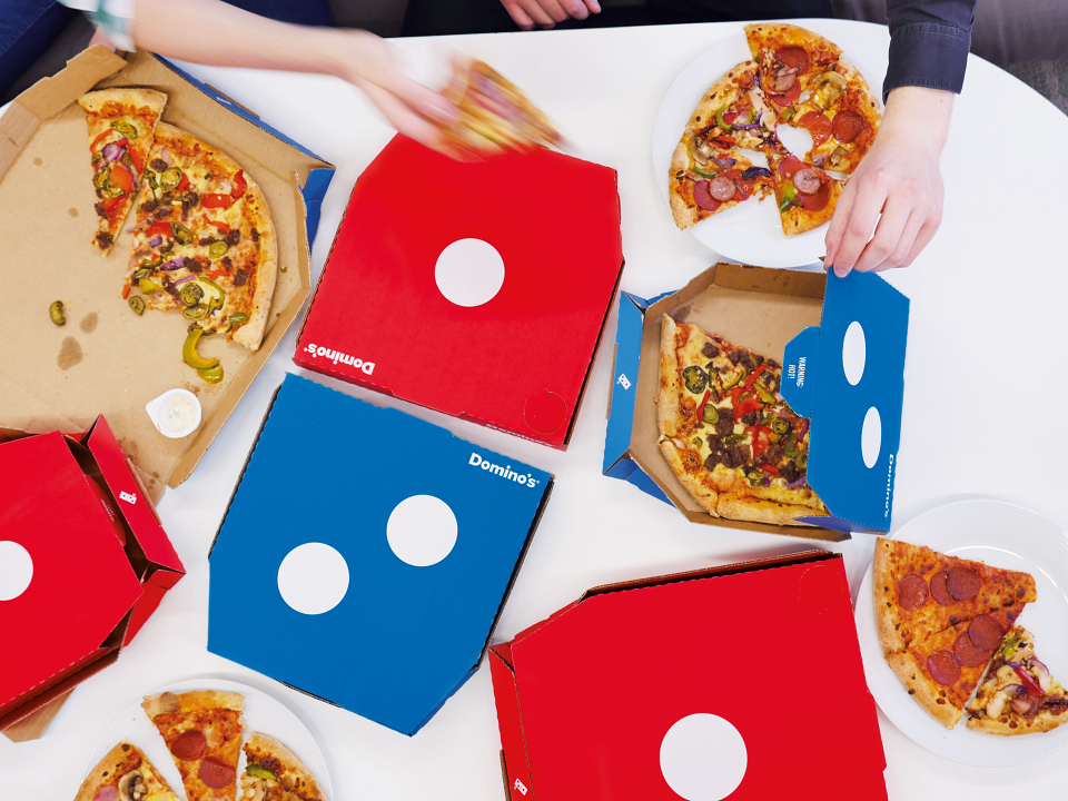
The Domino effect
Knowing that 96% of all Domino’s pizzas are sold in pairs, we decided to make the brand’s logo pivotal to the design, and used the brand’s pizza combo deal as a canvas to bring it to life – one red box, one blue box. The result was bold, brave and simple packaging design. An open invitation for sharing and play.
AWARDS
Clios - Gold
PentAward - Diamond
MADEIT CREDITS
-

Domino’s United KingdomClient
-

Jones Knowles Ritchie -

Amy MawMarketing Manager -

Leonie PayneSEnior Account Manager -

Ian RitchieExecutive Creative Director -

Matt ParkesGlobal Marketing Director -

Sean ThomasCreative Director -
Luke ThompsonGraphic Designer -

Brett StablerDesign Director
Annual 2017 WinnerThe Domino EffectGraphic
Annual 2017 WinnerThe Domino EffectPackaging
Project featured: on 13th April 2016
Contributor:
Invite
x3
Jones Knowles Ritchie has been a Contributor since 25th November 2015.