The Big A
London
ABOUT
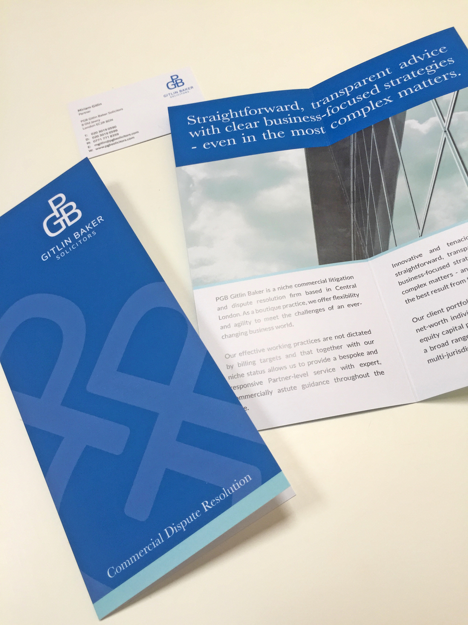
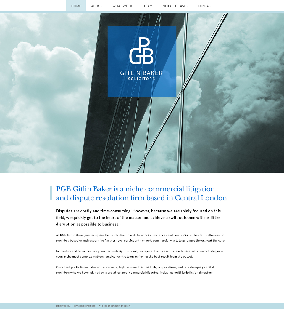
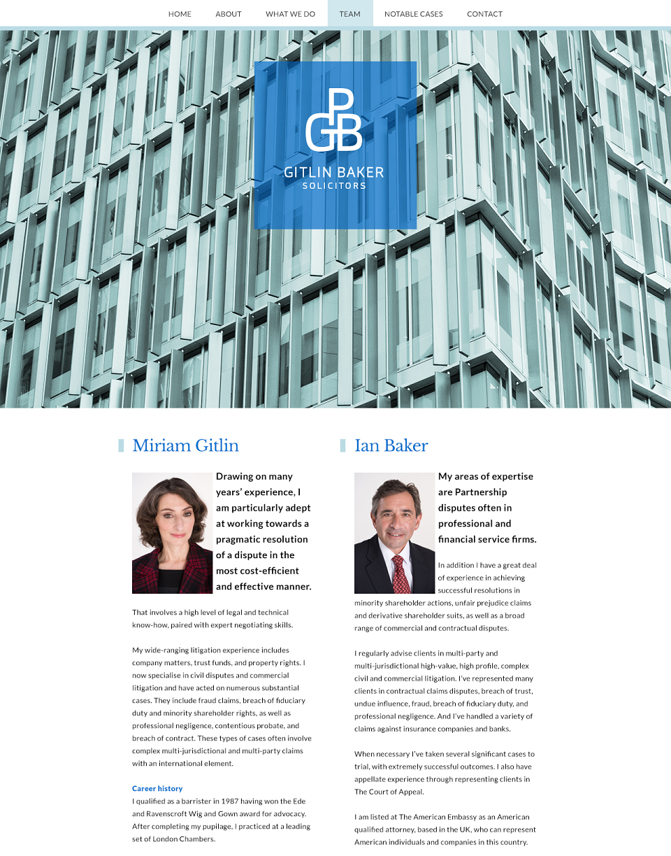
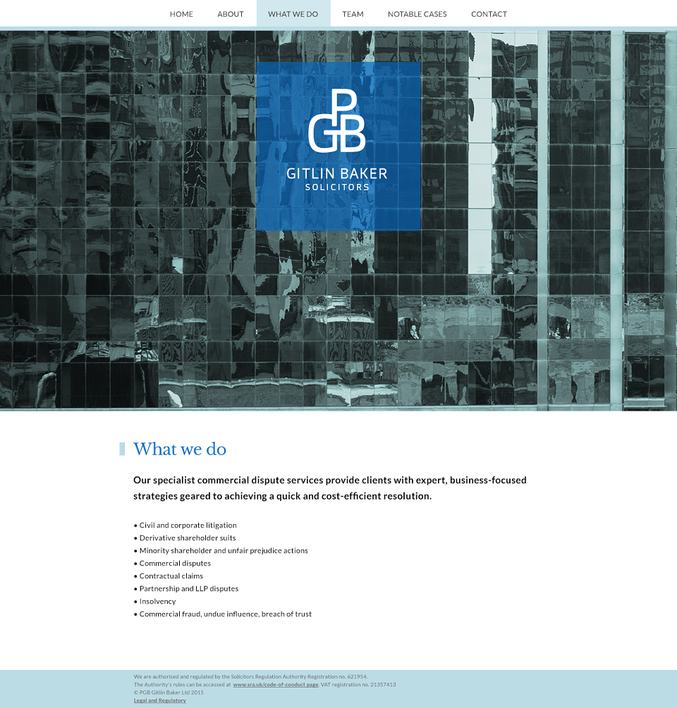
The design, colour palette, copy and imagery were all dedicated to communicating their transparent, clear and fresh approach with a corporate specialism
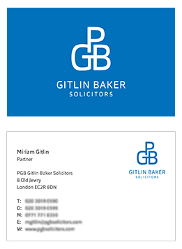
To communicate a personalised, high level corporate service with gravitas we used a monogram style logo. A distinctive font was modified to create an uncomplicated, precise and yet warm and elegant look.
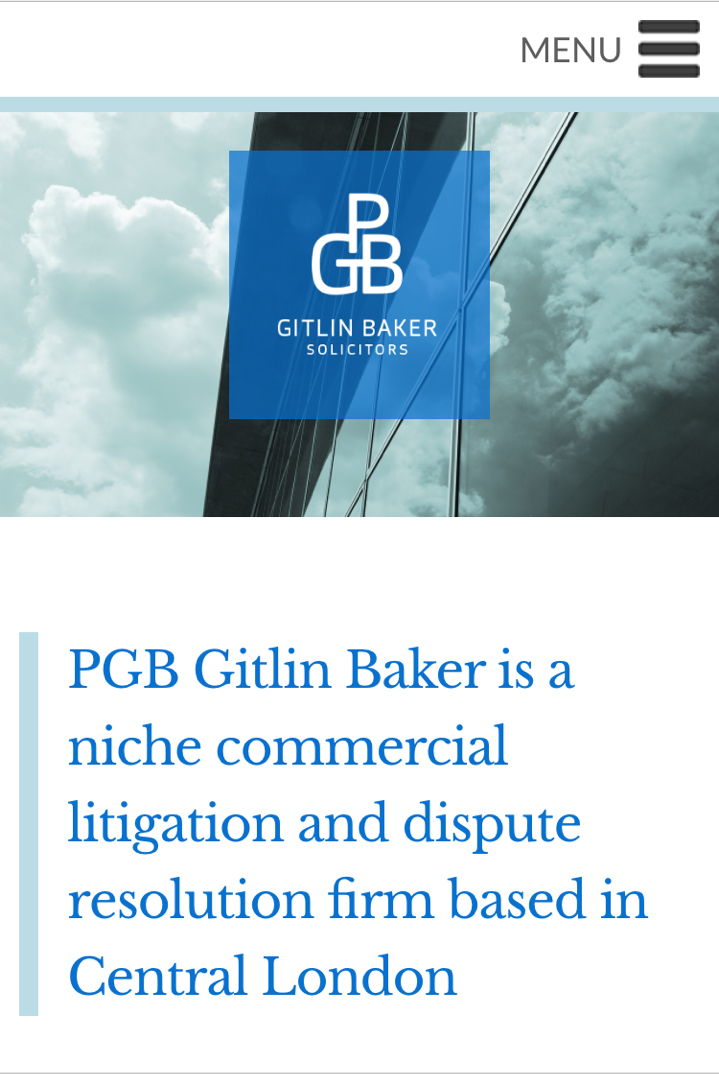
For the website, we used a bold but transparent logo dominating the page, on top of the clear and fresh looking duotone images to underline transparency and brand gravitas.
The images feature glass and windows of blocks, to show their corporate specialism in a transparent and clear way. The copy is clear, concise and to the point. Typography was used to add interest to the layout and break the information up.