KidDotCo | Robots, who love to create...
Cleethorpes
ABOUT
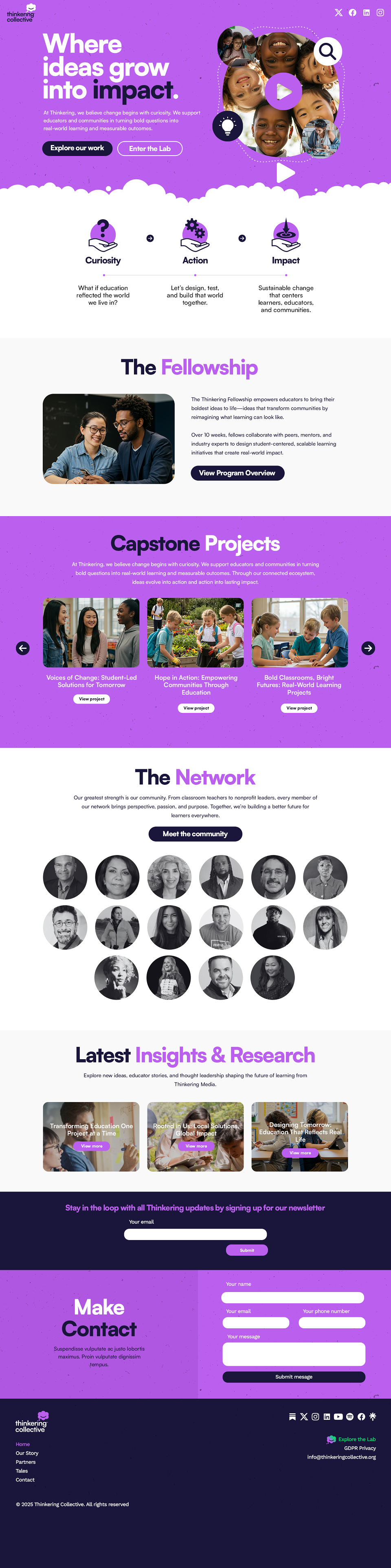
Thinkering Collective is a nonprofit education incubator on a mission to humanize learning through mentorship, leadership, and innovation. At its core, the brand aims to shift how we view education—elevating creativity and curiosity as essential elements of personal and academic growth. My role was to translate this bold vision into a brand that could clearly and powerfully communicate its values to educators, funders, and community stakeholders alike.
From the outset, communication was key. The aim wasn’t to overwhelm with complexity but to deliver clarity through bold simplicity. I developed a distinctive visual identity grounded in clean, confident design choices—disruptive within the typically conservative landscape of nonprofit education. Big, unapologetic typography and a tightly controlled, vibrant colour scheme demand attention without being fussy. Often, less is more—and in this case, it allowed the content and purpose to shine through.
A central visual element is the custom-designed cloud icon. It’s a quiet nod to "thinking" but rendered with a subtle, endearing smile—just enough personality to be approachable without tipping into child-like. It's adaptable too, able to wear different expressions as the brand scales. This was intentional. A good brand should grow with its mission.
The colour palette is intentionally strong and memorable. Where many peer organisations lean into soft, safe tones, Thinkering Collective is unafraid to stand out. Combined with the bold type and clean layouts, the brand exudes confidence, clarity, and intention.
As Thinkering grew, there was a need to introduce a sister brand: Thinkering Labs. This personalised platform and consultancy supports educators and communities with tailored programming and an AI-powered co-pilot, Thinkerbot. My design thinking here was evolutionary rather than revolutionary. I wanted Labs to feel like a natural extension of the Collective without losing its own identity.
The solution came in the form of a gradient—a visual metaphor that begins with the Collective’s palette and subtly shifts into that of the Labs. It’s a clever transition (believe me, I tested many combinations) that was both client-approved and well-received. It says: “We’re from the same family, but we’ve got our own voice.”
I avoided overly literal “lab” imagery like beakers and bubbling potions. Instead, I used polygon repeat patterns and retained the vibrant, ‘concocted’ colour scheme to evoke a sense of creativity and experimentation. When viewed side-by-side, the two landing pages are clearly cut from the same cloth—just different enough to stand apart, but still unmistakably Thinkering.
Another deliberate choice was to make Thinkering Labs appear vertically whenever possible. It's a small move, but a disruptive one. It adds energy and a bit of irreverence—‘why the hell not?’—in keeping with the brand’s spirit.
Ultimately, Thinkering is designed to scale. Whether that’s dressing up the cloud with different personalities or expanding into new arms of the organisation, the brand holds strong. And I look forward to continuing to grow and evolve it in the months ahead.
MADEIT CREDITS
-

Thinkering CollectiveClient
-

KidDotCo | Robots, who love to create... -

Paul Jamie KiddFreelance Creative Designer / Developer