ABOUT
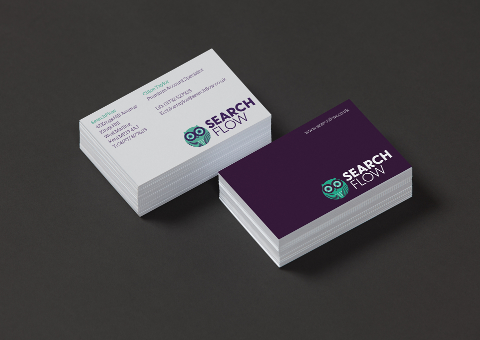
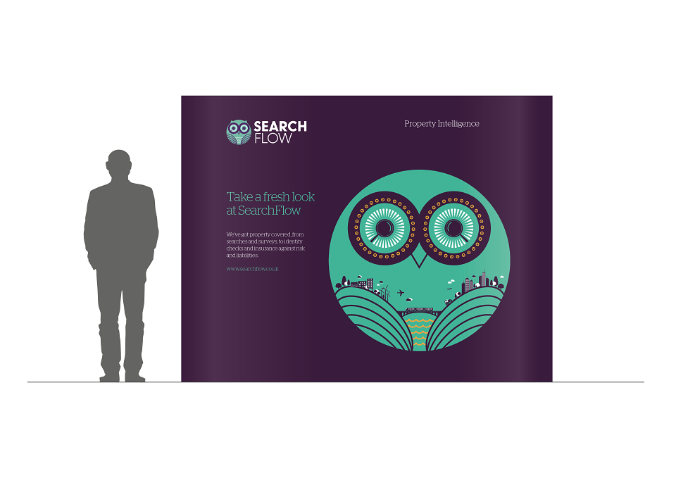
Industry has created a new brand identity for leading conveyancing search provider SearchFlow, featuring an all-seeing owl, capable of scanning the landscape with its razor sharp binocular vision.
SearchFlow, part of dmgi::land&property group, commissioned the rebrand in response to technological advancements and the changing needs of the property sector. It has 25 years of heritage in conveyancing search, delivering the reports, surveys and identity checks to solicitors and conveyancers across the UK that enable property transactions to complete.
The brief was to build a dominant brand position for SearchFlow as the specialists in property intelligence and help it to differentiate itself from its competitors, as it launches its enhanced service and product offer.
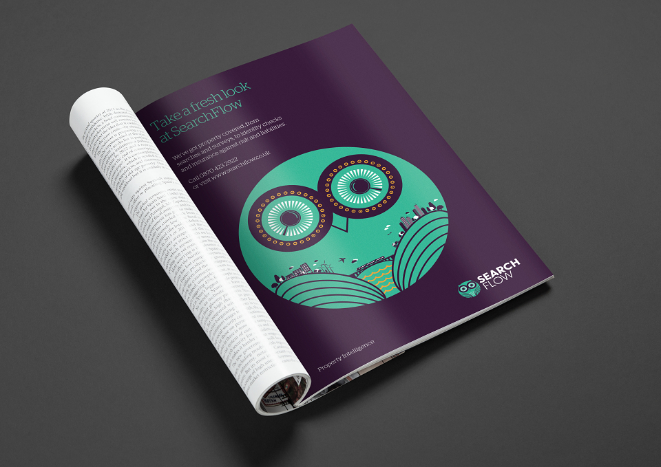
Industry built a brand identity around an eye-catching owl hero graphic with magnifying lenses for eyes, surveying the landscape below, which is embodied in its wings. An aubergine, teal and white colour palette is bold and distinctive, a clear move away from the corporate navy blue and orange appearance of SearchFlow’s previous logo.
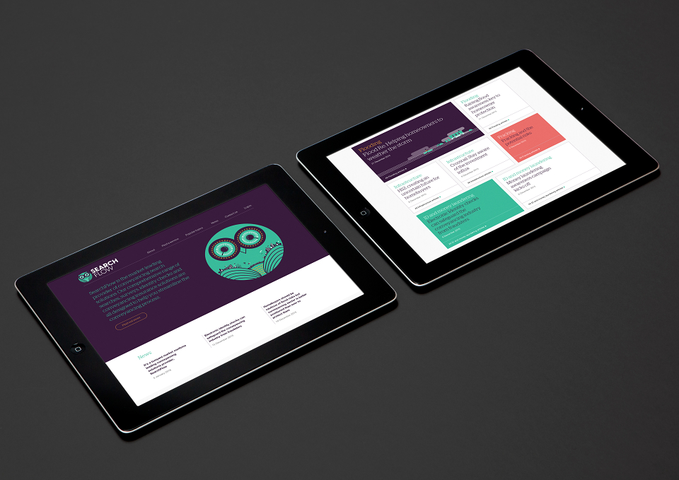
The new website, also designed by Industry, includes a new search ordering platform which is both more intuitive and user-friendly, reducing the time conveyancers spend processing searches.
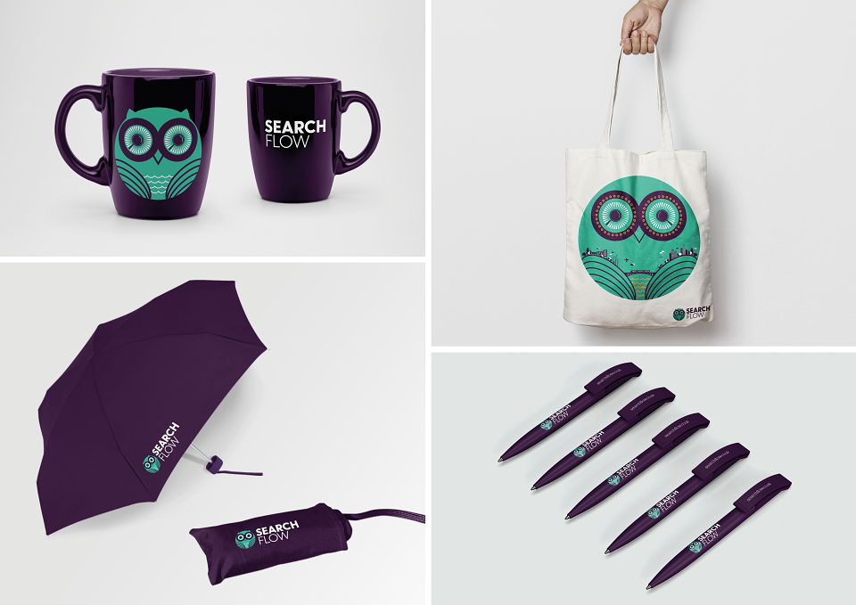
Industry developed a logo system, colour palette, tone of voice, typography, corporate stationery, website, advertising and brand guideline document for SearchFlow.