Bulletproof
London
ABOUT
Brief in brief:
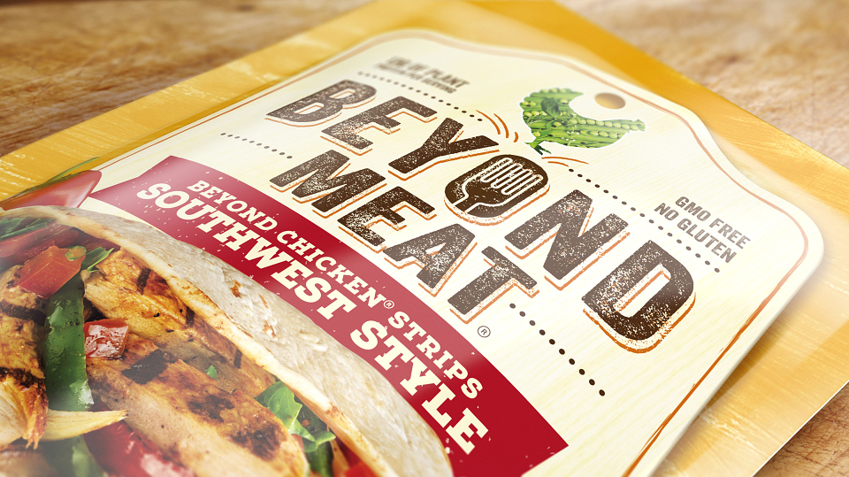
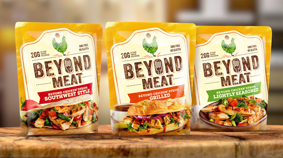
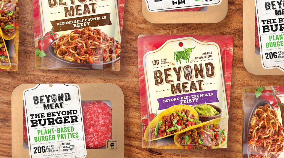
Created a bold new visual identity and packaging design for Beyond Meat; a plant-based protein brand with ambitious plans to change the way the world ‘meats’.
Our thinking and doing:
As we enter a new era of wellness with proactive health increasingly playing a key role in life, interest in plant-based protein is ripe among carnivores and vegetarians alike. With its delicious range of plant-based burgers, beef crumbles, and chickens strips, Beyond Meat is aiming to take things to the next level in the category by boldly delivering “The Future of Protein” to consumers: all the taste, texture, aroma and satisfaction of the traditional meaty dishes they love with the health, environmental and animal welfare upsides of plant-based protein.
Across the brand’s products, including the highly anticipated Beyond Burger—currently enjoying a very successful launch—there was a goal of bringing visual cohesion and consistency to ensure consumers could easily navigate the range. Taking the findings from a strategic review of the brand, Bulletproof was tasked with creating a design that would also elevate the brand’s bold and witty tone of voice on pack, while creating real stopping power on shelf.
Working from a strategic visual platform of ‘Dig into Fulfilment’, Bulletproof created a number of design concepts that celebrated Beyond Meat’s centre-of-plate offerings using dramatically shot, mouth-watering food photography within a design architecture featuring Butchers shop visual language, adding credibility and sumptuous flavour cues.
Dialling up the brand’s core equities, the final design concept features a bold brand mark with Beyond Meat’s signature fork featured within the rustic stamped typography and crowned by the veggie animal symbol.
The shopping routine for plant-based products has long been a series of sacrifices… both the food and its packaging are devoid of flavour, character and any sense of enjoyment. These shelves are ruled by a sterile aesthetic, which favours lifeless white backgrounds and tasteless, staged food photography. We sought to shake up that status quo with a bold style that serves up a real-food experience. All the new Beyond Meat brand equities encapsulate the essential essence of the farmer’s market…the engaging tag device, the boldly stamped typography and the magnetic food photography. It’s time to change how the world ‘meats’.