Hamilton-Brown
London
ABOUT
Aczel – Brand Concept Development
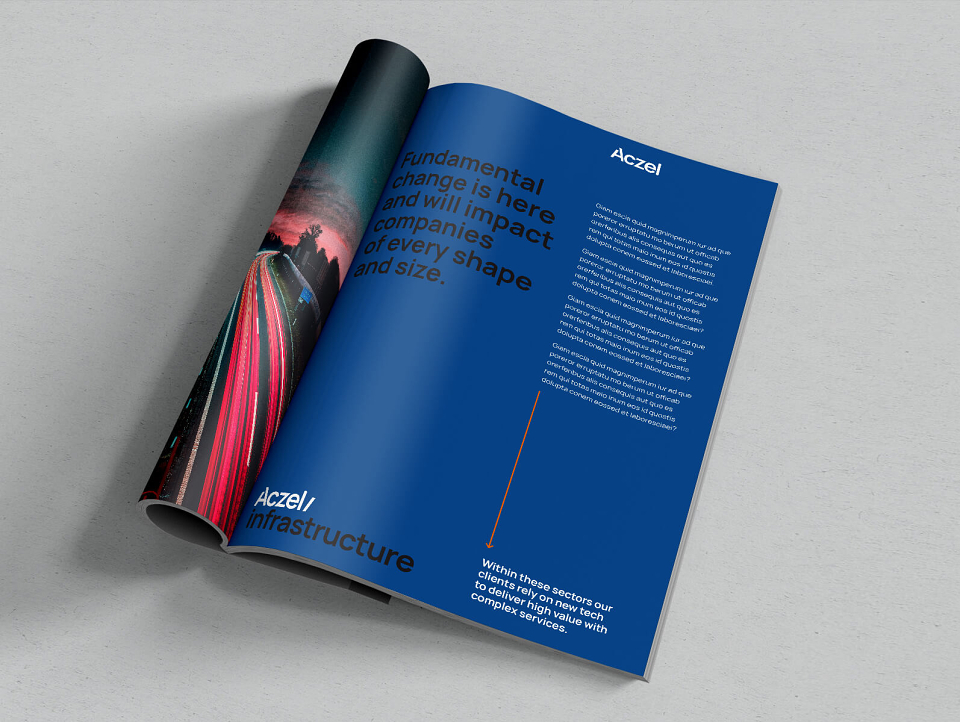
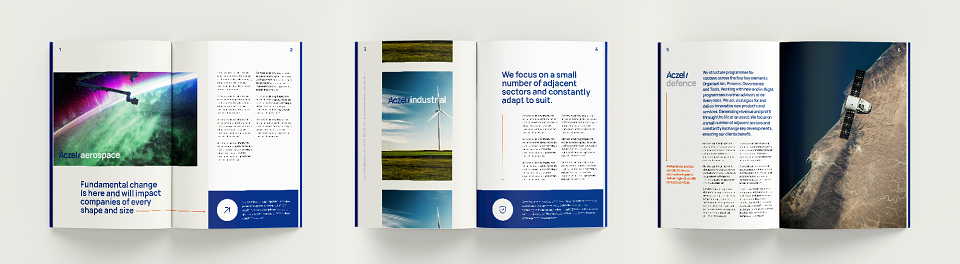
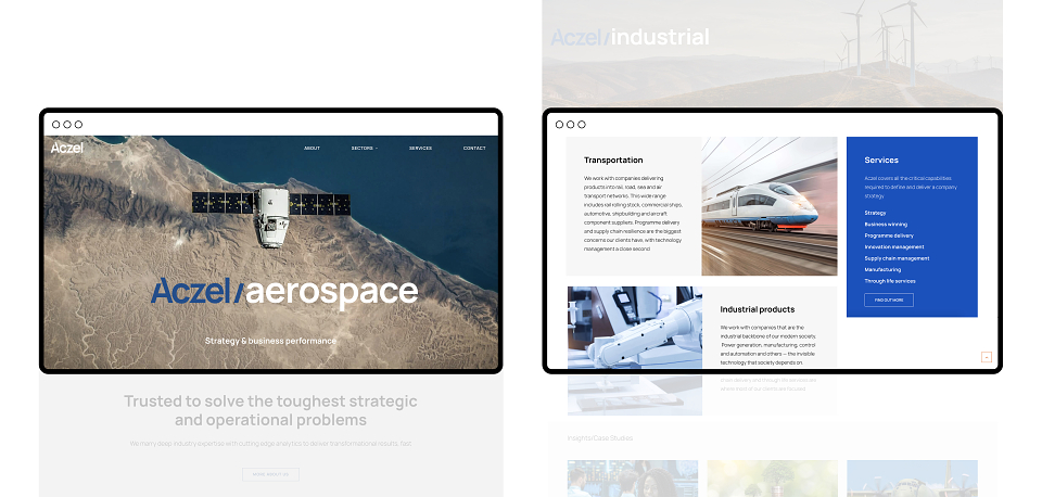
This proposed concept design was built around the idea of in-depth expertise and sector knowledge, the concept highlights and celebrates Aczel’s partnerships within the industries they champion.
Focusing on core technical and industry expertise, the direction taken here surrounds the concept of being proud of the knowledge at hand, being upfront and not following suit of similar businesses working within the same space. This plays directly into the visual styles of the Outlaw and Creator archetypes.
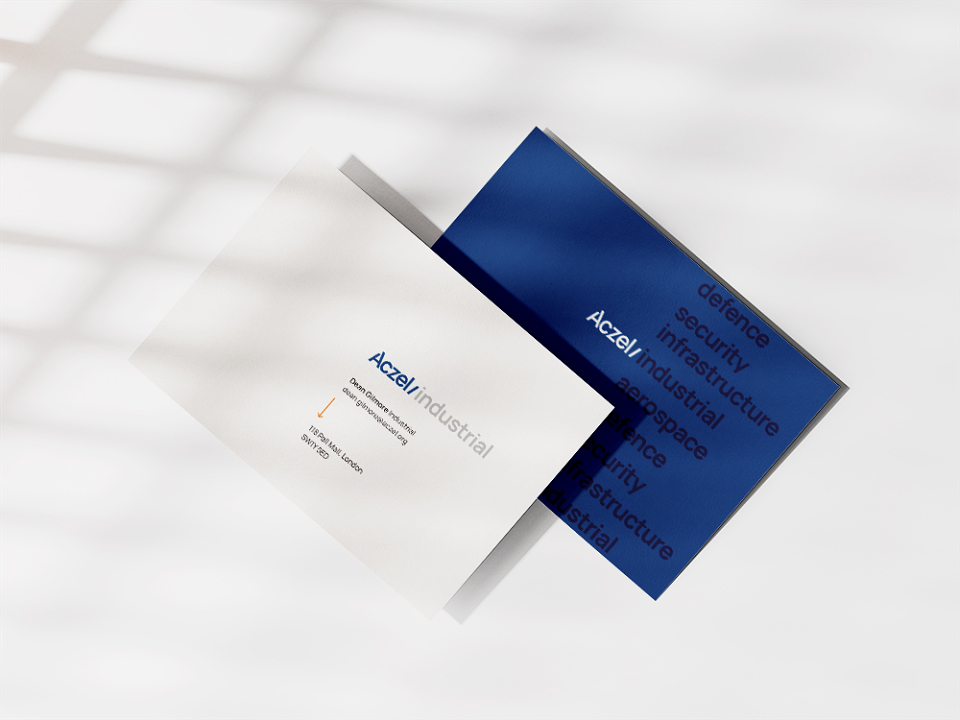
The logo has been greatly simplified from the original, in both its style and use of colour, giving visual strength and durability, allowing a far wider range of uses.
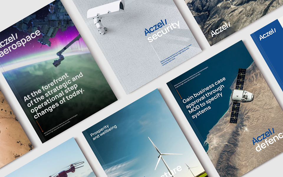
The core concept behind the logo is that it can be used to highlight the deep partnerships within the sector and can be attached to specific areas. These considerations create high-end and look and feel, making space and information more premium which allows the wealth of information Aczel can share, be better communicated.
By sliding the ‘/’ shape from the main body of the ‘A’ across the logo, the ‘Aczel/’ section can be added to industry names to highlight the concept of working alongside businesses and supporting them as opposed to directly taking over and in so a partnership is formed.
The photographic approach of the brand focuses less on the specifics of the industry and more on the perspective of the client looking out from their sector, overseeing the landscape they work in. This allows a much broader range of striking imagery and background assets to be used.
Using rich blue at the core, these colours follow suit of the more engineering, user manual side of industry, being almost architectural in their makeup. A bold highlight orange is used to pull focus on key areas, to break up content and direct the user.