JDO Global
Tunbridge Wells
ABOUT
The challenge was to unlock the potential of Whitstable Bay through brand extension opportunities and a new look for the brand. JDO was briefed to make ‘Whitstable Bay’ the umbrella to brand extension routes and in particular to develop the ‘ontrade’ opportunity. The creative team was asked to retain the premium nature of the brand whilst moving it to a more contemporary positioning that would appeal to both trade customers and end consumers.
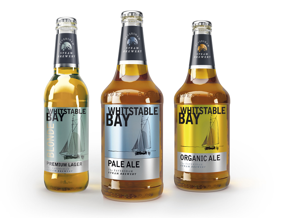
Whitstable Bay is currently sold as premium ale in cask and as organic ale in bottle form. The new range comprises; pale ale in cask, keg and bottle; a blonde lager in keg and bottle and an organic ale in bottle form. Further beer styles and additional packaging options will follow in the autumn.
The resulting design is clean and fresh and includes a modern sketch of an oyster dredger bringing both vitality and craftsmanship to an already existing brand icon. The colour palette is based on colours that you might expect to find on the British coast – soft pale blues, sunshine orange and sage green, contrasting with black typography to help distinguish the brand in a bar environment. The traditional script lettering has gone. Instead, an asymmetric quirkiness and a polished metallic finish have been introduced bringing the brand firmly up to date.
The tasting notes for the new range sees a departure from the traditional Shepherd Neame house style. The range therefore sits under the new ‘Faversham Steam Brewery’ brand, the strapline of the brewery back in the eighteenth century when a steam engine was installed to revolutionise production and replace horses. A silhouette drawing of the steam brewery sits on the neck label of the new range.
AWARDS
DBA Design Effectiveness Award