


Ardent are market leaders in the provision of land and consents advice to support the promotion and delivery of major projects in the UK and Ireland. With a network of six offices, they are trusted by many of the leading developers and contractors to advise on many of the UK’s biggest and most important projects across their core sectors of Regeneration, Renewable Energy, Utilities and Transport. Ardent are a purpose-led business and a team that is passionate about delivering life-improving change for communities and future generations.
Ardent's previous brand had remained unchanged for over 15 years, and, although it had served them well, their business was unrecognisable in 2023 to what it was in the mid noughties. The world has changed, and Ardent has changed too. They have grown from a small firm to a consultancy of almost 150 people, incorporating some of the country’s leading land and property experts, consent managers and stakeholder engagement experts.
Developing the new Ardent brand was an inclusive journey that started with an interactive discovery session with people from across the Ardent business. We took Ardent on a journey of self discovery through a journey that started with a discovery session, that was supported by a company wide questionnaire to allow the whole business to provide key insight into how the Ardent brand needed to evolve. These insights, coupled with market research allowed us to create the new Ardent brand proposition and strategy.
Ardent describes itself as delivering life-improving change for communities and future generations. It does this through a team of experienced experts in each area the Ardent brand touches and during the design process, we defined Ardent as standing for quality, growth, experience and its people.
The company's reputation is built on the trust of its existing clients which has been formed through the quality of the service they provide. However, their old brand failed to connect with potential new clients and was widely regarded as dated and ineffective in communicating what Ardent does. Ardent needed a new strong and confident visual that would support its clearly defined brand message.
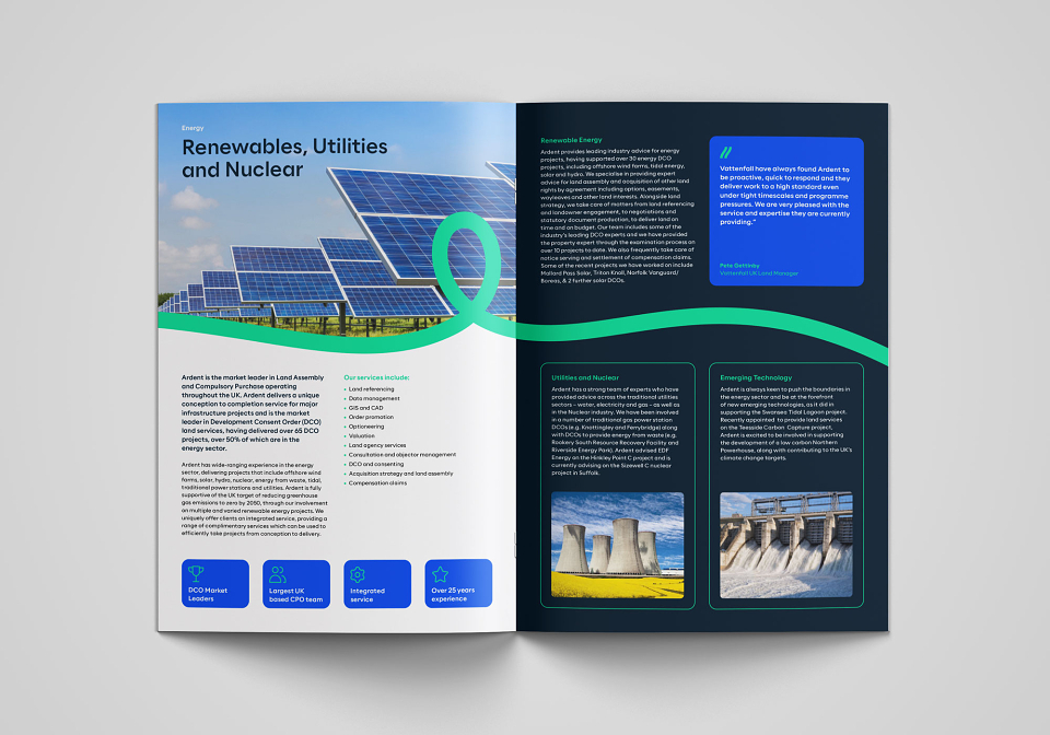
To build upon their existing reputation, we retained the color blue which was widely associated with Ardent, but refined it and made it part of an extended color palette that now includes multiple shades of blue and the introduction of green for a bold and vibrant feel.
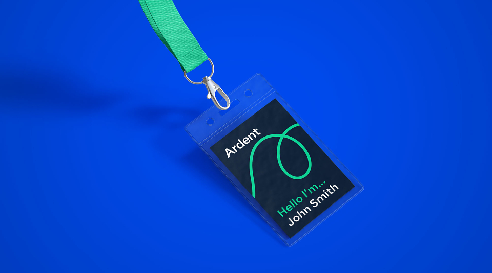
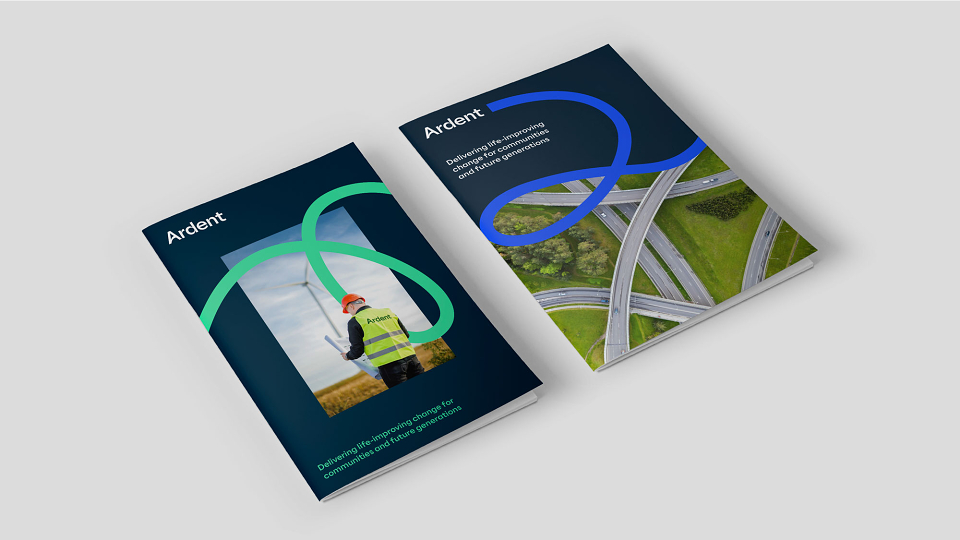
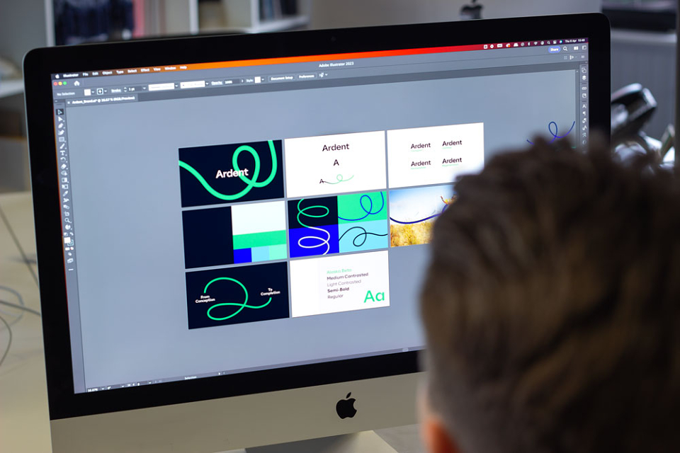
Focusing on Ardents unique proposition of being the only company that can take you from concept to completion, we used the line detail within the old Ardent logo to create a new visual journey.
Not a linear straight line from A to B, but a twisting and turning journey that represents the way Ardent takes the time to understand each client's individual needs and create custom solutions through knowledge, experience, and innovation.
The playful nature of the journey graphic creates a striking visual that is friendly and exciting. Over time this will be as recognisable as the Ardent logo and become instantly identified as the Ardent brand.
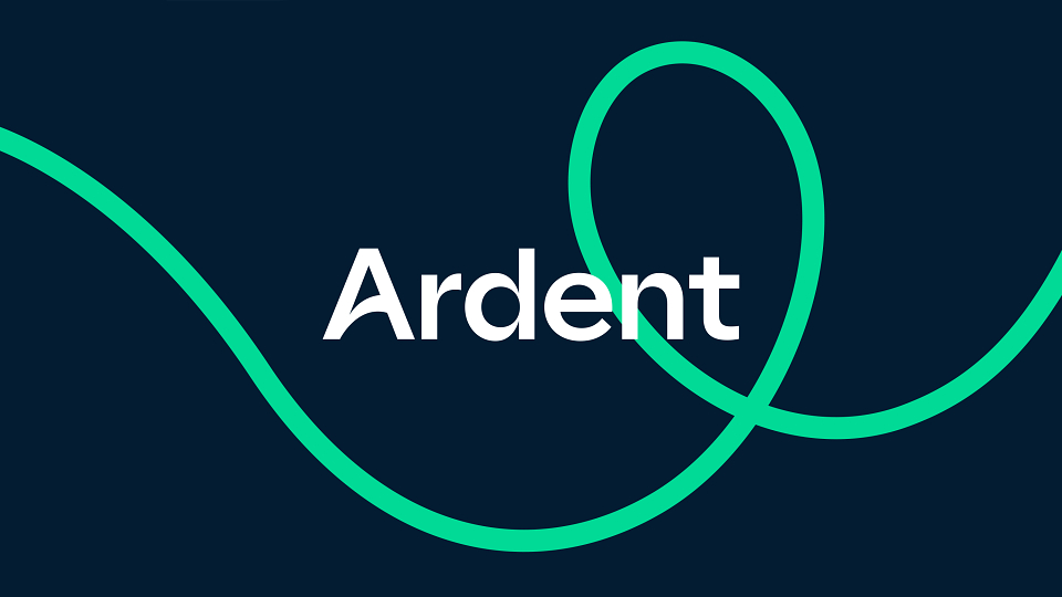
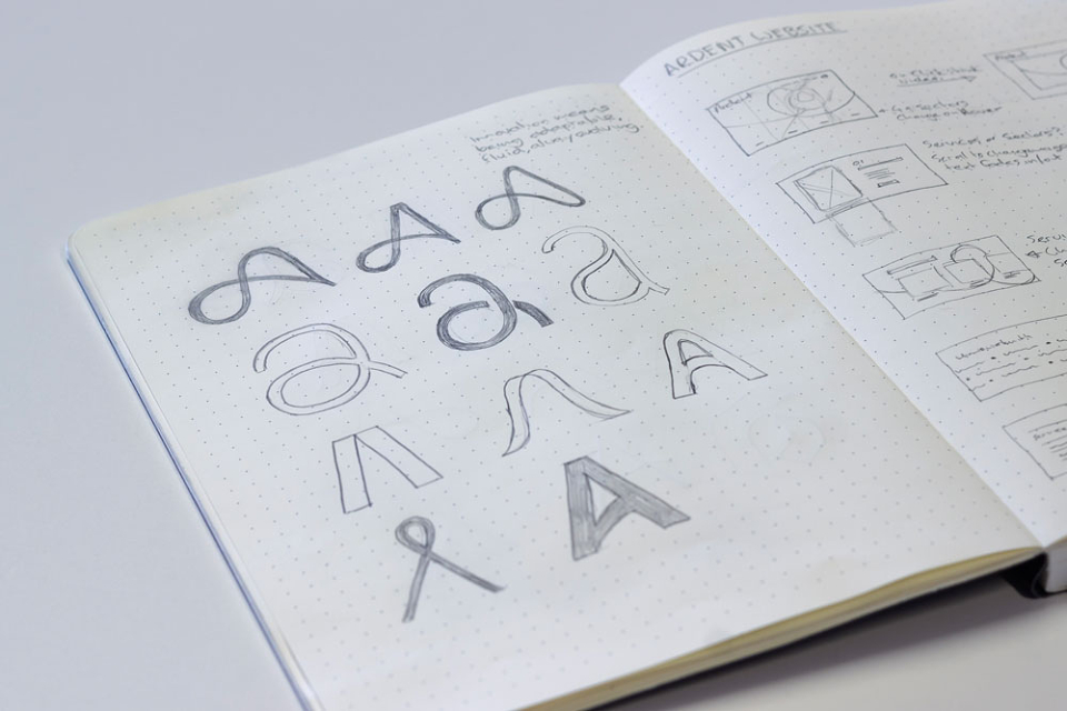
This bold and confident styling is replicated in the logo which is a strong typographic mark with a custom 'A'. This bespoke letter, with its curved crossbar, works as part of the name or as a stand alone icon, that can be used with the journey graphic growing from the crossbar to create striking brand visuals.
The typeface was carefully selected for its varying stroke widths to complement the movement of the journey graphic. This character and variety of font weights help to strengthen the brand visual.
We redesigned the website to focus on 4 key sectors rather than services and created a clear user journey that quickly directs people to the relevant information. Projects are now front and center, emphasizing Ardent's technical abilities and highlighting the team's experience and knowledge.
The results speak for themselves, with a 40% Revenue growth and a 66% Increase in website engagement.