Bray Leino
Barnstaple
ABOUT
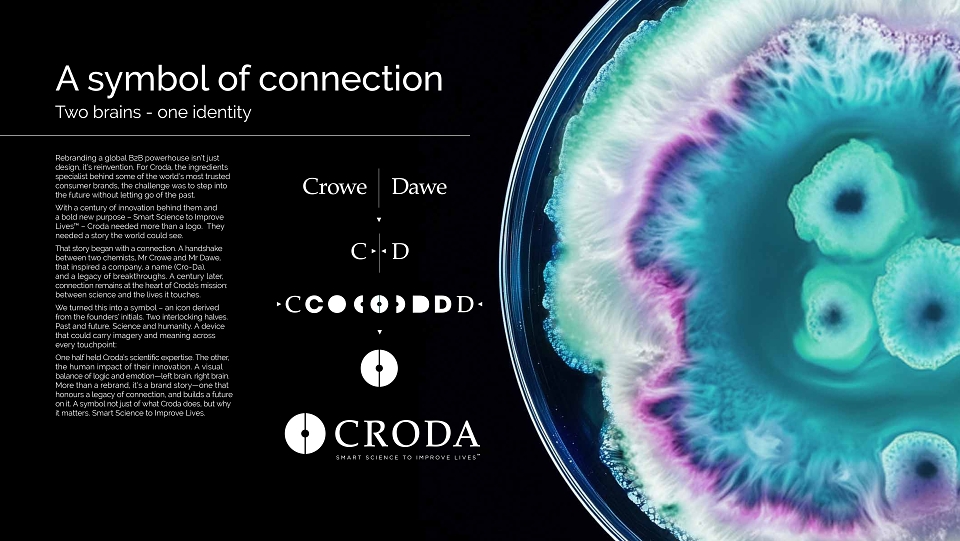
Rebranding a global B2B powerhouse isn’t just design, it’s reinvention. For Croda, the ingredients specialist behind some of the world’s most trusted consumer brands, the challenge was to step into the future without letting go of the past.
With a century of innovation behind them and a bold new purpose – Smart Science to Improve Lives™ – Croda needed more than a logo. They needed a story the world could see.
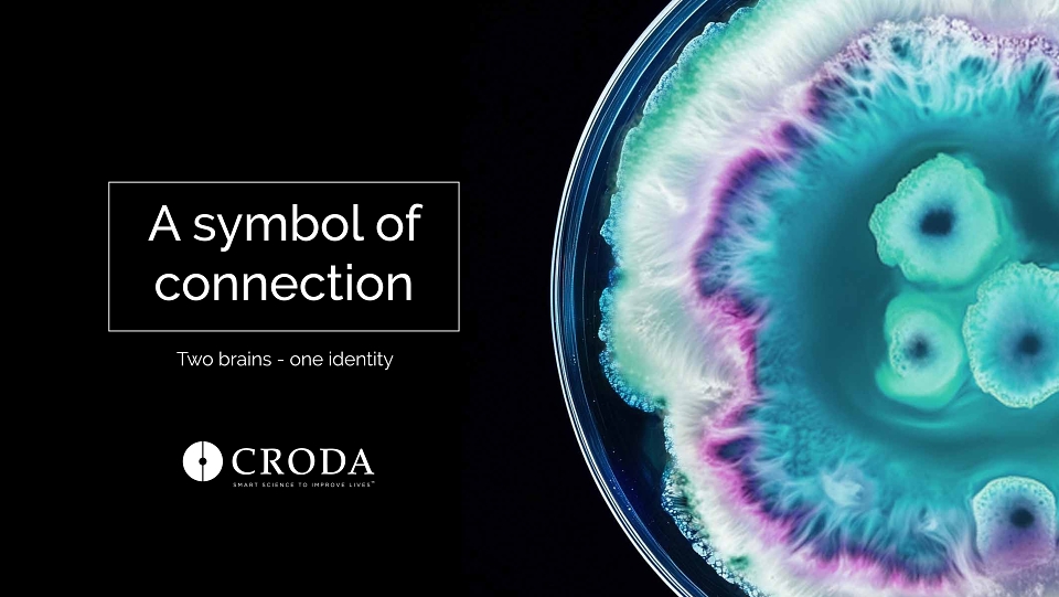
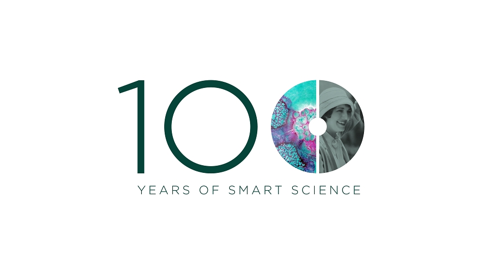
That story began with a connection. A handshake between two chemists, Mr Crowe and Mr Dawe, that inspired a company, a name (Cro-Da), and a legacy of breakthroughs. A century later, connection remains at the heart of Croda’s mission: between science and the lives it touches.
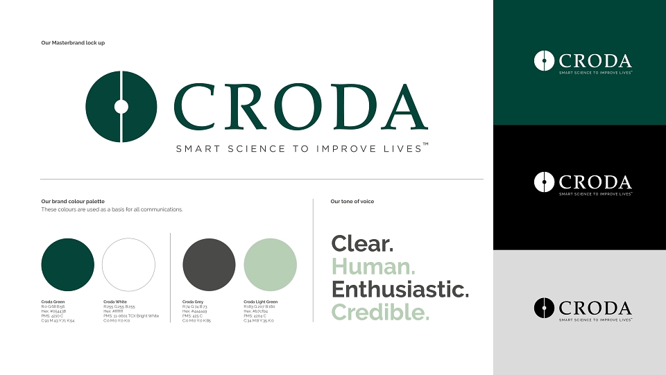
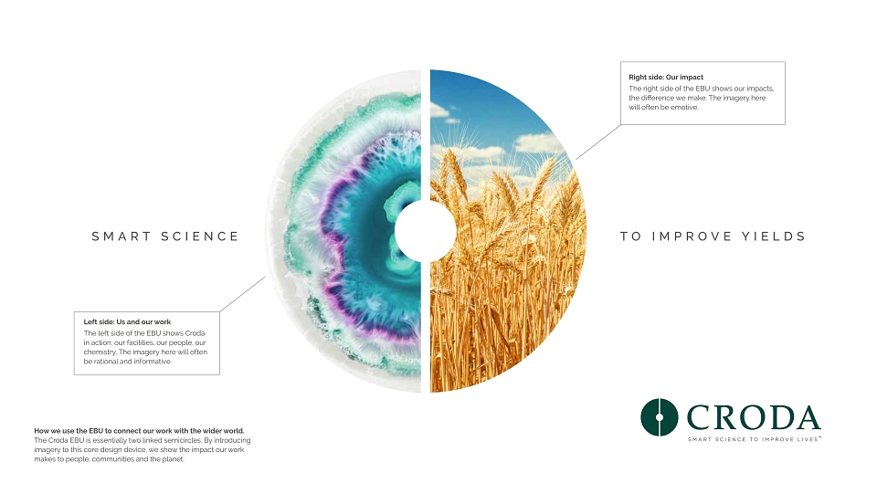
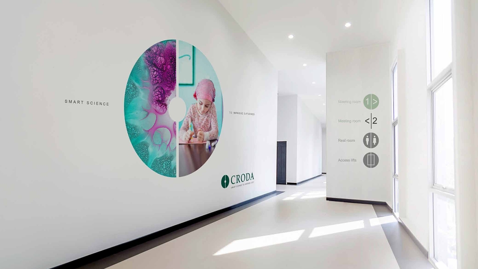
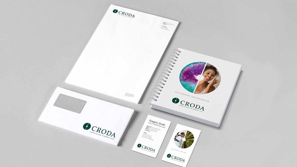
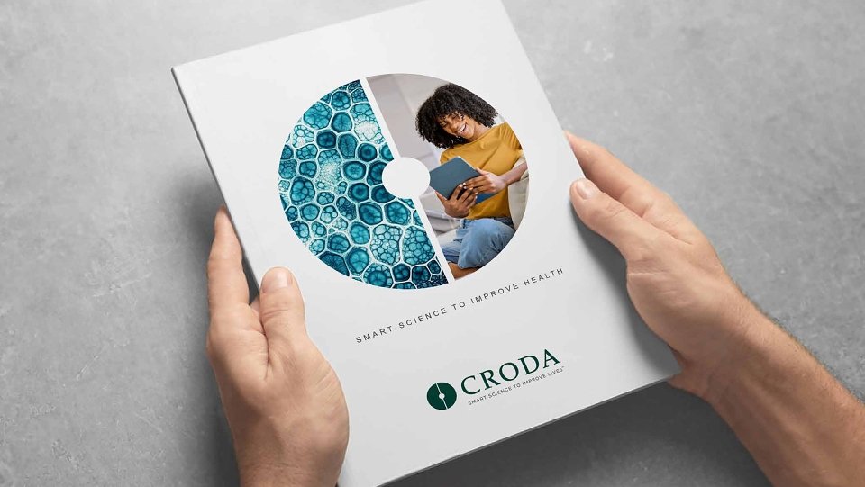
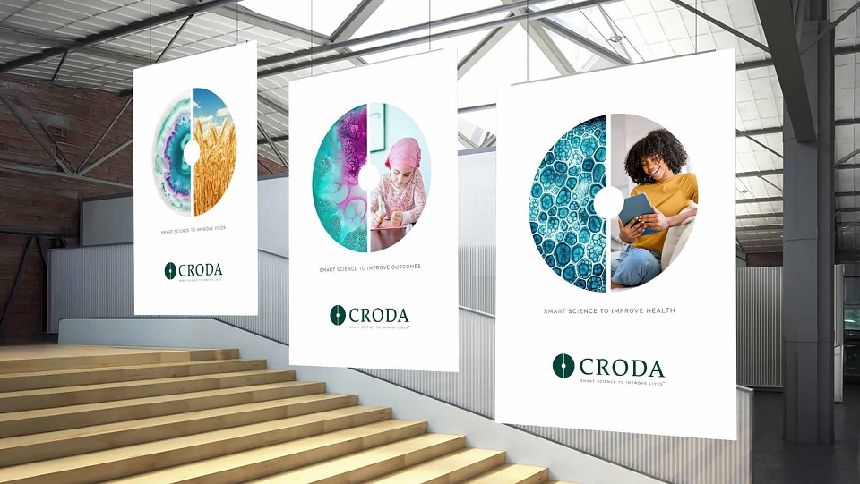
We turned this into a symbol – an icon derived from the founders’ initials. Two interlocking halves. Past and future. Science and humanity. A device that could carry imagery and meaning across every touchpoint:
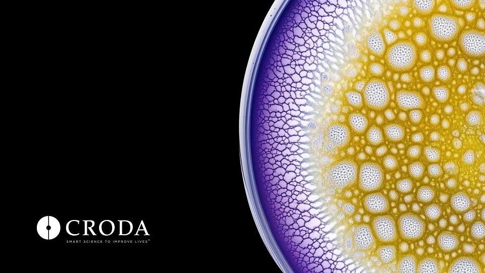
One half held Croda’s scientific expertise. The other, the human impact of their innovation. A visual balance of logic and emotion—left brain, right brain.
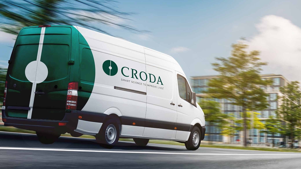
More than a rebrand, it’s a brand story—one that honours a legacy of connection, and builds a future on it. A symbol not just of what Croda does, but why it matters. Smart Science to Improve Lives.
MADEIT CREDITS
-

CrodaClient
-
Bray LeinoDesigner -
Bray LeinoDesigner -
Bray LeinoSenior Account Manager -
Jason WebbArt Director -
Bray LeinoArt Director -
Bray LeinoAccount Director -

Bray Leino -

Nicola RobertsExecutive Creative Director -

Pete JamesB2B Creative Head -
Anthony HurstHead of Retouching & Illustration -
Julie CrippsSenior Account Manager -
Alan WilksJunior Creative Artworker -

Kerry CookeDesigner -
Edd SoutherdenSenior Account Manager