


Evolving The Brand
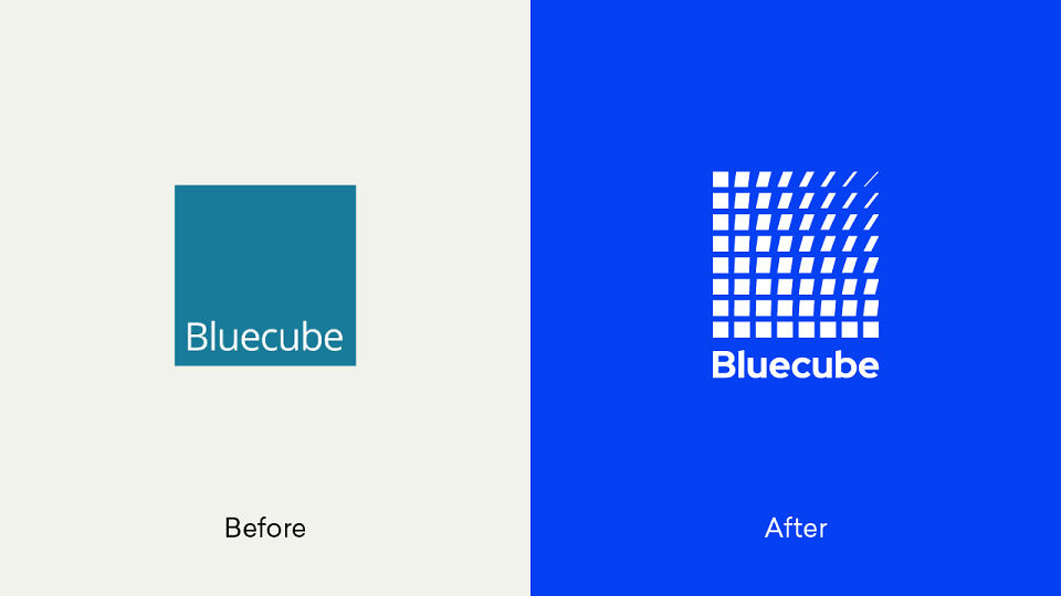
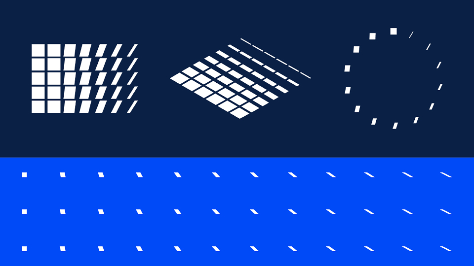
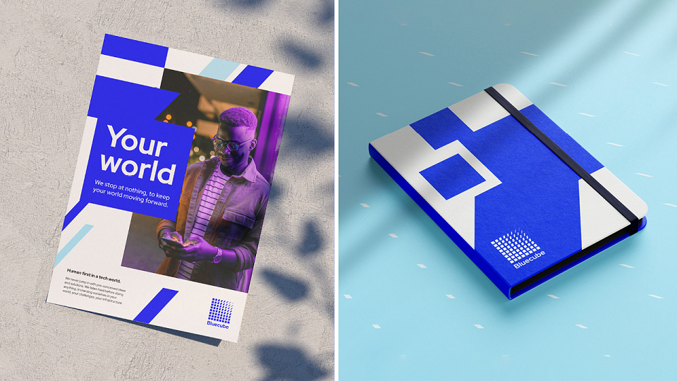
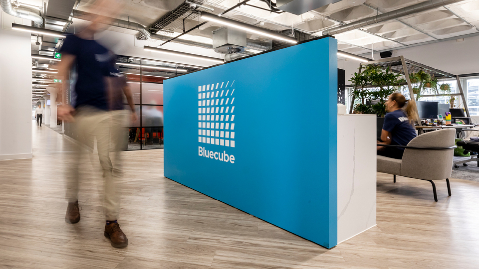
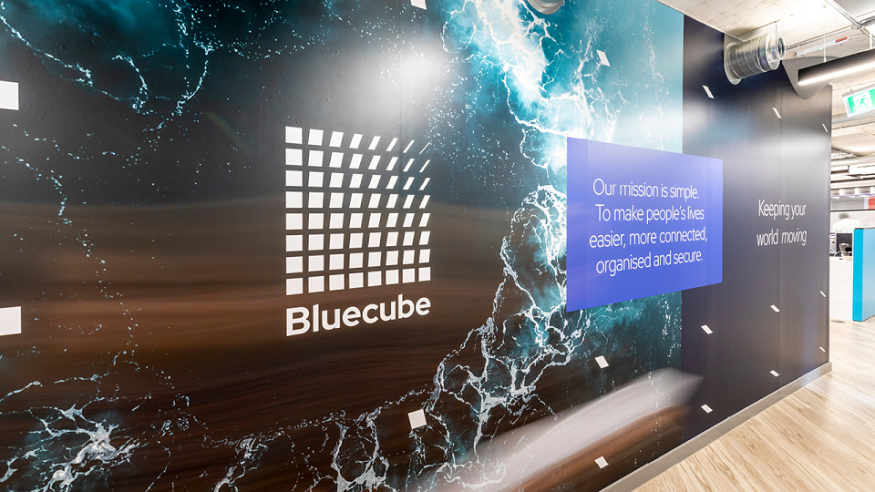
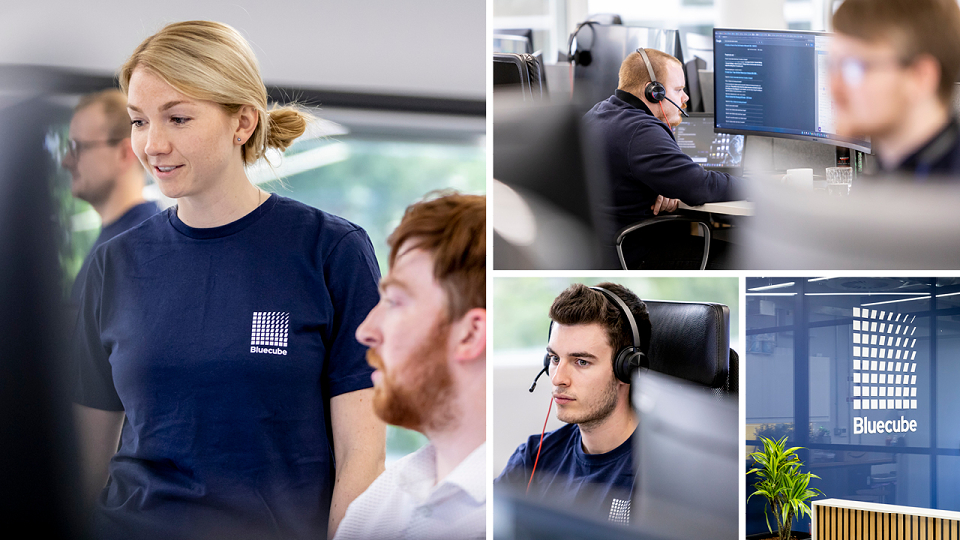
To bring our brand idea, 'Keeping your world moving' to life, we created a living and breathing logo and identity that evokes movement. Starting with a square, it adapts and morphs into thinner, clean lines. This represents the ever-changing world of the client and how Bluecube is agile enough to tackle any challenge and keep their client's operations running smoothly, 24/7, 365 days a year.
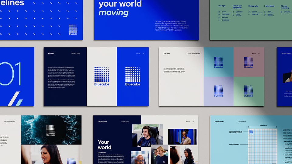
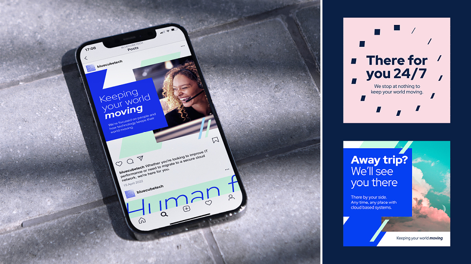
A new electric 'RGB' inspired primary colour palette was created to reflect the digital nature of the brand alongside a softer, warmer secondary palette. A more human and down-to-earth tone of voice was also introduced, complemented with a typeface that was friendly yet tech inspired.
Switching Bluecube Off and On Better
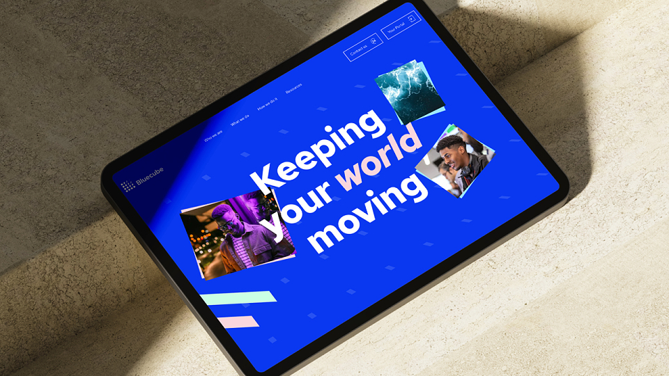
We flipped the script on how Bluecube communicated online, designing, populating and building a brand new website that put the users at the heart of the experience. And with comprehensive brand guidelines created, we made sure Bluecube remains 'humanised' and keeps moving in the right direction.