Chaos
Guildford
ABOUT
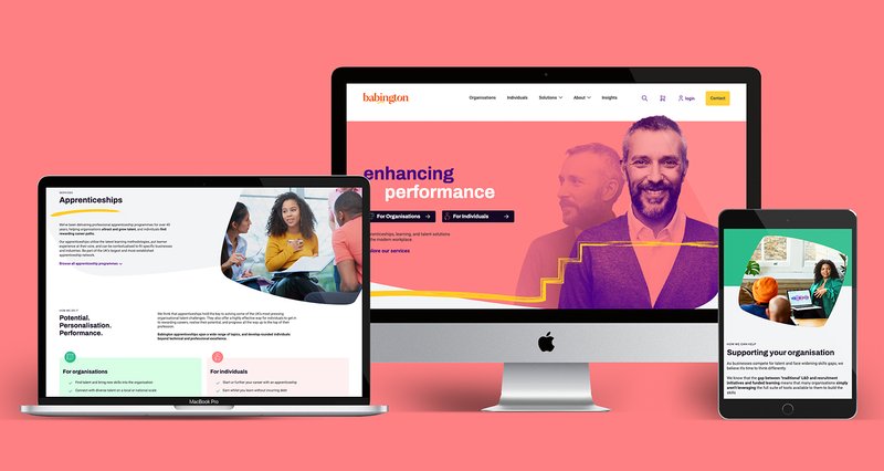
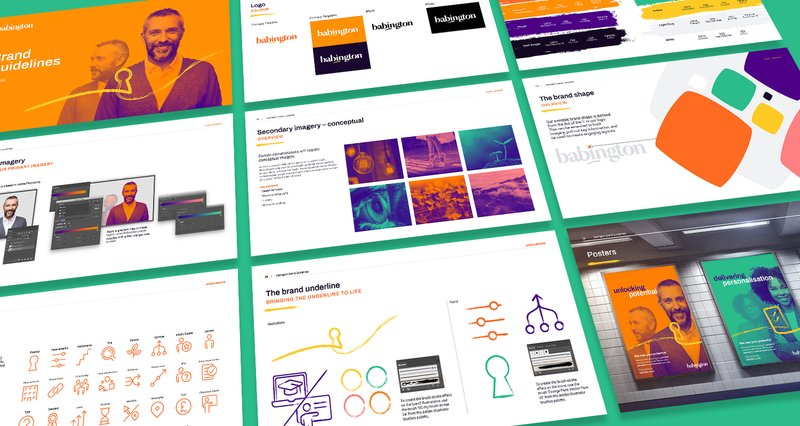
The redesigned Babington logo showcases a custom font that exudes a delightful blend of quirkiness and modernity. Notably, the special characters 'o' and 'i' take center stage, with the latter being particularly emphasized to symbolize the brand's commitment to personalization, placing the individual at the core of Babington's endeavors.
Embracing a vibrant personality, the new brand incorporates three primary colors: orange, mint, and rose. These warm, bold, and contemporary hues distinctively differentiate Babington from its competitors, harmonising seamlessly with other brand elements.
Additionally, the primary images featured in the new branding consist of duotone representations of the same individual, capturing a transformative journey from one state to another. These images embody the notion of progress and the realisation of potential, signifying how individuals attain clarity, confidence, and success through their engagement with Babington.