

Trive is a next generation, multi-asset investment platform that partnered with BrandOpus last year to develop a new brand identity system that will “set it apart from peers and facilitate the company’s vision of attracting investors with trading experience who are ready to take it to the next level.”
BrandOpus created a new brand for Trive that aims to be disruptive whilst driving a story that would change the minds of the target audience. Leaning on the insight that trading is a form of entrepreneurialism for the target audience, BrandOpus based the brand narrative of ‘never standing still’ around the opportunity for Trive to develop, progress and evolve. An idea that reflects a state of constant motion and adaptability.
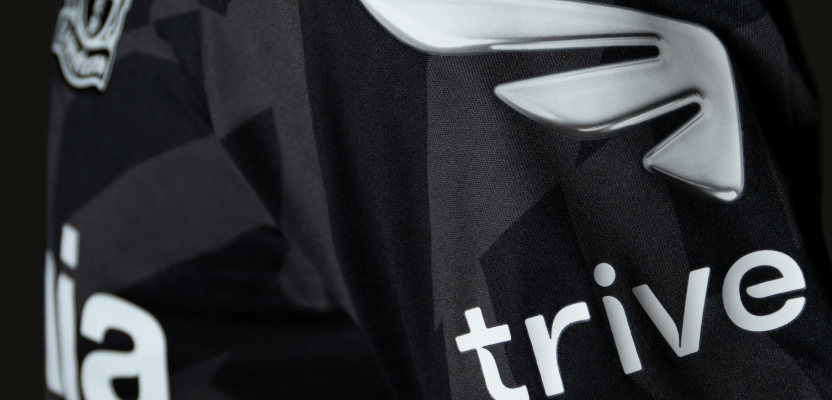
The new brand identity and visual system reinforce the design thread by elevating the symbolism of Mercury as the inspiration for the brand identity. As the God of Trade, he is the vision of perpetual motion reflected in the brand’s logo, but the natural element mercury provides the metallic colour palette allowing for the Trive brand to come to life.
Its shapeshifting nature allowed BrandOpus to create a dynamic and disruptive visual identity system, eschewing the current trend for flat design. Trive now comes alive in three dimensions with the liquid mercury forming and re-forming to create the logo, icons and other shapes that act as a framing device for the entire brand.
To learn more, we spoke to Daniel Wegrzyn, Business Director at BrandOpus, about how they tried to build a deeper meaning and mythology into the branding with layers of storytelling not normally associated with start-up brands.
What was the brief for the rebrand?
The investment platform category is cluttered and there’s not a whole lot of product differentiation. Brand plays a huge role in driving choice. Our brief was really to stand out from the crowd.
Describe the purpose of the brand and its target audience

Investment for Trive’s audience is more than just a hobby, it’s a gateway to entrepreneurialism. So we wanted the brand to speak to the need of an emotional benefit. Empowering progression is the brand’s purpose and it really speaks to the entrepreneurial mindset which is all about self-advancement.
What was your thinking behind the rebranding solution?
Once we’d established the brand’s purpose, we aligned on an attitude that would unlock it, an aspirational behaviour that our audience could identify with. ‘Never Standing Still’ was that attitude. It signaled both a restlessness and thrust that we wanted people to identify with within the brand. From there, it was really all about symbolizing that attitude.
What visual influences fuelled your solution?
We wanted a simple, iconic device that both represented our attitude, but also felt true to the world of finance. Mercury’s wing became our inspiration. Mercury is the Roman God of financial gain, but he’s also this messenger in perpetual motion. We thought that was really neat. But the really fun bit was when we layered on the idea of the metal mercury and brought its liquid/metal properties into our visual identity.
Did you learn anything new during the project?

That Mercury is the only liquid metal.
What was the biggest challenge? How did you overcome it?
Designing our wing. There’s no doubt that wings can be generic. We needed to create one that really felt like it was distinctive from the category.
What kit/tools/software were used to create it?
For the identity and BrandWorld motion we used: Cinema4D and Octane for the overall build, metallic liquid motion, macro textural detailing and lighting environments. We used Adobe AfterEffects to refine the motion elements - from kinetic typography through to brand iconography. Cinema4D and Adobe photoshop was utilised to create the logo for the football shirts.
We also collaborated with the iconic and award winning font foundry, Colophon, to refine the custom typeface used in the Trive logo.
What details are you most proud of any why?
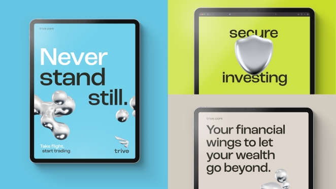
I think we’ve managed to create a brand that feels active and dynamic from the ground-up. Motion principles weren’t an after-thought, they were baked-in right from the very beginning, so the brand felt ready made for a digital-first world.
What do you hope it achieves for the brand?
We hope it helps the brand get noticed in a crowded category. It’s really that simple. That’s the first job. Then we want the brand’s image and meaning to work at an emotional level, to drive affinity with people so they go ahead and download the platform!
What would you do differently if you could do it over again?
Looking back, we'd collaborate with a third-party platform, such as Unreal Engine, to create a 3D motion world and innovate how we could push the proprietary 3D liquid mercury motion further (i.e. within the metaverse, NFTs, interactive/responsive motion assets)
We carried out a lot of RND across the project to get the motion of the logo to hit the idea of 80% wing symbolism vs. 20% liquid mercury. Ideally, if we had the opportunity again, we'd extend this RND stage and work with several post-production houses and 3D liquid specialists to further develop the brand logo and overall brand world.