Born Ugly
Leeds
ABOUT
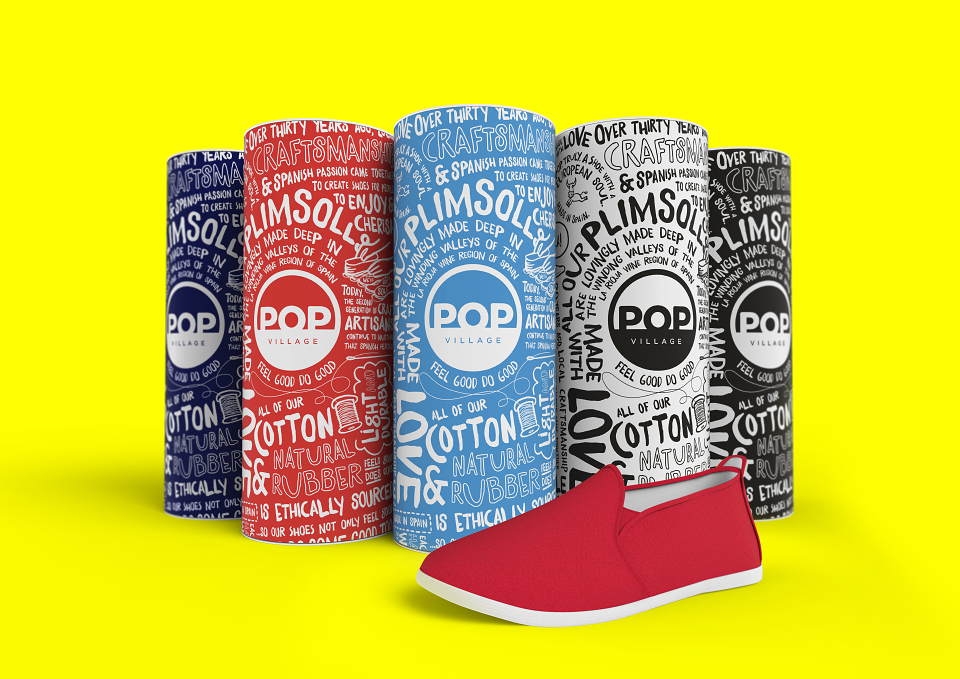
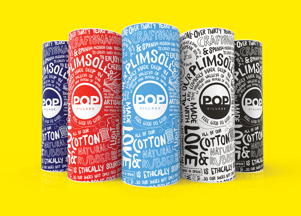
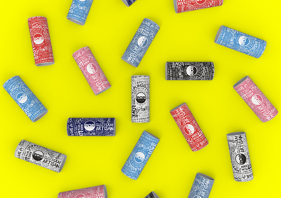
We worked with new footwear company POP Village to create the brand identity and packaging for their collection of plimsolls, a line of British athletic shoes debuting at summer music festivals.
Each pair of shoes is merchandised inside a striking cardboard tube with a pop-top aimed at creating iconic, disruptive packaging that is not only engaging to customers, but works well in a retail environment. The tubes feature hand written-style text communicating messages about the brand’s ethos and a palette of on-trend shades, including cherry red, denim blue, candy pink and navy, which mirror the colours of the shoes too.
A bold and distinctive logo consists of the brand name ‘POP Village’ inside a circle, which features on the heel of each plimsoll.
POP Village was a really exciting project to work on because we had the fortune of building the visual identity for the brand from the ground-up. Our aim was to appeal to a fun, young audience by capturing the playful, vibrant feel of the products. A bold versatile logo was especially important in setting the tone and the unique tube packaging and bright colour palette brought it all together into a strong highly own-able brand concept.
MADEIT CREDITS

Annual 2015 ShortlistPop VillagePackaging
Project featured: on 12th February 2015