Butterfly Cannon
London
ABOUT
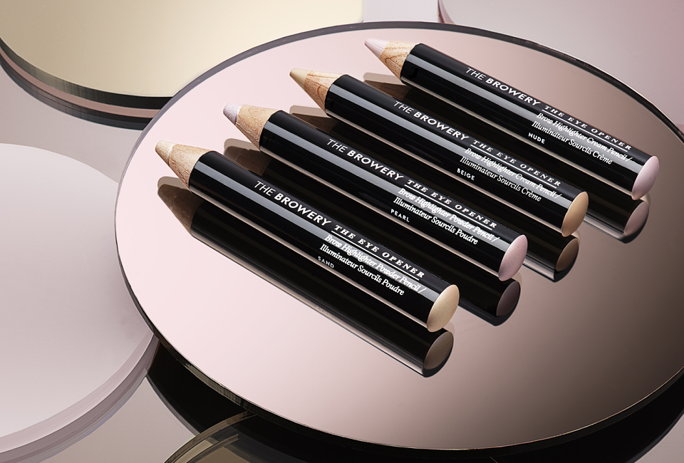
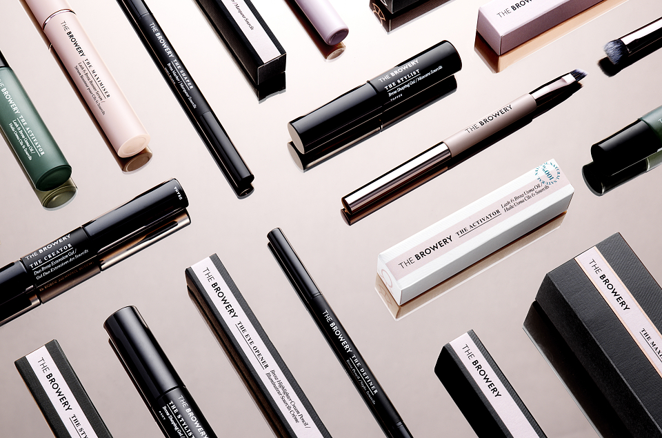
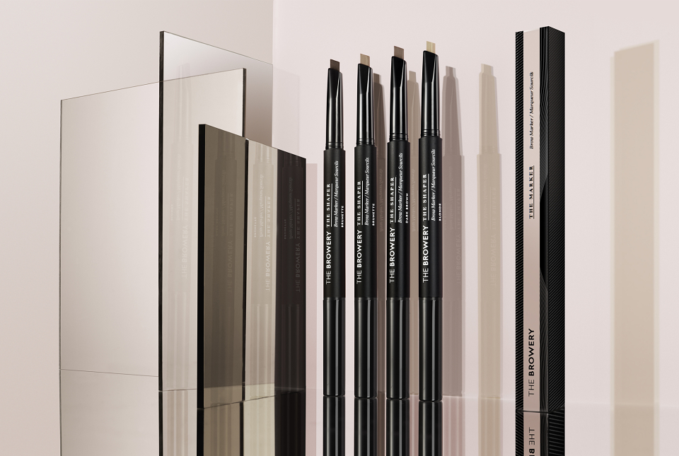
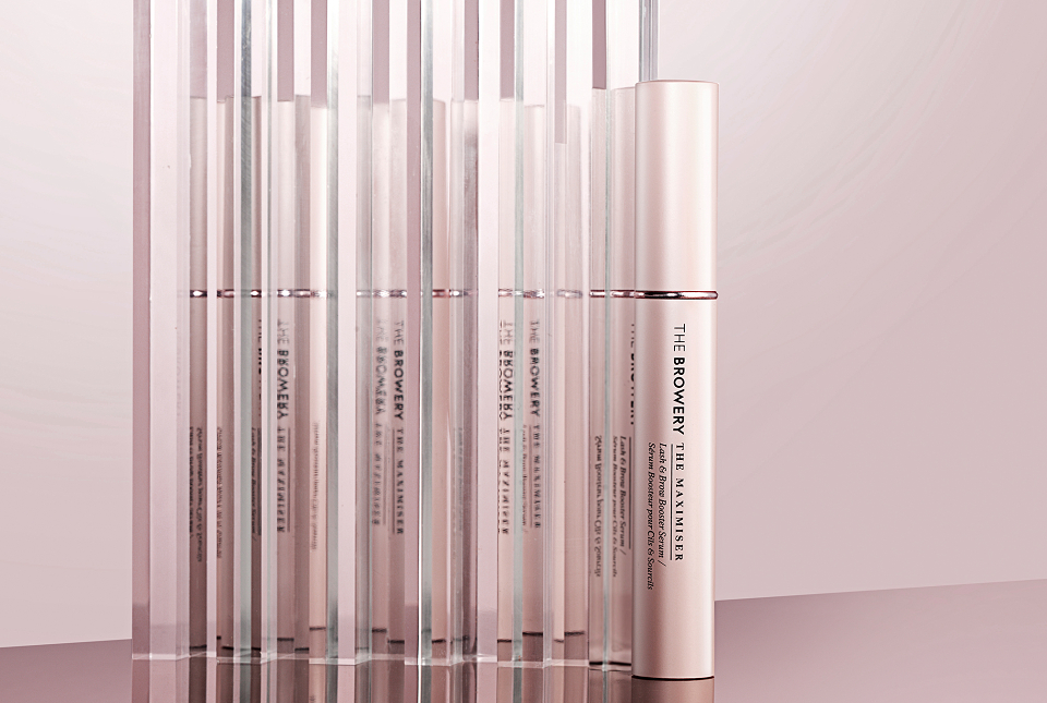
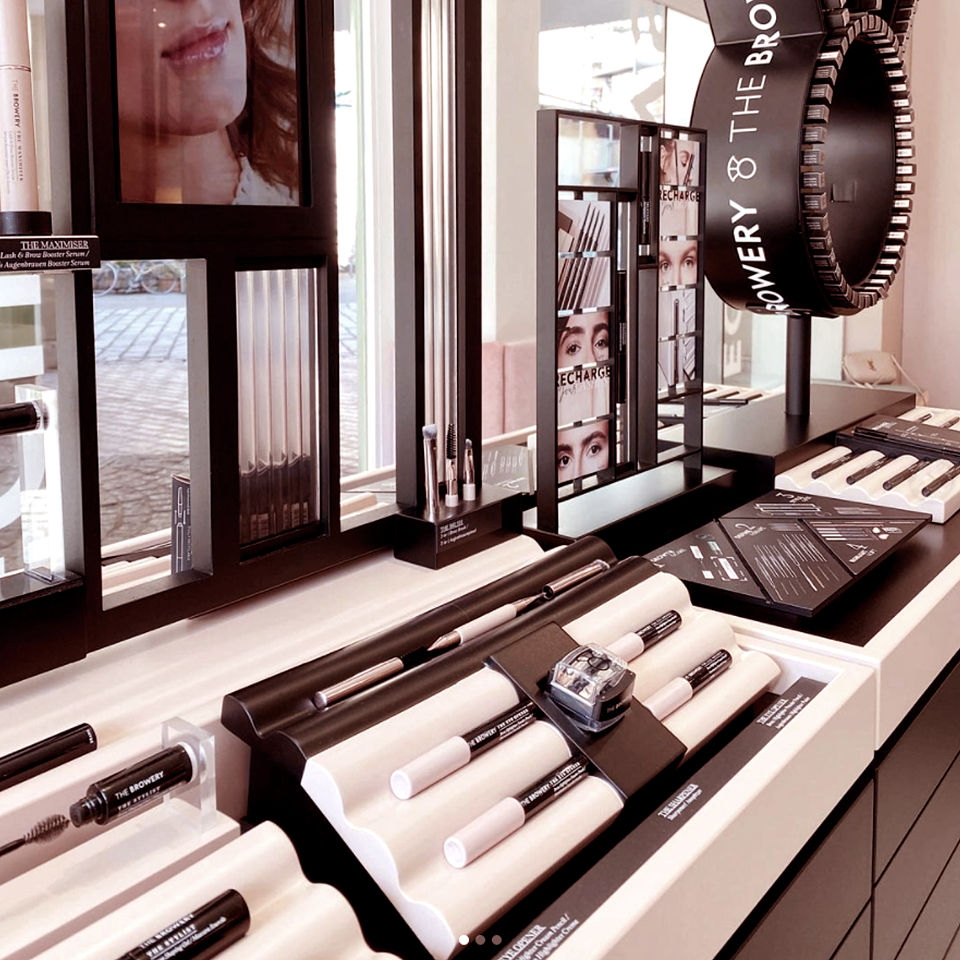
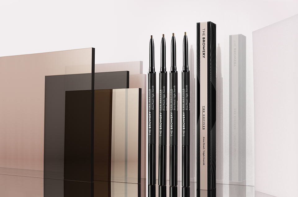
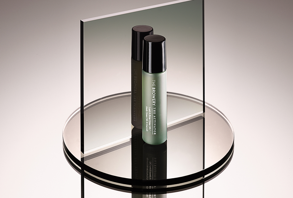
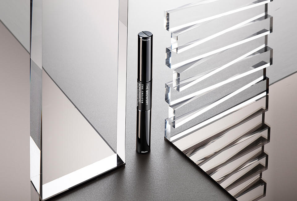
High end urban brow bar, The Browery came to us to create the packaging for their first product range. We saw the chance to shape their entire brand identity around the personality and personal touch of founding sisters Amira & Rada.
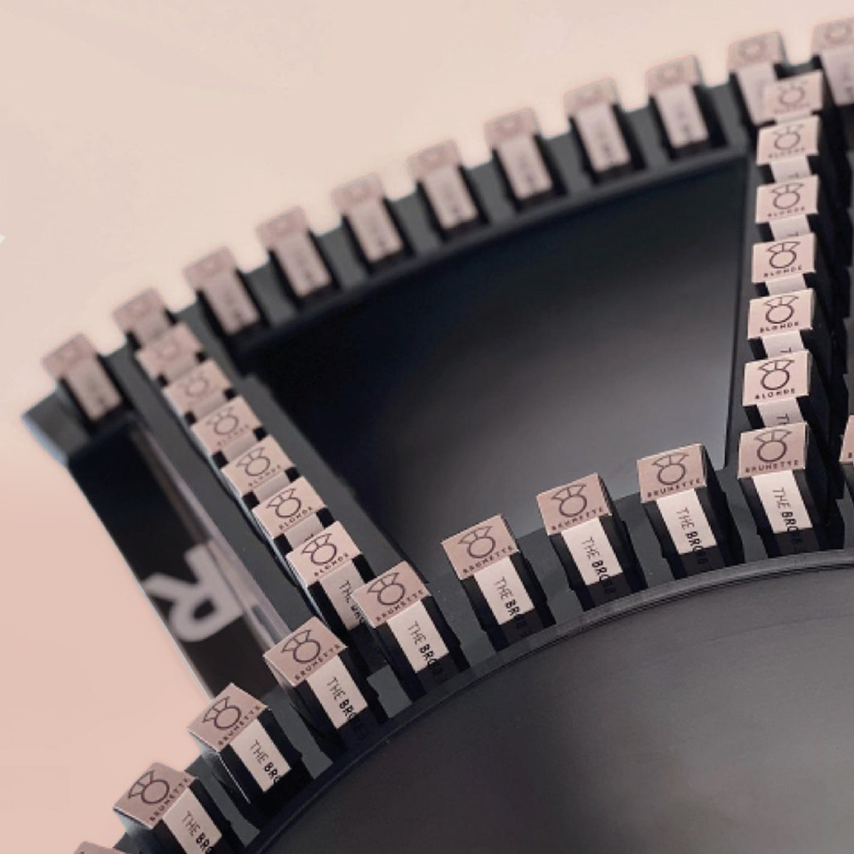
Just as the contrasting personalities of the sisters perfectly complement each other, the new brand identity is rooted in a sense of duality. Warm and welcoming whilst always straight-talking. High-end with a sense of attitude. Serif/sans serif typography in contrasting weights is used to display strong, simple product names. Whilst a pink-nude ‘real beauty’ palette has a steely black edge. On & off pack. Physical & digital.