Bennardo Santos
Managing Director
ABOUT
FLOWER POWER LA is a premiere floral design studio, providing flowers and decor for all types of events, corporate settings, and productions in the Los Angeles.
BRIEF
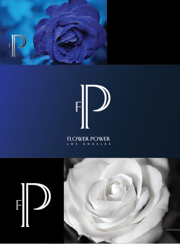
Flower Power LA is a floral studio that creates flowers and decor for large events only. We specialize in both social and corporate markets. While the name is very "cute" we want to capitalize on the "power' part of it- I imagine something serious with very clean lines and not a lot of fluff- maybe type only- not sure. Flower Power should be the focus with Los Angeles as a rider. Peace.Love.Flowers is our tag line which we use on our sales materials, tee shirts etc. I would be thrilled if our work shirts didn't have to be white to accommodate the logo (they get really dirty).
REQUIREMENTS
Must Have: Nothing cute or girlie, we are a business to business provider. I am looking for something strong and new - that must be specific to our industry. Imagine us as very high-end artists, not a sweet little flower shop.
Nice to Have: I'd love to see a graphic box with FPLA- possibly a letter in each box with the name spelled out either underneath or attached somewhere. I love the Tiffany and Company logo. Love the trestle. It's really simple but very upscale.
Should Not Have: Nothing girlie or sweet. Please no pink
DESIGN PROCESS
After reading the brief. I made research on the Tiffany and Company logo, and realised the simplicity yet sophistication of the logo. A few days earlier I had downloaded, and at that moment I knew that it would be right font for this project. I tried a few variations while sticking to the main idea of the F and P. I sent in two versions to see which one she like the most. Once she chooses one, I will further work on it. To my surprise she loved one of the versions. Requested that I put on a dark background as the uniforms get very dirty.