Pragya Sahoo
Illustrator
ABOUT
Brand Design for a Restaurant
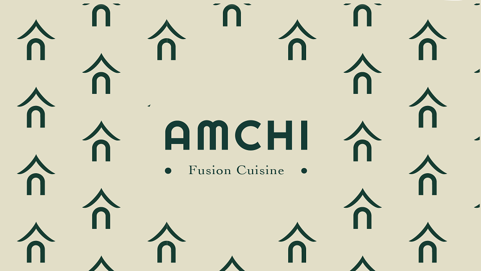
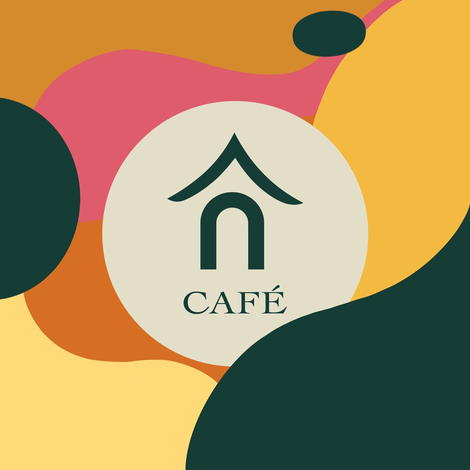
I kept the logo clean and simple. The green is to give it a sense of elegance and trust. The green also helps to communicate that the restaurant serves vegetarian meals. The home icon is derived from the curve of the "A" to give it a warm feel because the business owner's purpose is to serve people food that matches the care and hygiene of home-cooked food.
MADEIT CREDITS
-

Pragya SahooIllustrator