Phil Perkin
Graphic designer
ABOUT
Concept
The brief was to create a bold, modern identity for Progress Personal Training that reflected strength, momentum and measurable transformation. The brand needed to feel powerful yet professional — appealing to driven individuals serious about improving performance, physique and mindset.
The core idea centred around the word “Progress” — not just as a name, but as a philosophy. Every session, every rep, every week should move the client forward. The identity needed to visually communicate movement, direction and growth.
Execution
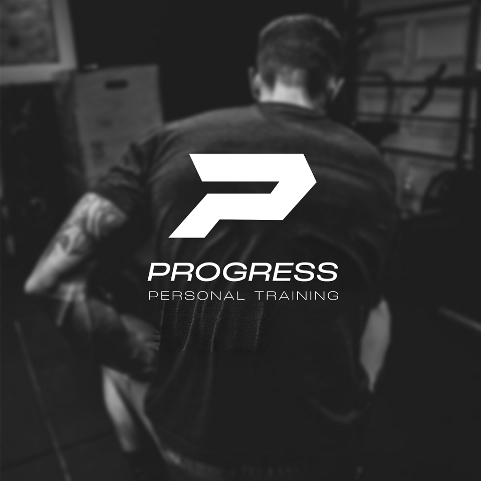
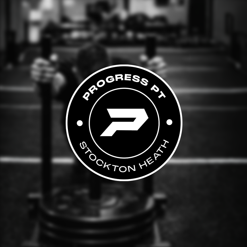
The visual identity was built around a strong, angular “P” marque designed to convey forward motion and stability. Its geometric construction and sharp lines reinforce ideas of structure, discipline and power — key attributes in personal training.
Typography was kept clean and modern, with a bold primary wordmark to anchor the brand and a lighter secondary type treatment to add balance and hierarchy. The monochrome palette enhances the brand’s premium, no-nonsense feel while allowing flexibility across apparel, social media and gym environments.
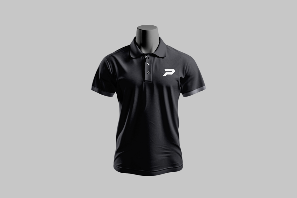
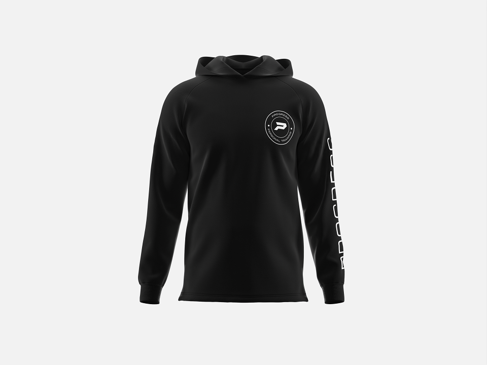
The logo was designed to work effectively across multiple touchpoints — from gym signage and branded clothing to digital marketing and social content — ensuring strong recognition and impact at every scale.
Results
The final identity presents Progress Personal Training as confident, focused and results-driven. The bold marque gives the brand a memorable visual shorthand, while the refined typography maintains professionalism.
The cohesive brand system strengthens credibility, improves visual consistency across platforms and positions the business as a serious, high-performance training provider. The identity communicates exactly what the brand promises: measurable progress, delivered with purpose.