PepsiCo Design & Innovation
New York
ABOUT
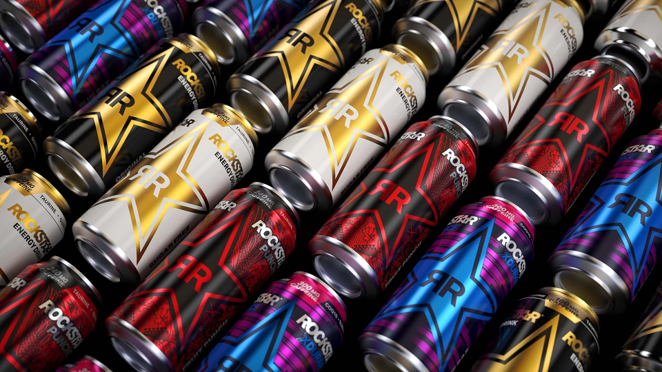
Rockstar Energy drink. It’s fuel for the hustle. So, we challenged ourselves with this portfolio-wide global brand identity. Our first in over a decade. We re-engineered our iconic star logo to be modern. Timeless. Premium. Our new packaging architecture leverages the star as a supergraphic that connects cans on shelf with advertising in field to create a bold billboard that transcends touchpoints. This bold, new golden star serves as a strong foundation for brand equity moving forward, serving as an icon for the aspiration of the hustle.
Rockstar was one of the original energy drinks. We have a ton of history. An amazing story. When people see our brand, they know exactly what it is. However, with a decade-old identity it was time for an infusion of… well… energy. Excitement. Luckily for us, all the pieces were already in place. We just needed to dust everything off and remix the brand for modern times.
This brand starts and ends with its stylized star. It’s been used as a supergraphic for nearly 20 years. It’s emblazoned on packaging. Logoed on action sport athletes. Decaled on racing teams. And painted on guitars. Our design strategy embraced this ubiquitous shape infusing it with renewed confidence, timelessness and modernity all while making it approachable, desirable and badge worthy.
Using this simplified brand symbol as the foundation of our design strategy, we got to work crafting an entirely new packaging and visual identity system.
On pack, we took a new approach to the logotype — creating a wordmark that’s more mature and jives with the star. We developed an innovative “paired” product imagery which gives us persistent branding in the cold vault and easy information navigation for consumers. We brought key information to the top of the pack and created an iconographic caffeine level system so customers can shop across the portfolio based on their energy needs — caffeine levels are something other energy drink brands relegate to the back panel. For sub-lines we reduced the SKUs and designed each one according to the style of different music genres.
The visual identity system is based on a gold and black color palette to elevate quality expectations. We took an evolved approach to shape language, typography and product imagery. We also took what worked from the previous branding including a bold application of the star equity to build brand awareness.
Our new branding launched in a big way with the brand's first television commercial and integrated 360 campaign before the big game. Consumer and customer response to the campaign and new look of the brand, especially packaging, has been highly positive. In fact, the general social sentiment for initial social posts with the new look and campaign have been at a 20:1 positive sentiment ratio.
MADEIT CREDITS


Annual 2021 BronzeRockstar Energy RedesignPackaging
Contributor:
Invite
x3
PepsiCo Design & Innovation has been a Contributor since 25th November 2015.