PepsiCo Design & Innovation
New York
ABOUT
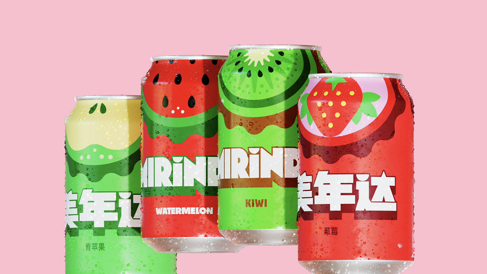
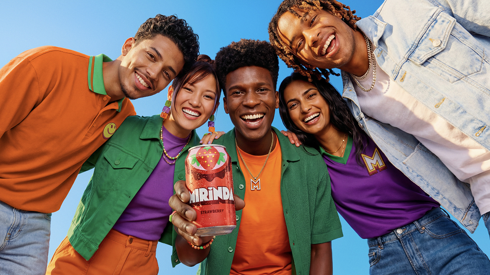
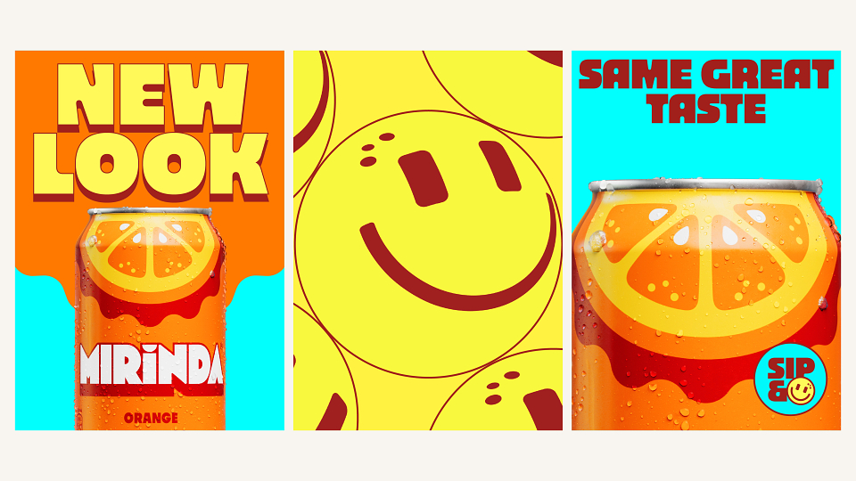
The new MIRINDA® brings flavor into focus with a look that pops at first glance. As competition in the soda category intensifies, we saw an opportunity to sharpen the brand expression of our fruit-flavored soda. We set out to reconnect with Gen Z through a more recognizable and ownable visual identity. Our team reimagined MIRINDA® as a vibrant, flavor-forward system that sparks joy and bursts with retro-modern energy.
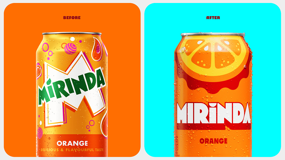
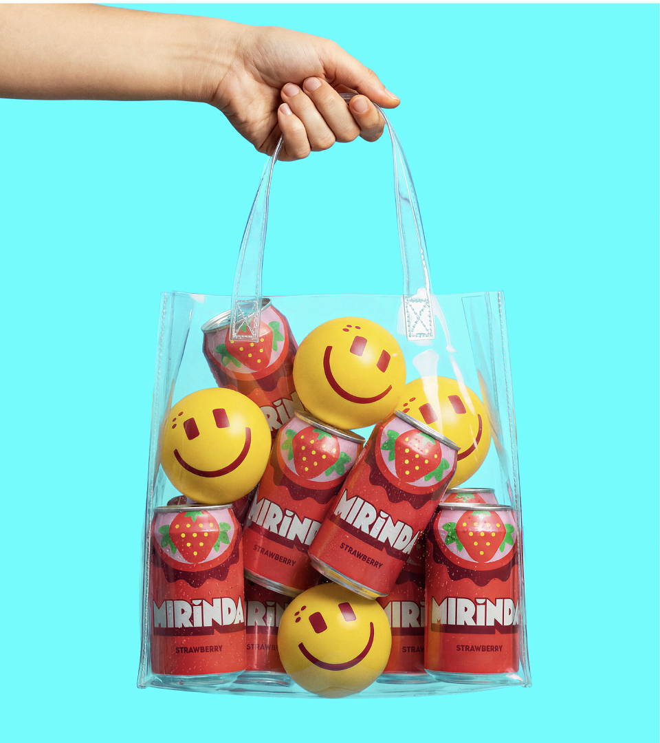
We saw an opportunity to redefine MIRINDA® on its own terms. In a visually crowded category, we wanted to move beyond traditional brand assets and focus on a more ownable approach. Fan feedback showed that while the MIRINDA® look had room to grow in consistency, its name and energy still resonated. Rather than competing on logo or color alone, we focused on flavor as the most distinctive and recognizable brand asset. Integrating into the brand’s “Smiles” platform, the new look sets MIRINDA® apart and creates grins at first glance.
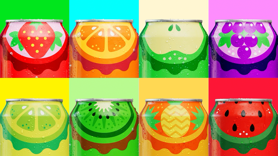
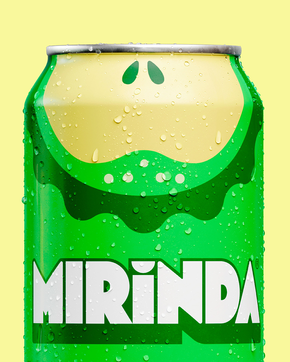
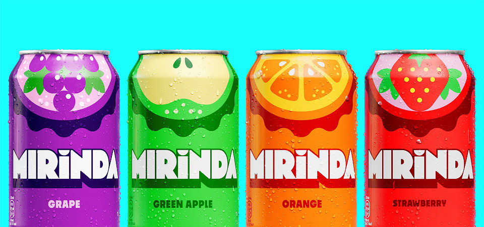
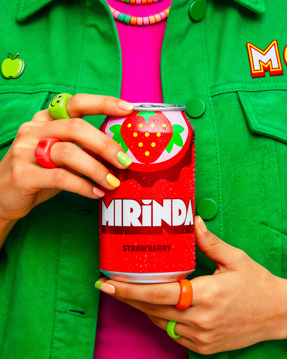
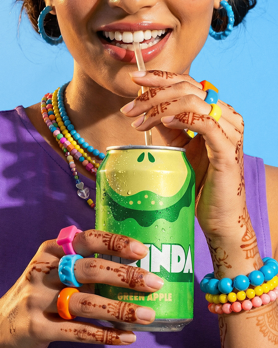
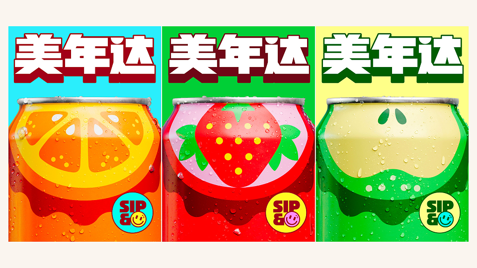
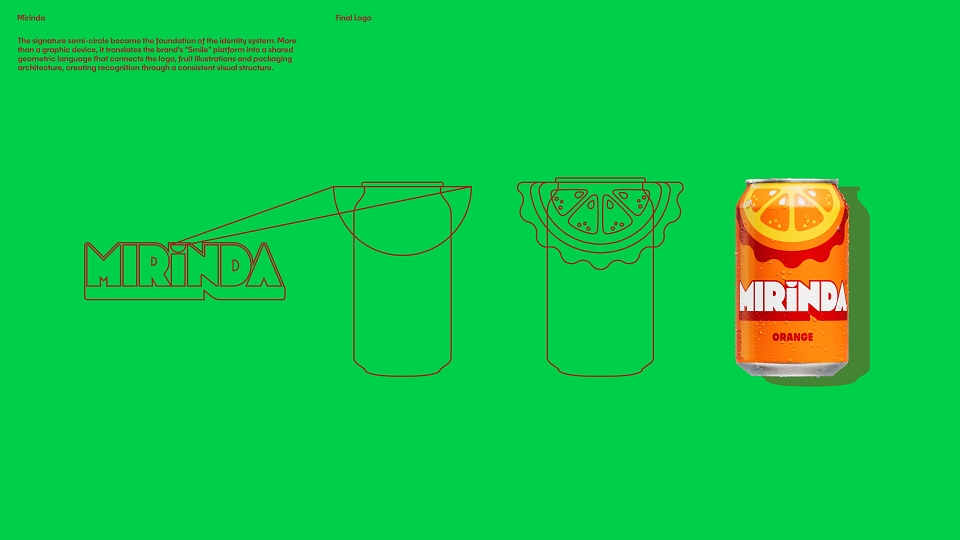
We built the system around playful, simplified fruit forms that communicate flavor instantly. Each fruit is rendered in oversized, graphic shapes, preserving its most recognizable features while removing unnecessary detail. Crowning each can and label, these graphics create a distinctive and consistent asset across variants. Built from semi-circles, they echo the uplift of a smile, reinforcing the brand’s platform, and establish an unmistakable visual language.
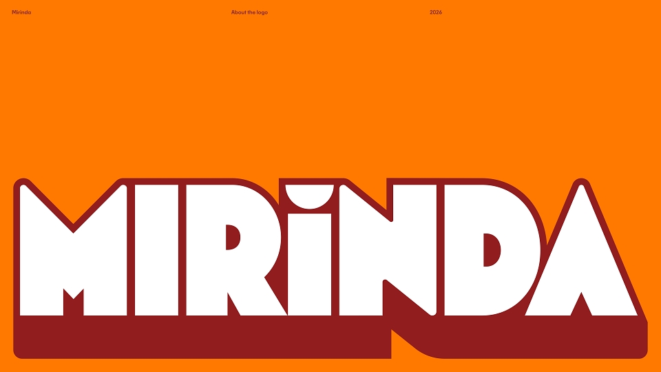
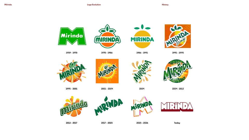
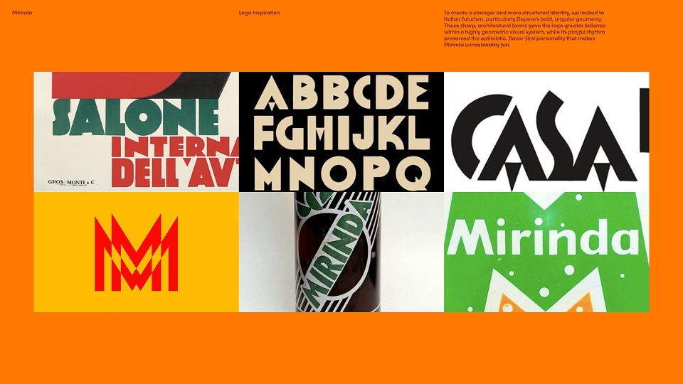
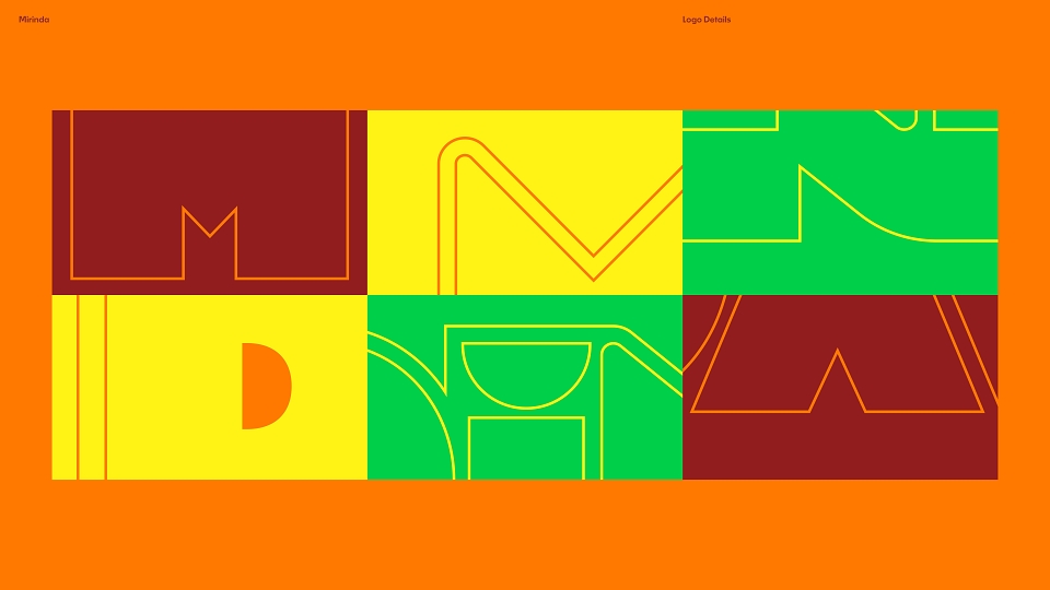
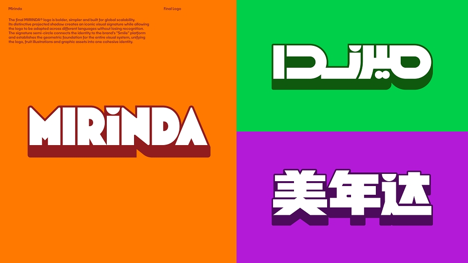
Color plays a central role. Saturated tones define each variant, amplifying flavor differentiation while maintaining cohesion across the system. High contrast between fruit, background, and pack structure boosts visibility and stand-out on shelf. Rounded shapes and expressive layouts draw from the brand’s heritage, informing a refreshed logo reimagined with a fresh, youthful energy that pops. Every detail was designed for clarity, speed, and expansion across markets.
As the new identity rolls out globally, early feedback signals strong progress. The system improves visibility at point of sale and creates clearer differentiation between flavors. Its simplified, modular design allows the brand to work faster, increasing recognition while reducing visual clutter. It also enables more efficient rollout across markets, improving consistency and ease of execution. Most importantly, the new identity positions MIRINDA® to connect with younger audiences through a more contemporary, expressive, and flavor-led presence.
With a vibrant and flavor-first identity, MIRINDA® cuts through clutter and is ready to connect with a new generation.
MADEIT CREDITS
Annual 2026 SilverMirinda Global Restage 2026Packaging
Annual 2026 SilverMirinda Global Restage 2026Branding
Project featured: on 5th July 2026