PB Creative
London
ABOUT
CONTEXT + OBJECTIVE
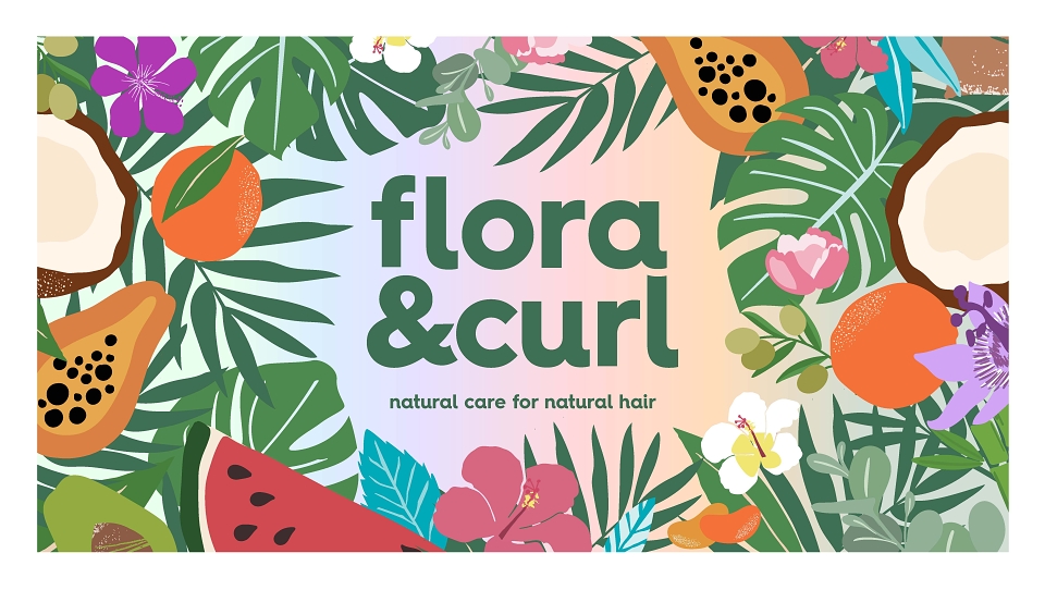
This is Flora & Curl.
A sustainable curl care brand, powered by plants.
Their mission is to be the most popular plant-powered hair care brand for healthy textured hair.
Following her own struggles with complicated hair care routines, founder Rose Ovenshi launched Flora & Curl in 2017 to simplify and demystify the world of textured hair care. She successfully moved the business out of her mum’s kitchen and onto the high street but needed support helping the brand grow, reach new audiences and secure new listings
PB Creative was approached to help establish Flora & Curl as a modern & accessible luxury brand whilst also better communicating their eco-friendly commitments and values.
CREATIVE IDEA + EXECUTION
We based Flora & Curl’s new visual identity around a widely shared consumer truth: curls need care. The relationship between a person and their curls can be complex. It just isn’t enough for brands to be functional in this category, leaving space for a reliable, trustworthy companion. The creative idea driving this project, Curl’s Best Friend, encompasses the product truth – being a beautifully simple, naturally-derived regime for all curls, coils and waves – but also a category need; to simplify curl care so it can be joyful, not stressful.
There’s no attempt to be the ‘scientific expert’ voice here.
Natural curls thrive with natural care.
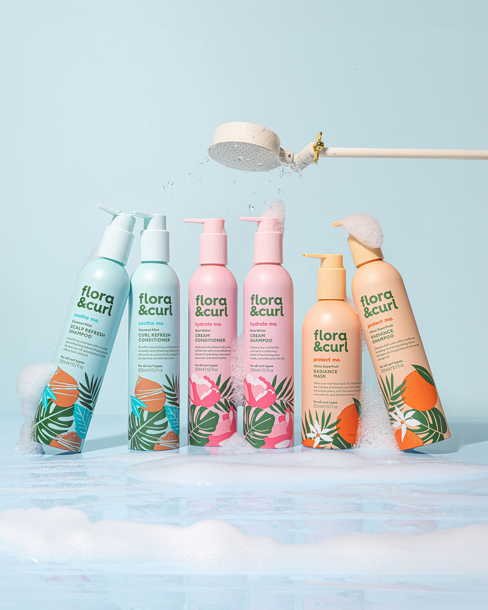
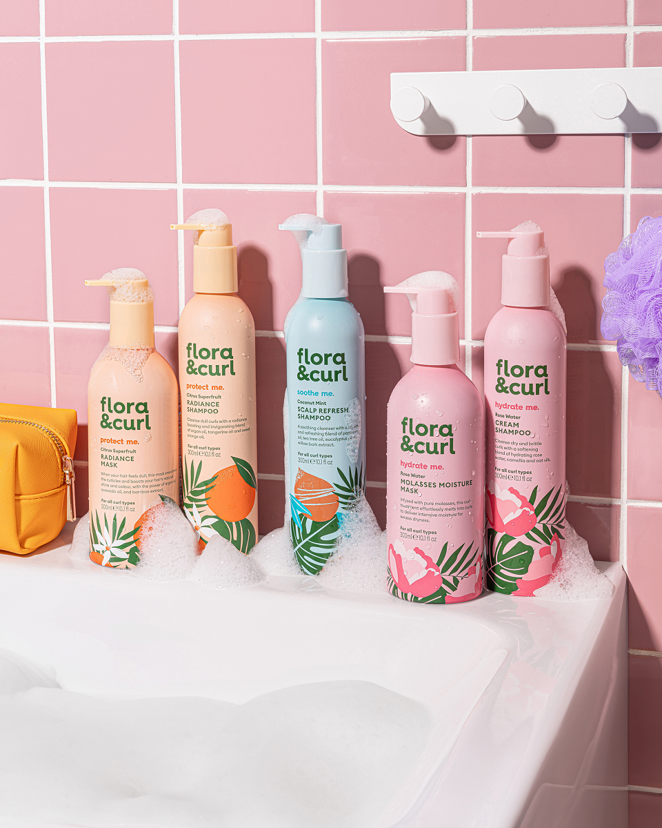
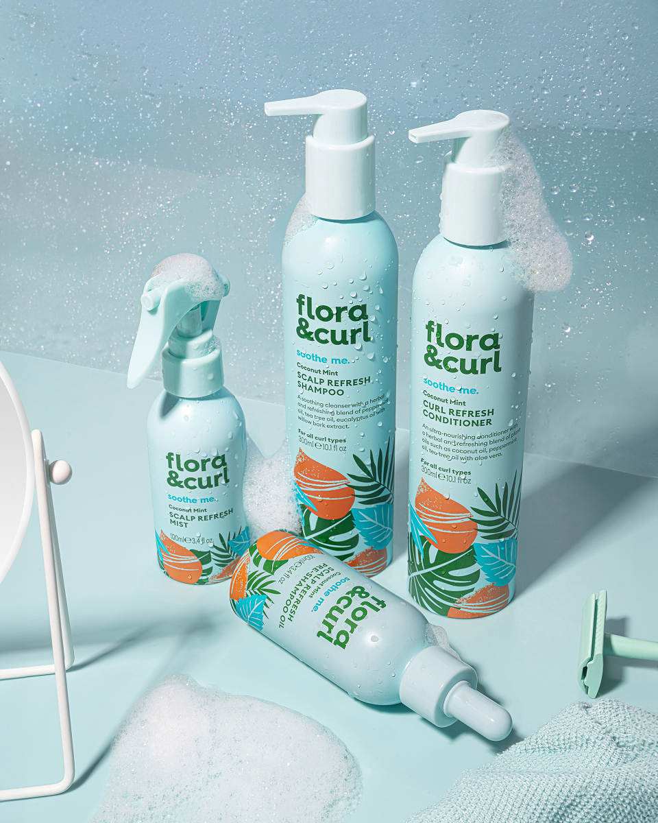
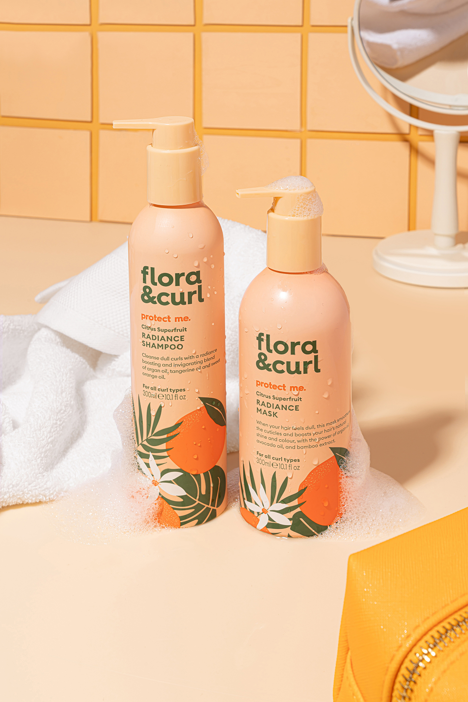
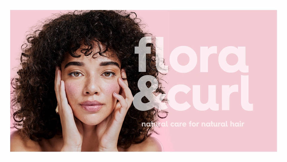
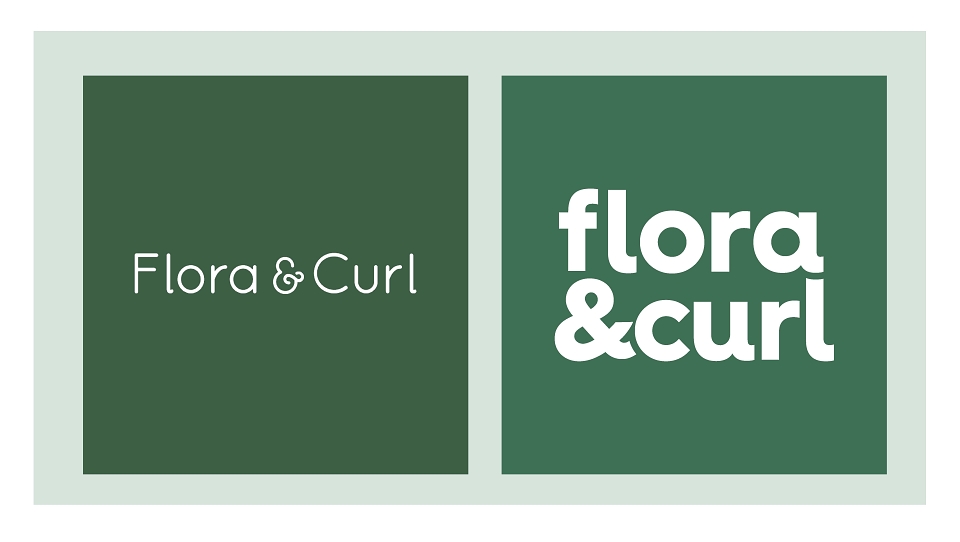
Our evolved new brand mark for Flora & Curl embodies the core product truth - we’re both a friend to your hair, and a friend to the planet. In its beautifully simple rounded form, it recalls the curl definition while suggesting a harmonious, uncomplicated relationship between our consumers and their hair. By owning this bold confident leaf green brand colour, we’ve cued ‘naturals’ without relying on clichés.
The use of a much more paired-back illustration style (inspired by graphic trends) mirrors the simple efficacy of our ingredients and the uncomplicated nature of the regime.
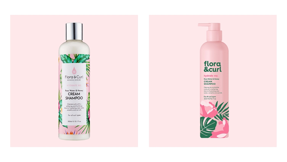
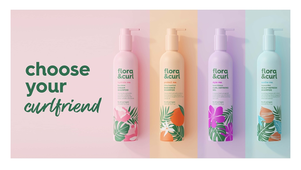
By using gentle pastels as key variant colours, we departed from the previous design’s colder, more expert use of white and aligned with the macro trend for friendlier use of colour, Dopamine Beauty. Using joyful colour drenching for each variant, we lifted Flora & Curl into a more soothing space that would resonate with Gen Z.
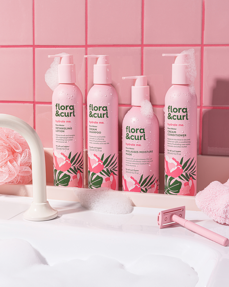
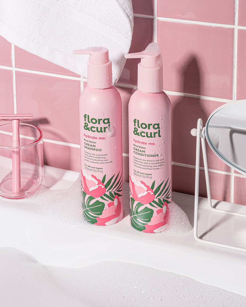
Our updated pack design brings joy to the brand story and reinforces the products efficacy through beautifully contemporary use of colour, ingredient illustration, messaging and layout. As part of the brand’s commitment to sustainability this rebrand saw the packs move from plastic bottles to aluminium, using 90% less plastic.
To maximise shelf stand-out we decluttered the pack and applied captivating colour-drenching across all of our variants. By using key benefits like ‘Hydrate Me’, we pull out the end result in a conversational way that gets to the point. With so many expert claims in this category, it was important to cut through this noise. Baking this TOV across the brand positioned the brand as a companion to your curls.
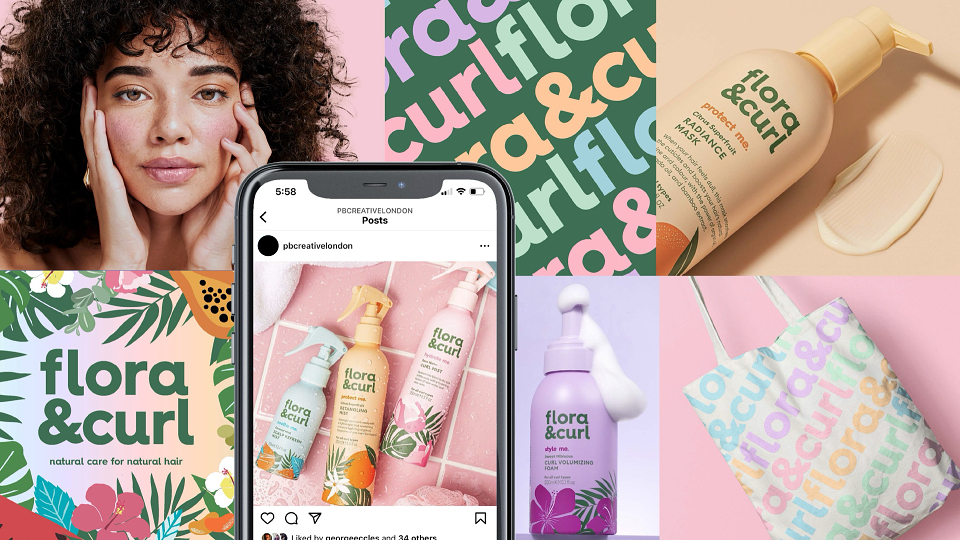
The Flora & Curl brand world embodies both the sustainable, natural-ingredient proposition, and its role as a companion for curly hair. Looking to lifestyle and beauty brands with cultural influence, everything from the product photography to social media style has now been rooted in the brand’s purpose; to be an uplifting companion that champions natural beauty through natural care.
OUTPUT
Since the redesign Flora & Curl has successfully launched inn 900 Boots locations up and down the UK and their D2C channel continues to flourish,