PB Creative
London
ABOUT
The UK's number one hand wash brand Carex has celebrated it's 25th anniversary with a portfolio refresh by award winning, brand design agency PB Creative.
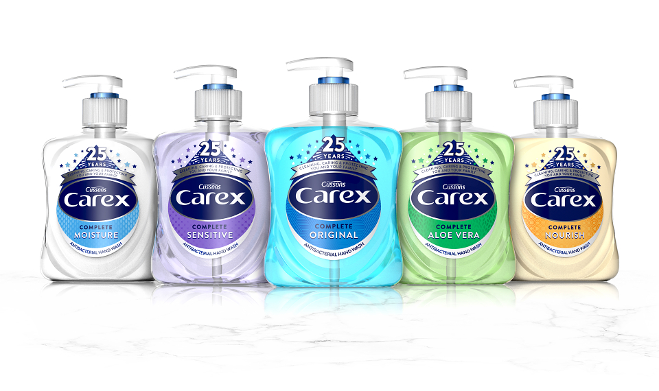
PB Creative was tasked with defining a core brand message and bringing balance and unity to the packaging portfolio. The team worked closely with Carex to reappraise the brand and create a strong core aesthetic that could stretch and flex across each of the different tiers.
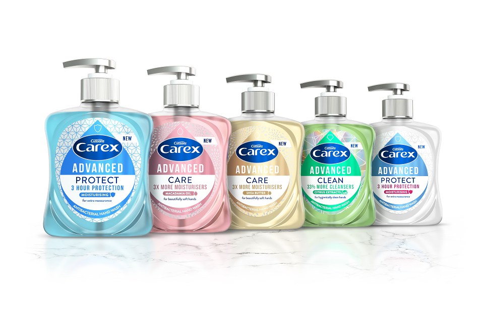
To achieve this the agency developed an iconic droplet device to reflect Carex's USP as the leading anti-bacterial hand wash brand, and create synergy across the Core, Fun Editions and newly developed Advanced ranges. The new design encapsulated the core brand message - 'Cleaning, Care & Protecting' - and also allowed for scope for future growth.
PB Creative Co-founder Pete Hayes said: "The biggest challenge was to deliver unity. We needed to champion the different aesthetic shifts and personalities that exist within the Carex family, while consolidating the range with a consistent brand look and feel. We were keen to move Carex into a more contemporary area. We began at the brand's heartland - with the five SKUs that form the foundation of the Core Carex range. We created the iconic droplet structure as the key ownable brand equity, delivering clarity and coherency to the messaging hierachy which was then developed across the other tiers."
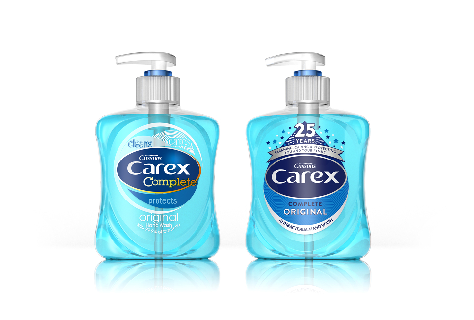
The brandmark itself was also given a subtle refresh, moving to a more single-minded solid background colour, delivering iconicity and standout at shelf. It was essential that the new 2D droplet execution complemented the established 3D equity.
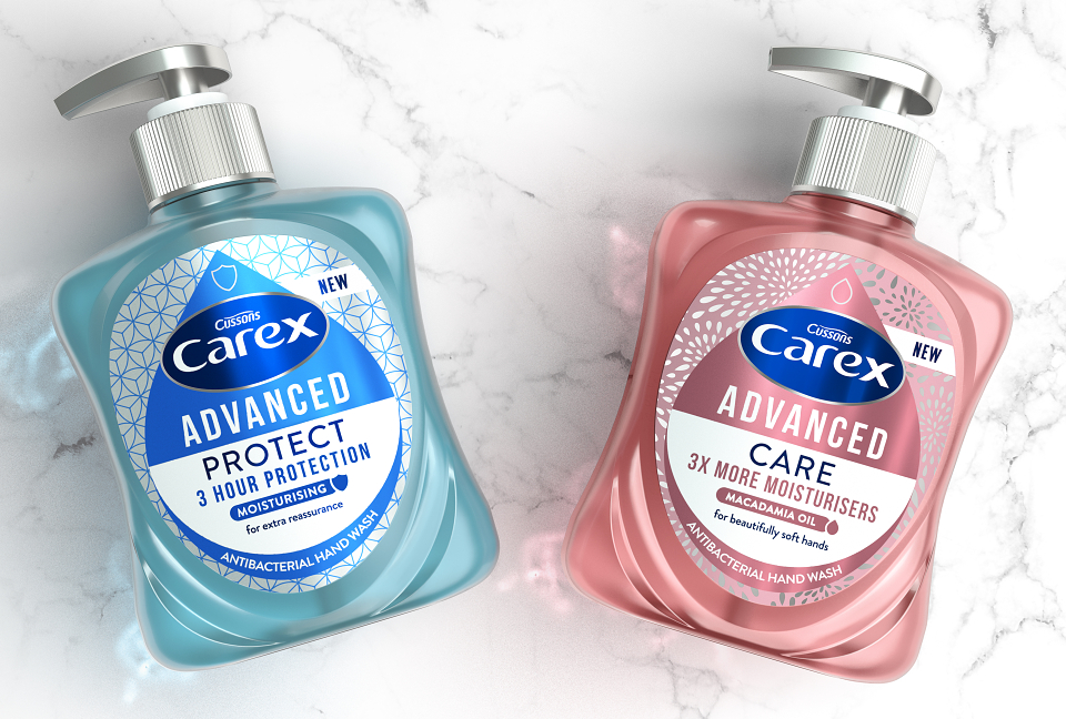
The new Advanced range further leverages the droplet, employing a pearlescent, semi transparent bottle finish. Silver pumps and a metallic label substrate deliver a more premium proposition.
Contemporary graphic textures reinforce each product's efficacy - a floral design denotes 'Care'; diamond geometrics 'Clean'; and the structured hexagonal backdrop 'Protect.'
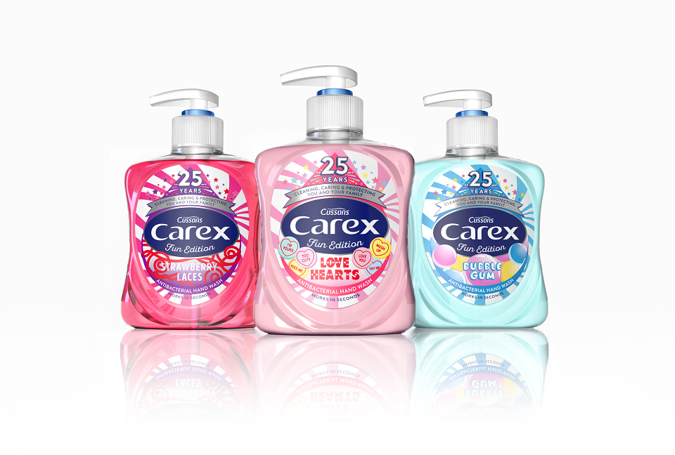
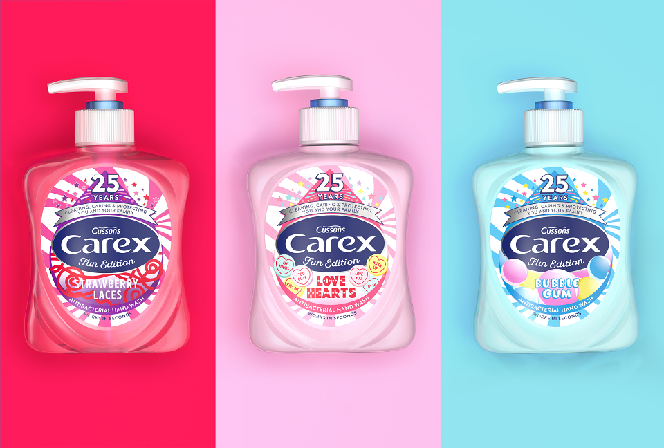
The droplet core asset remains consistent across the Fun Editions tier also but with the playfulness of each variant 'dialled up' to reflect the enticing 'flavours' including Bubble Gum, Strawberry Laces and Love Hearts.
Carex Global Head of Brand, Ian Henderson commented: "We're really passionate about the new design - the droplet stands for Carex now. PB Creative has delivered against a challenging brief, bringing together different personalities in a unified and iconic way, while maintaining the existing usual qualities of the brand. We are proud to have been category leader for 25 years - the new design reflects our brand strengths supported with a clear and cohesive range hierachy."
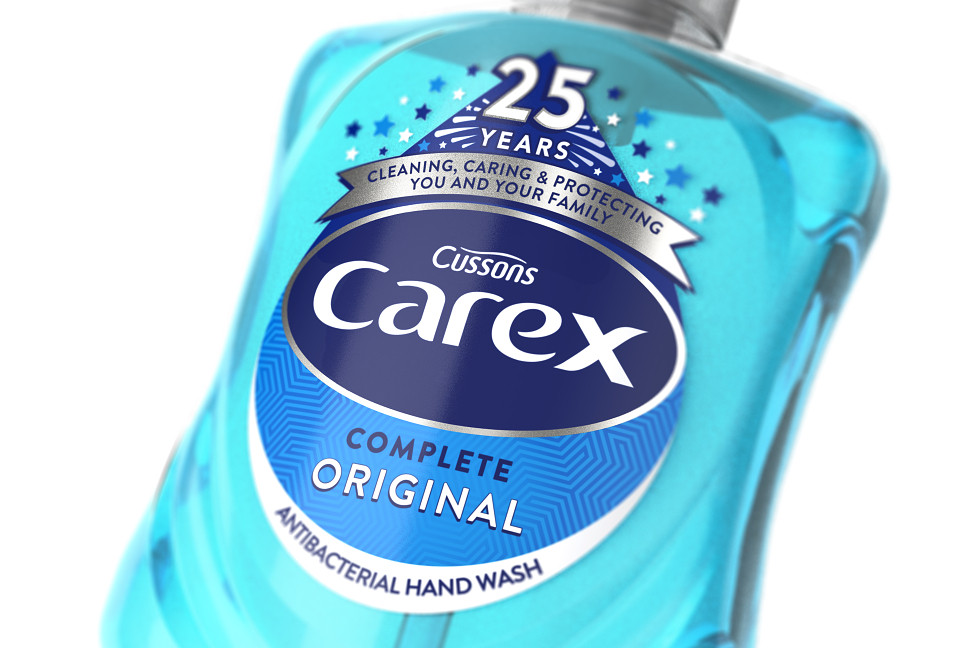
The celebratory '25 year' banner will remain on pack for up to six months following the nationwide roll out.