Paul Mackay
Graphic Designer
ABOUT
We Love Our Planet (WLOP) was the idea of a successful reusable bag company couple. They were looking for an online social media that allowed like-minded, environment-conscious people that were concerned for the overall treatment of animals throughout the world, to connect with each other.
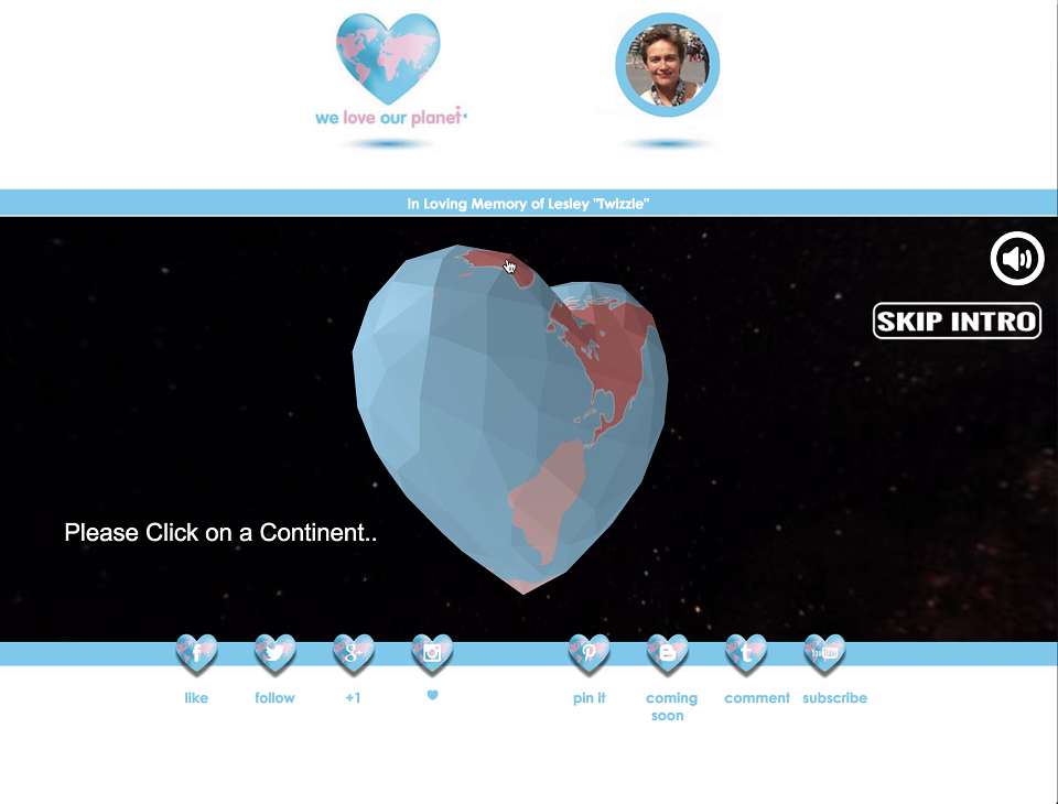
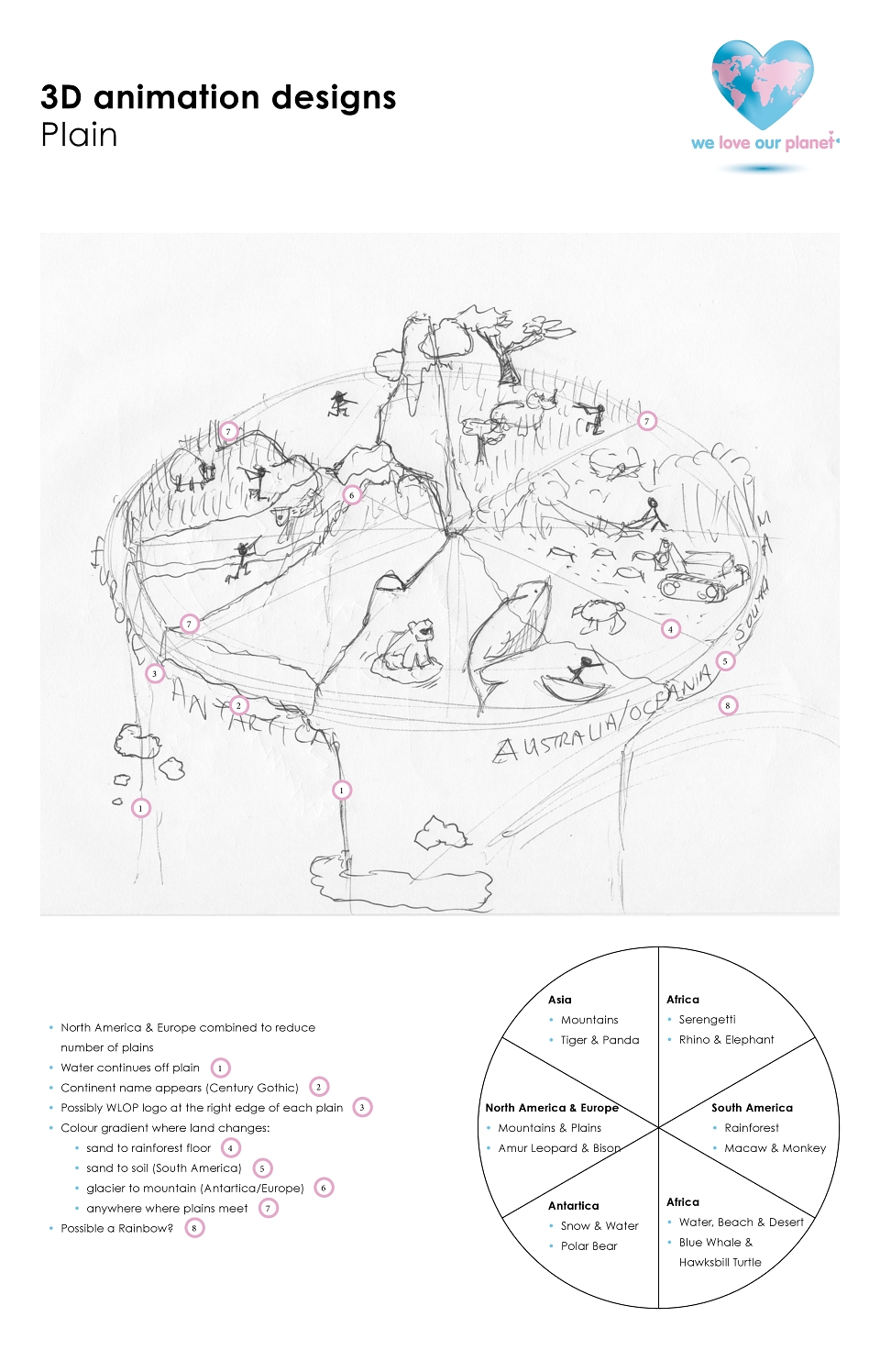
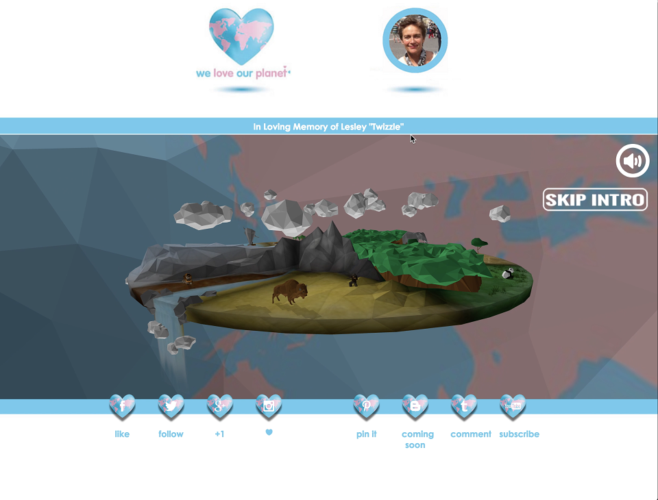
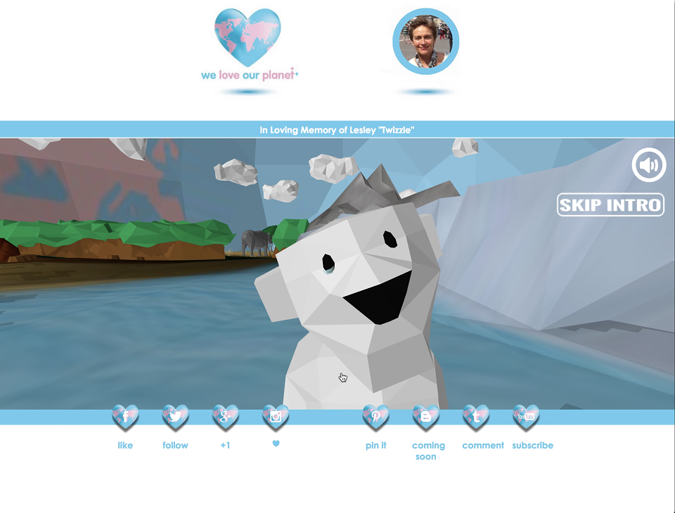
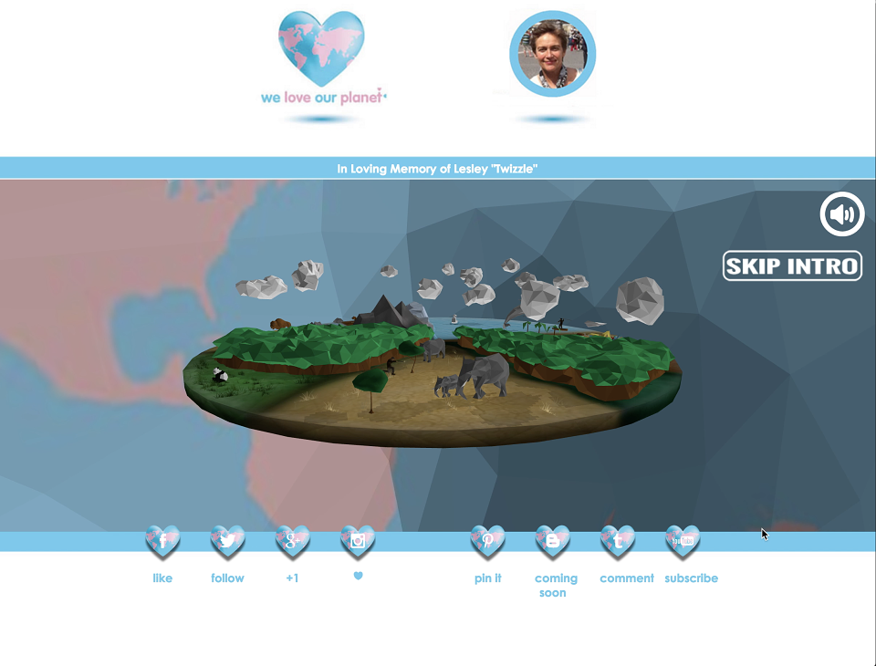
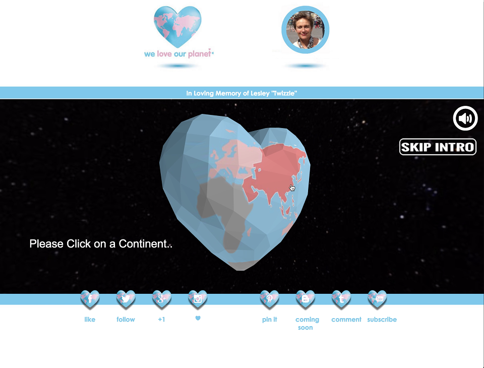
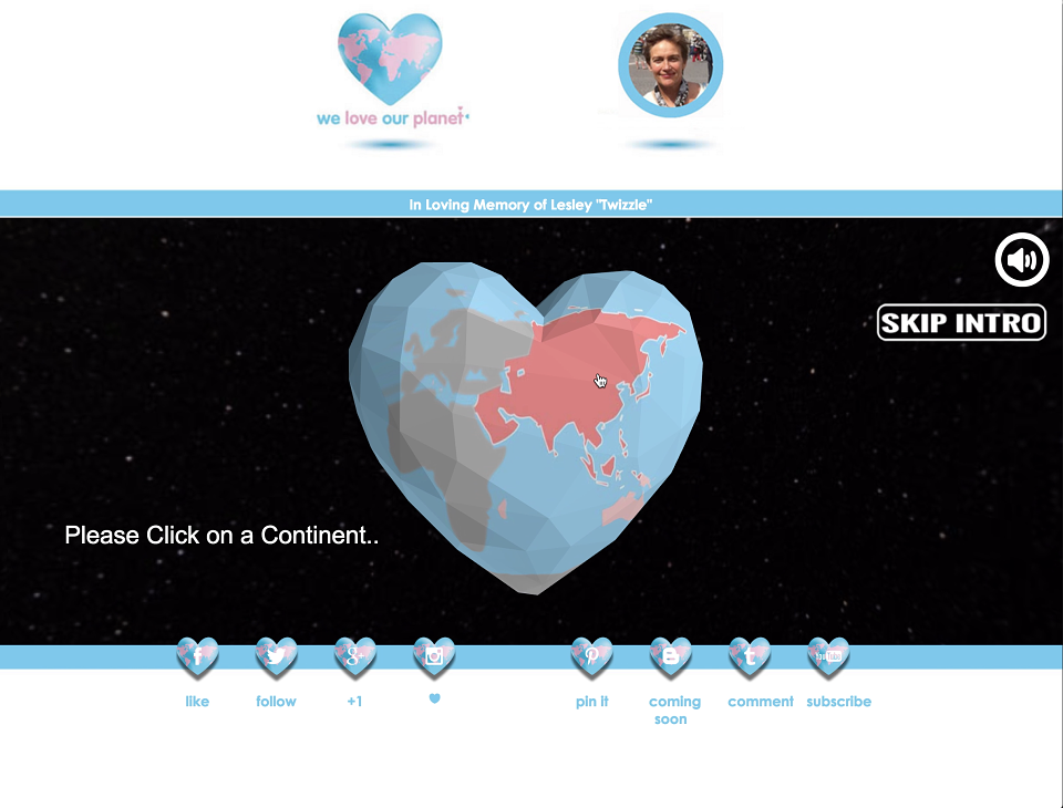
Project Management: I was tasked with the running of this project. I worked closely with each individual involved in delivering on the brief. With the Developer and WebGL animator we set about creating the initial environment that the client was looking for. A 3D, interactive spinning globe with animations throughout was one of the biggest tasks to achieve.
Video-Editing: These short videos were put together using iMovie to showcase the work We Love Our Planet was trying to do and the resources in place for achieving this. Visit the clips at the Flytrap Design YouTube Channel.
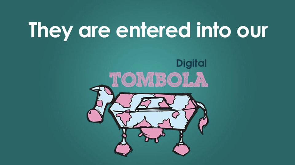
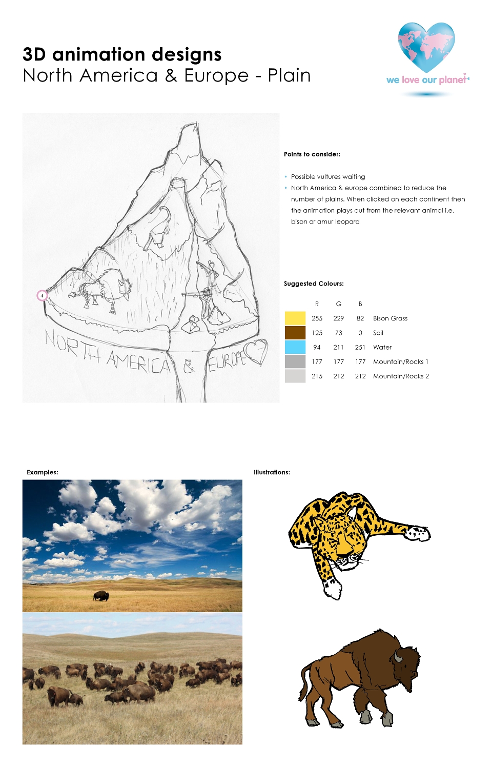
Designs & Illustrations: I created the illustrations using hand drawn, scanning, illustrator and PhotoShop techniques. Each of the Endangered species were illustrated. The approach of the illustrations were to be friendly and fun. We didn't want the community interest service to seem stiff and an effort.
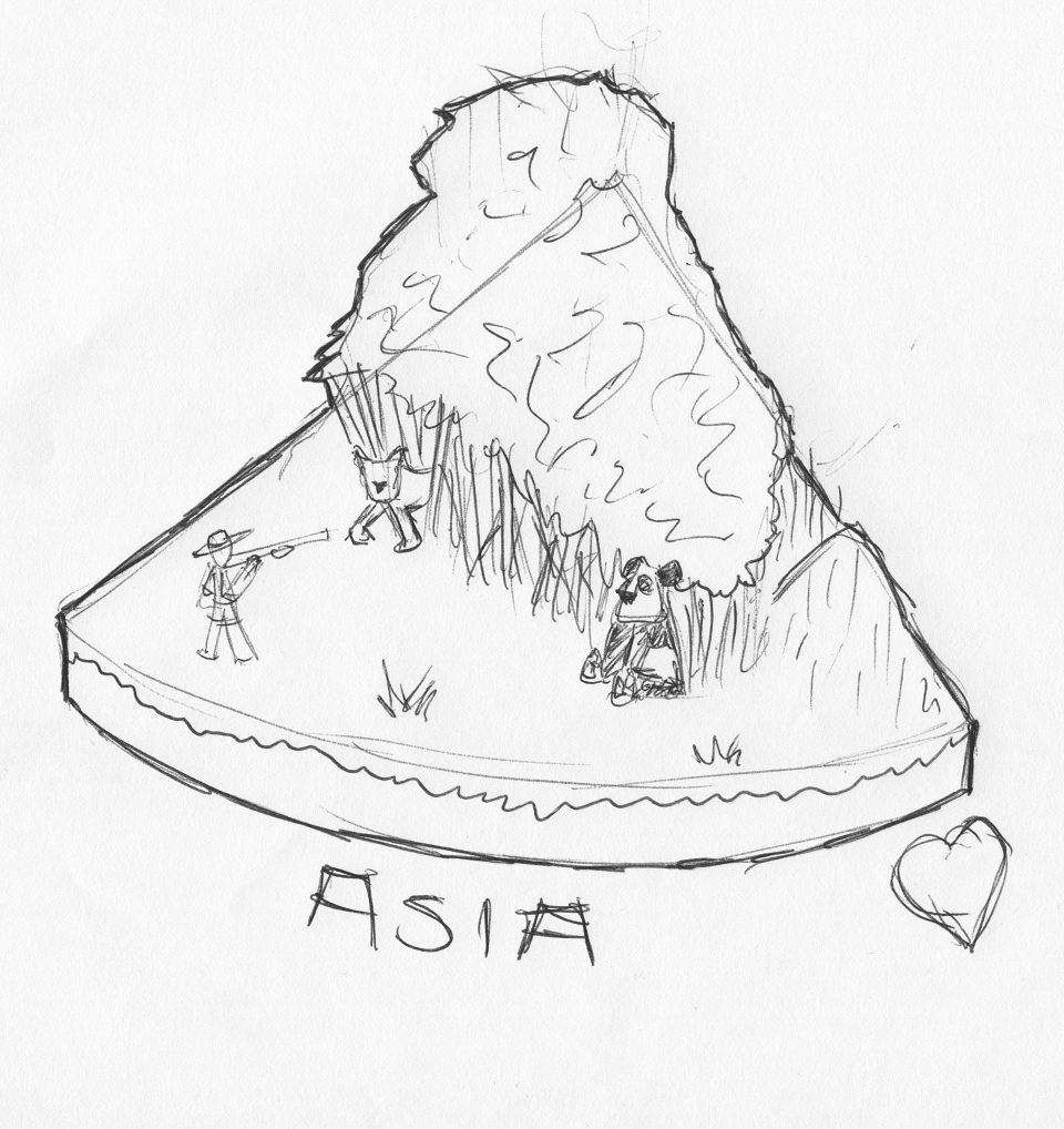
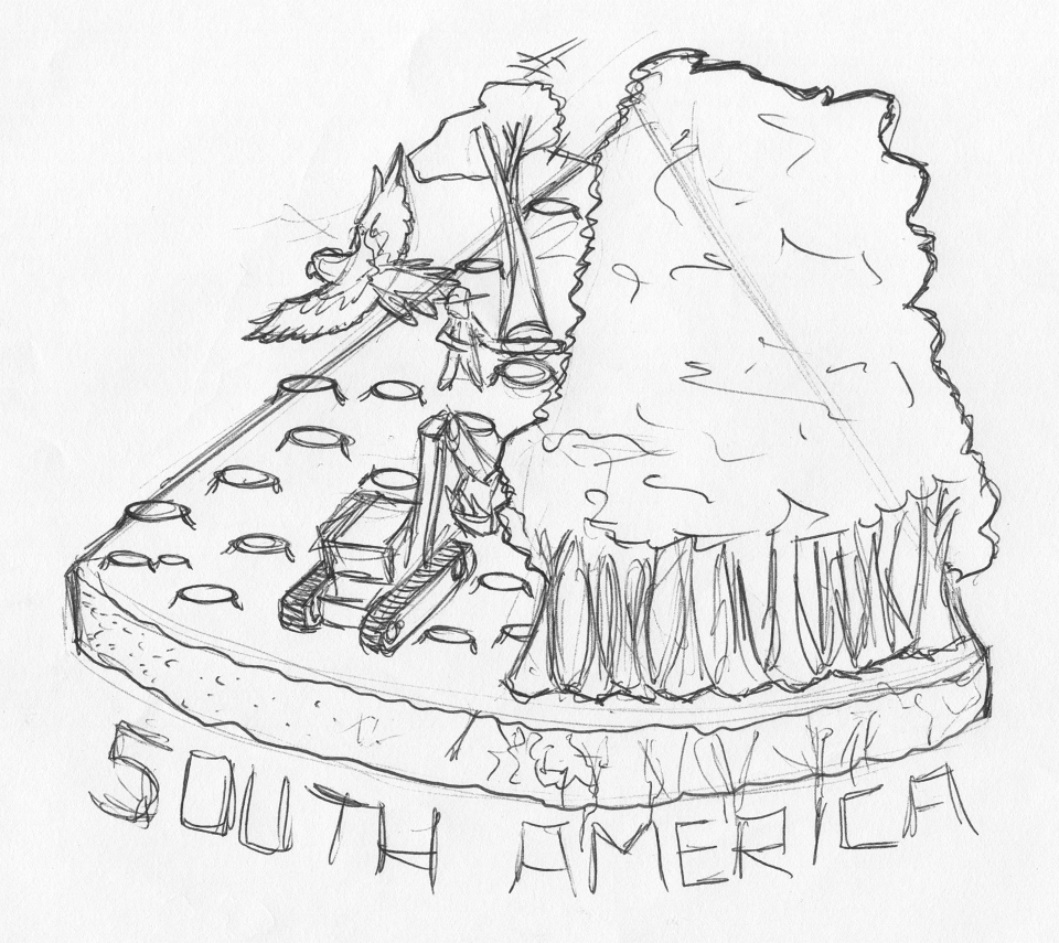
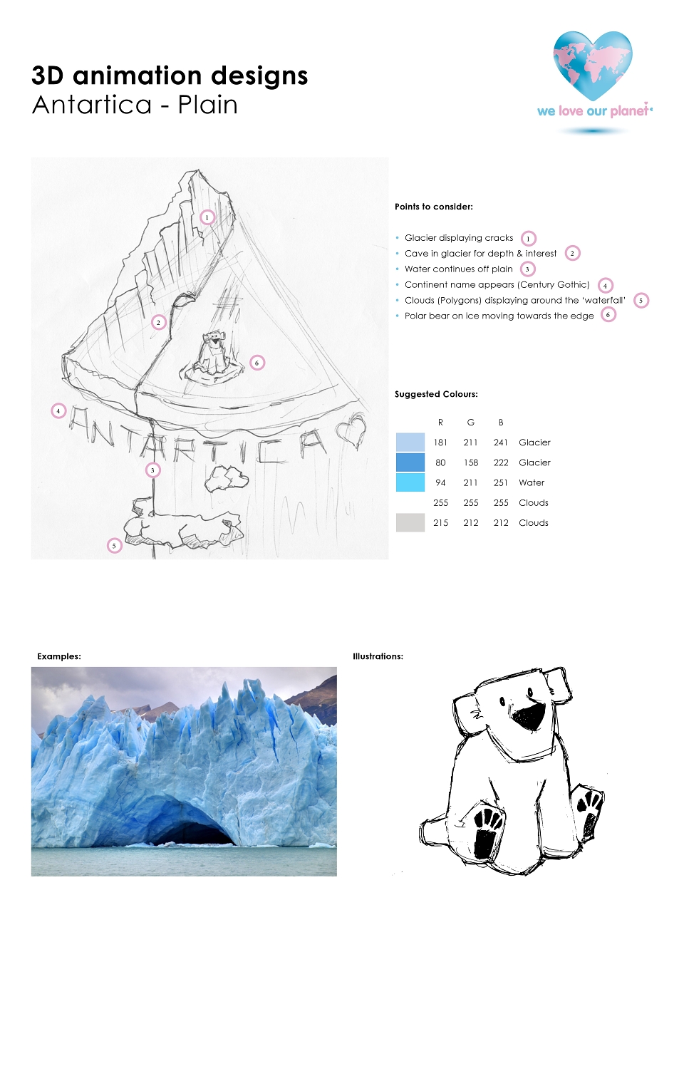
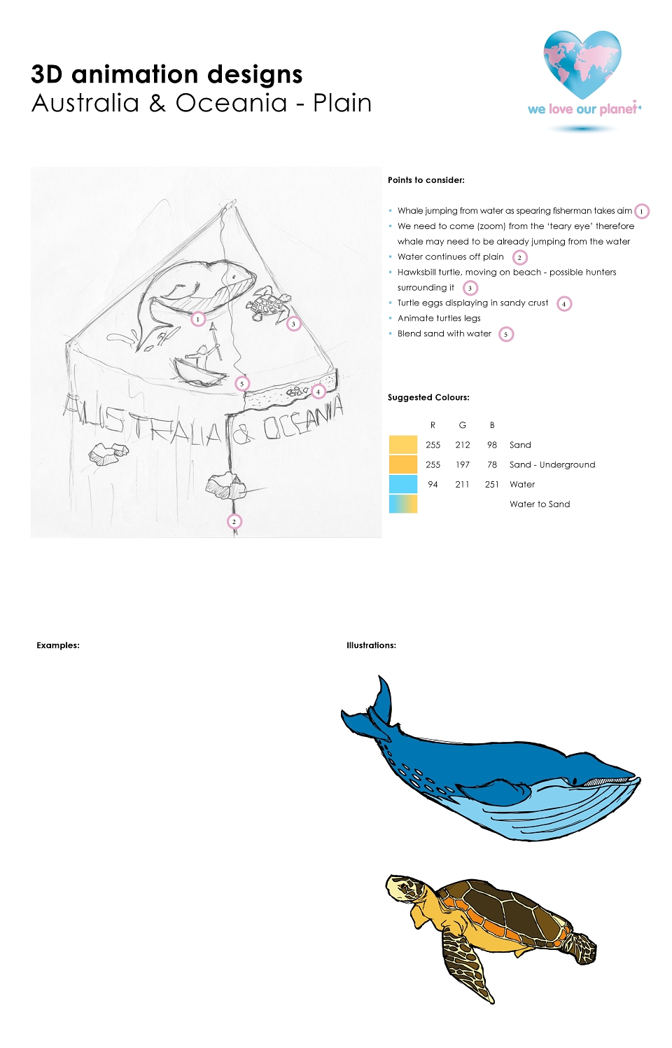
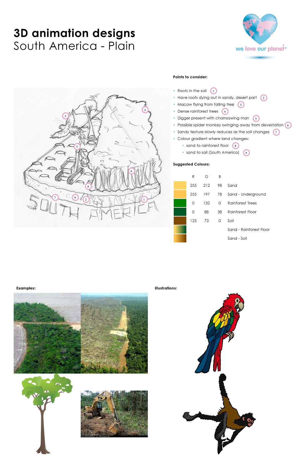
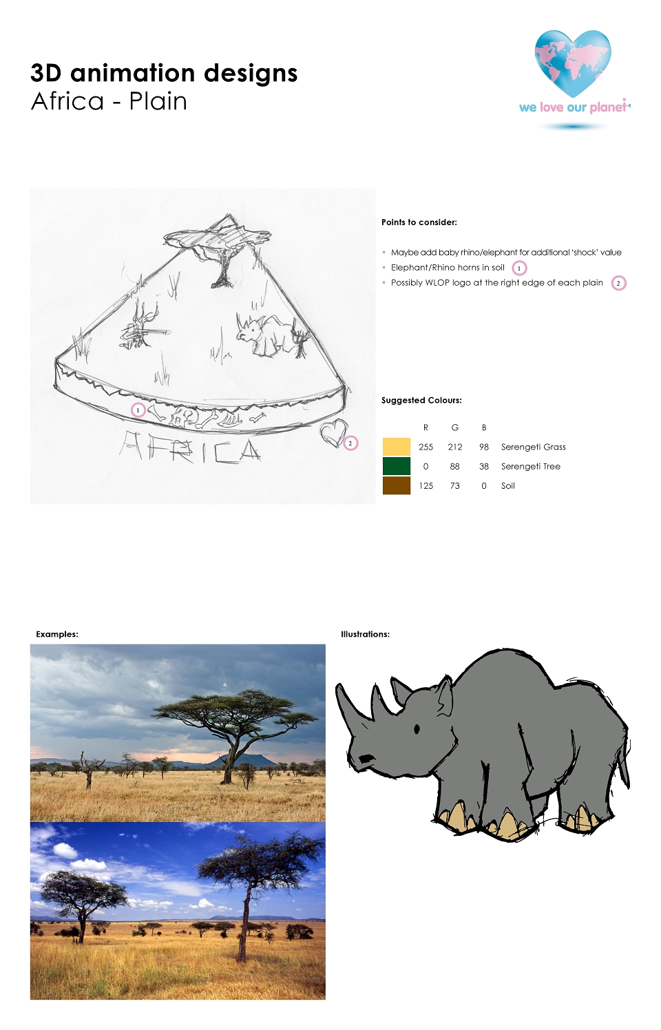
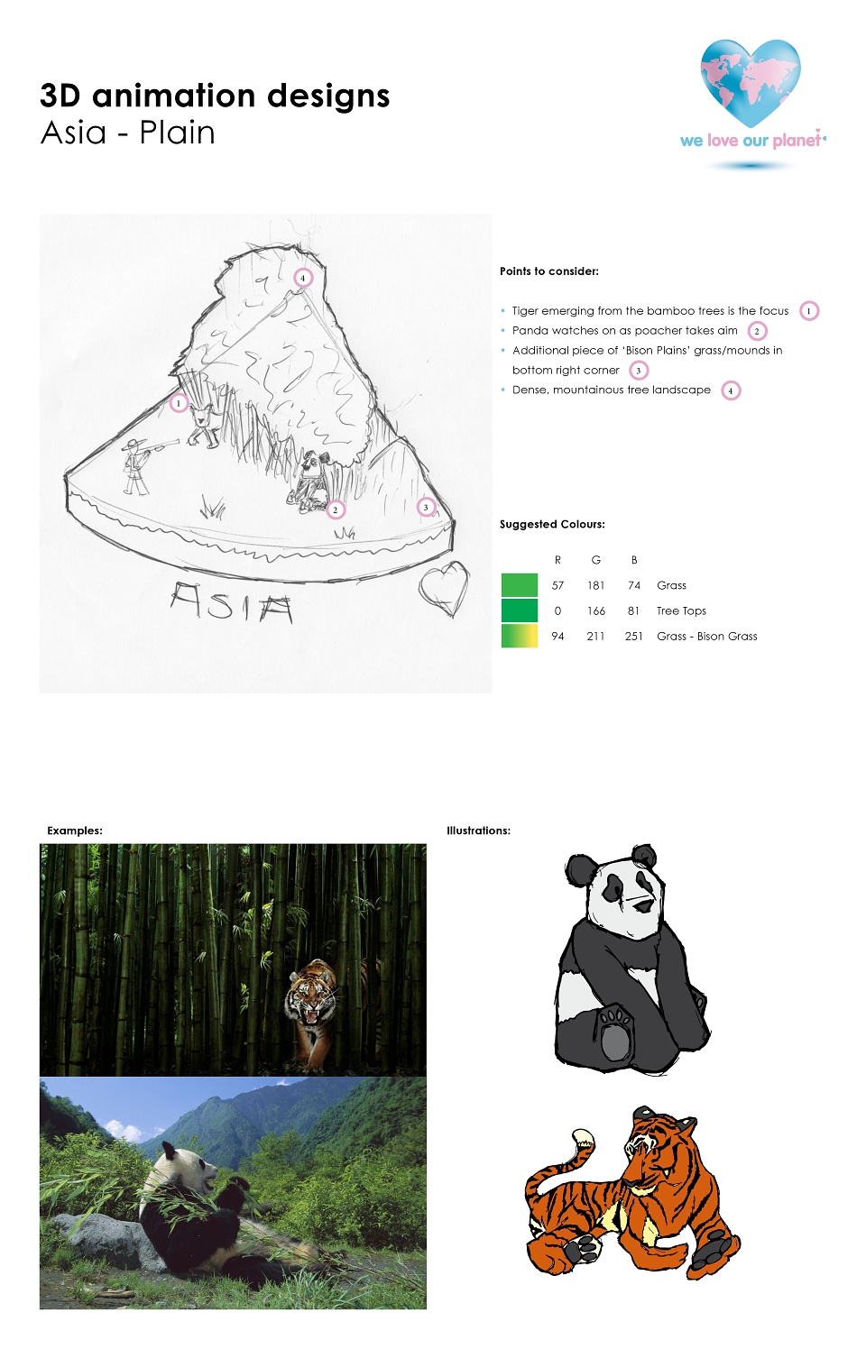
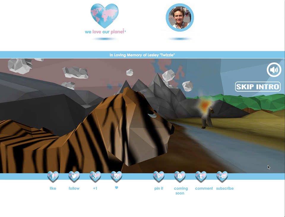
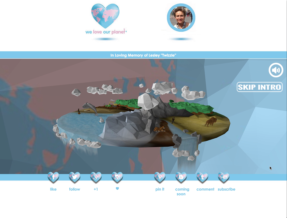
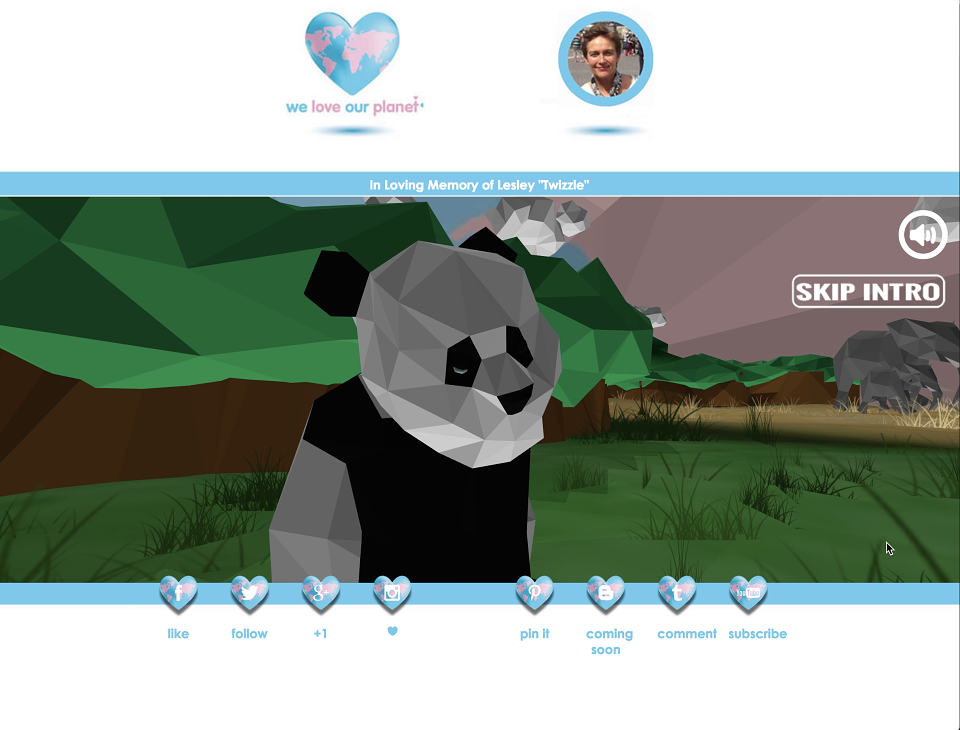
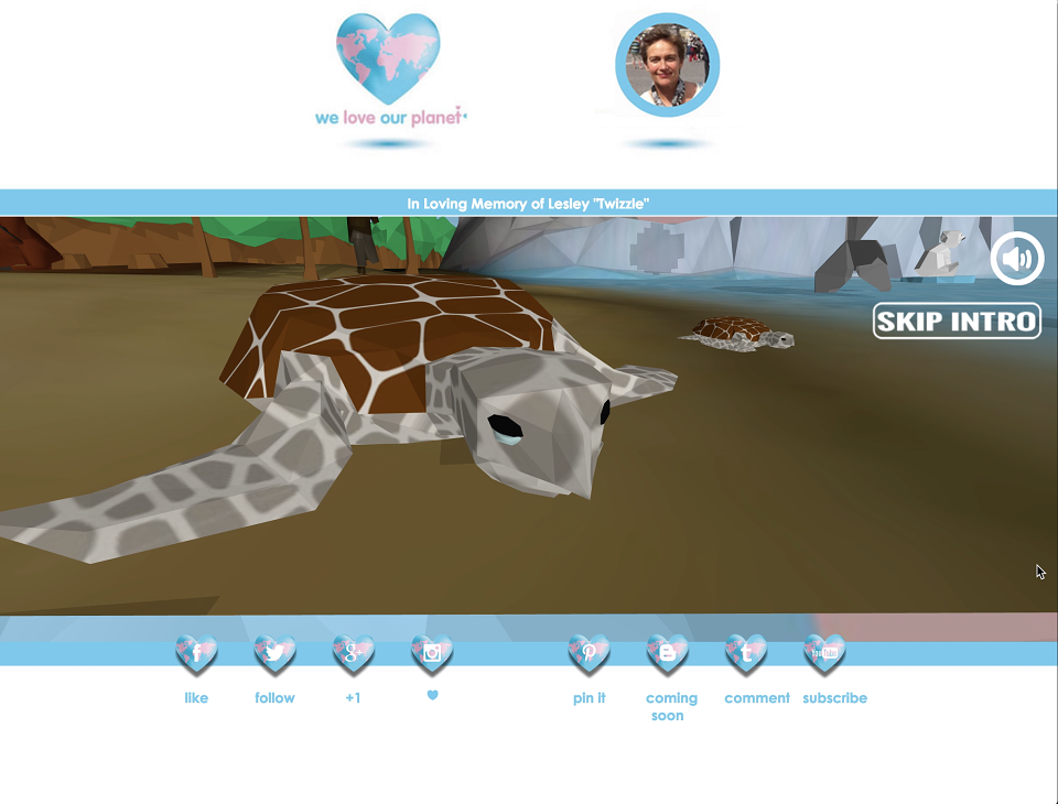
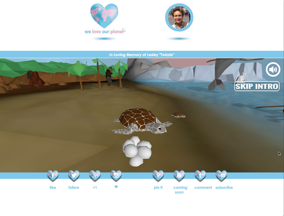
Concept Art & 3D Animation: Whilst working with the extremely talented WebGL animator. I sketched the concept art and displayed mood boards so the animator knew the exact art direction and therefore could make efficient use of his time. The end result was incredible and can be viewed on the YouTube Channel - Flytrap Design.
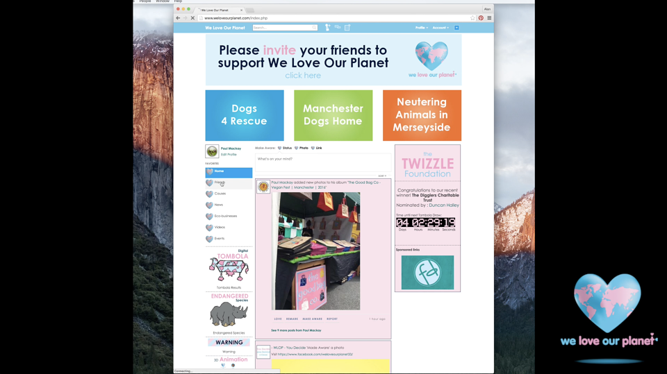
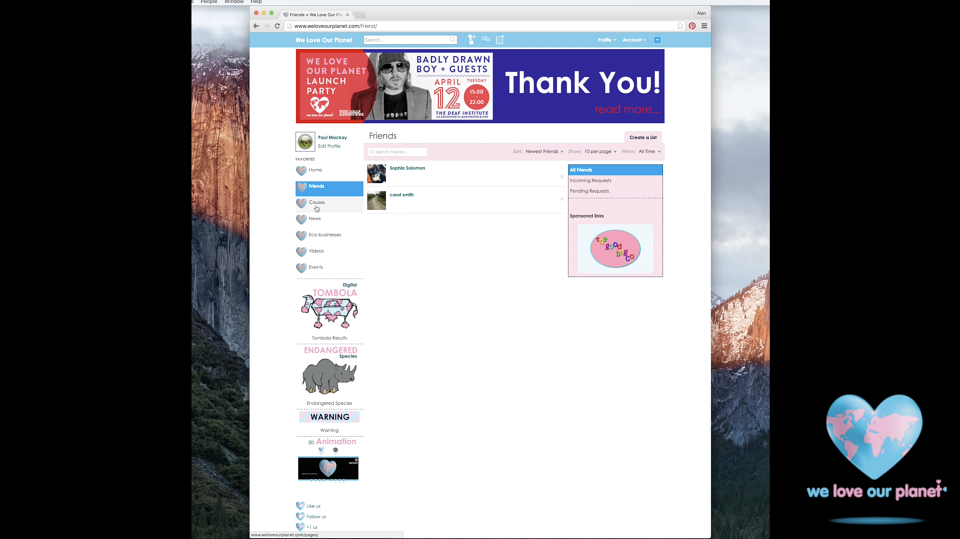
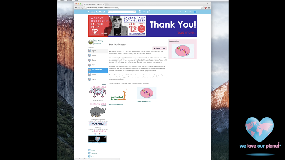
Web Design: This was the biggest hurdle as knowing the extensive workload involved in creating a social media website from scratch. Therefore locating a template website, of an older version of a popular social media was the viable solution to our issue. So by consulting with the Client, drawing up designs, discussing with the knowledgeable Developer, finalising the look and feel and then developing, we achieved a great amount with such a challenge. The website can be seen on our YouTube Channel: Flytrap Design.
Logo & Branding: The Client already had a strong vision on what he was looking for, which made the brief a refreshing challenge. The logo outcome was beautiful, approachable and strong at the same time. We wanted to keep this approach going by introducing vibrant coloured versions to compliment and contrast, the pastels, specifically the WLOP baby pink and baby blue. These different colour sets were also used to display strong and more relaxed messages to the end user. Against the strong white backdrops, these illustrations and designs worked, achieving a fun and friendly environment with a strong message edge.