Paul Atchison
Freelance Brand designer
ABOUT
The Goal
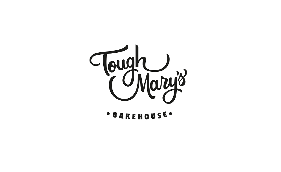
Operating a successful artisan bakehouse in a highly competitive food and drink sector means your visual identity needs to make an impact instantly. The goal was to build a comprehensive brand identity and a distinct logo mark that captured the bakery’s independent, energetic personality, while giving them a polished and established presence that sets them apart from standard high-street bakers.
What I Did
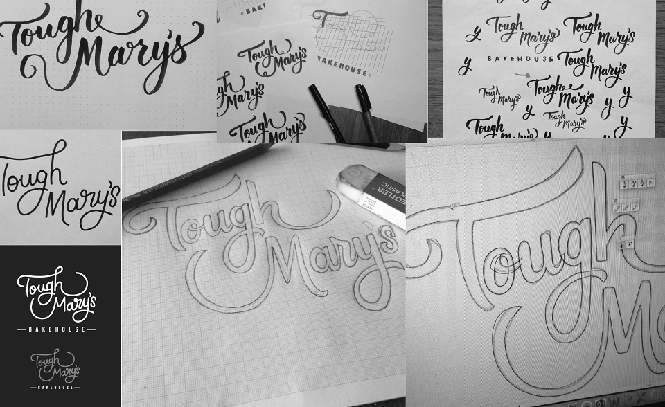
I developed a versatile brand identity system centered around a bold, custom typographic logo mark. The lettering balances a subtle mid-century heritage feel with clean, modern design elements, ensuring the identity feels timeless but contemporary.
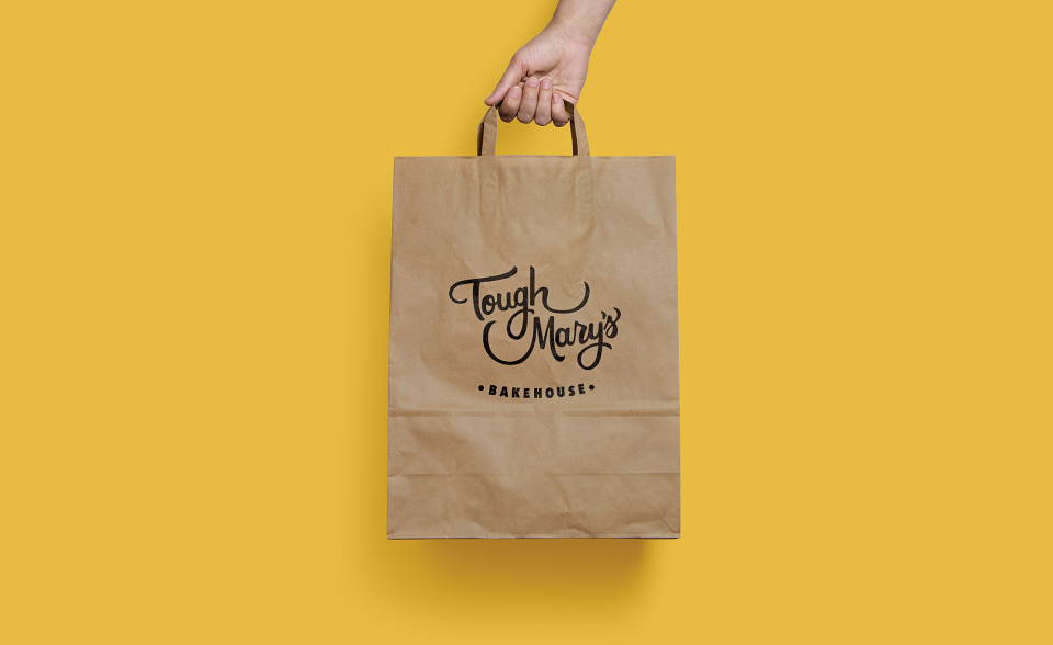
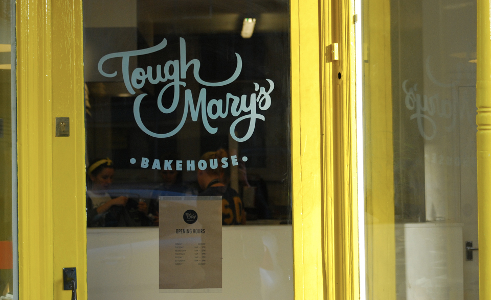
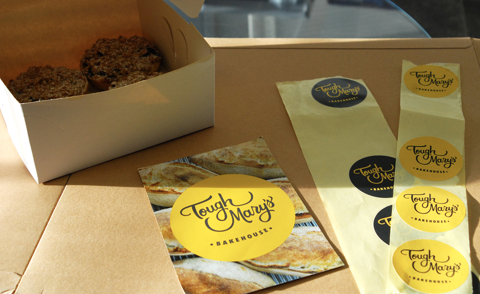
Once the primary logo mark was locked in, I built out a cohesive visual system designed to work across a huge range of real-world touchpoints. While this system naturally scaled onto secondary packaging layouts like takeaway bags, product stamps, and pricing labels, the primary focus was ensuring the core brand mark retained absolute visual clarity and strength whether viewed on a tiny social media icon or blown up across the physical bakery space.
The Result
The new brand identity gave the bakehouse a commanding, instantly recognizable visual presence. It successfully bridges the gap between raw, independent character and premium design professionalism, ensuring their visual mark looks just as refined and crafted as the products they bake every day.
MADEIT CREDITS
-

Paul AtchisonFreelance Brand designer