Paul Andrew
Brand Designer
ABOUT
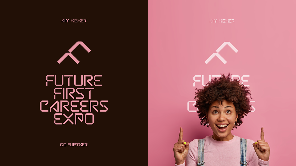
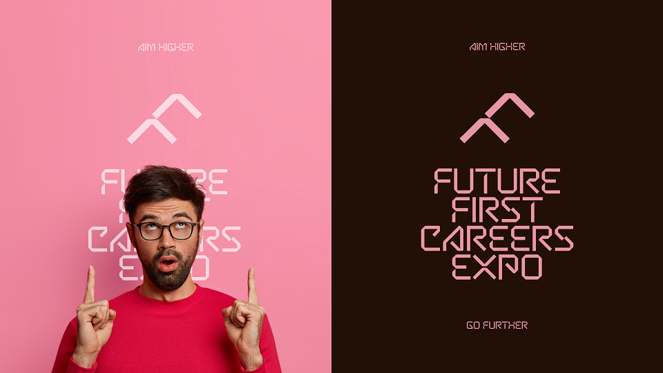
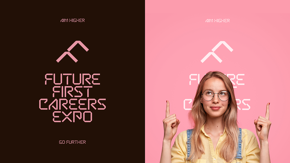
This concept was one of two presented as part of a brand development project for Future First — a careers expo for students from schools in and around the Nottinghamshire area.
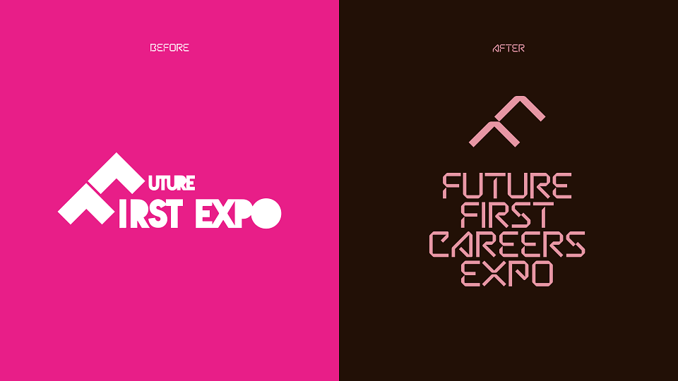
As the original logo had already been established locally for some time, it seemed necessary to retain some of that brand recognition and keep certain elements of the design, but evolve and update them to something that communicates more effectively to the students who attend, as well as the local businesses who exhibit at the expo.
Reintroducing the "F-Arrows"
Retaining the original design idea — using the two upward arrows to create the letter ‘F’ — but updating it to fit with this new concept. The arrow shapes are taken from the letter X in Expo, simply adjusting them to fit neatly together and form the initial letter.
Typography
Introducing a distinctive new typeface that clearly sets it apart from all the other identities seen on the visual landscape as part of the initial research.
Betatron is a free to use font from CoType Foundry, which leans towards the more futuristic look we were aiming for, while also subtly referencing the classic type style of Wim Crouwel's New Alphabet, giving it an almost retro futuristic feel, which would hopefully resonate more with the older exhibitors at the event.
Another significant change from the original design was to include the words ‘Careers Expo’ to make the focus of the brand/event perfectly clear and less likely to be confused with any other brand identity in that arena.
Ultimately, this concept was not selected and was resigned to the cutting room floor, but I'm confident the client chose the correct option and look forward to sharing that in the near future.