PAUL ROWE
GRAPHIC DESIGNER
ABOUT
Concept
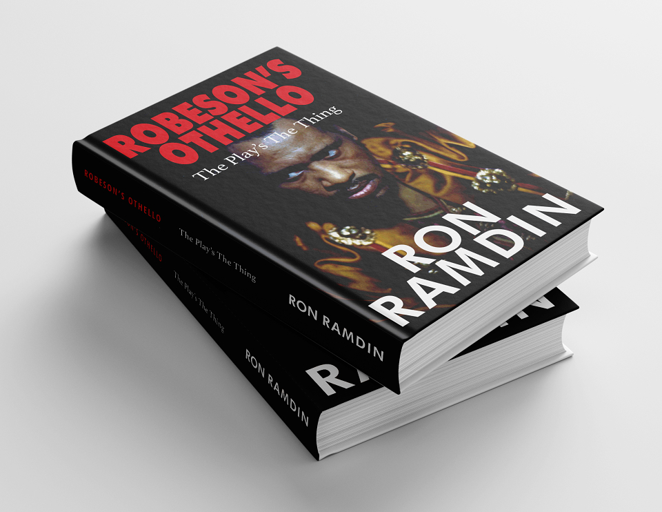
The goal was to design a book that visually and typographically reflected the intellectual and emotional gravity of Paul Robeson’s performance in Othello. The author’s exploration of race, identity, and legacy called for a design that balanced historical reverence with modern readability. The cover needed to feel timeless and iconic — much like Robeson himself.
Execution
Cover Design: Used a minimalist yet impactful approach, with a focus on bold imagery and strong typography. The color palette was intentionally subdued, drawing inspiration from vintage theatre posters and historical photography.
Typography & Layout: Interior pages were formatted with a classic serif font for readability and sophistication, supported by clean headings and balanced white space to guide the reader through academic and narrative sections.
Print & Digital: Designed formats for both print and eBook versions, ensuring visual integrity across platforms and devices.
Results
A striking cover that captures the spirit of Robeson’s Othello — instantly conveying seriousness, legacy, and dignity.
Seamless reading experience that complements the tone of the content, enhancing reader engagement and accessibility.
Positive feedback from the author and readers for the design’s professionalism, emotional resonance, and ease of use in both formats.