
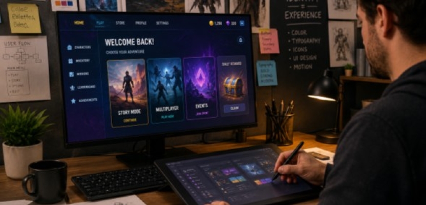

You know when a game has really nailed its look.
You see a screenshot with no logo and still know what it is. Maybe it’s the colors. Maybe it’s the typeface, the shape of the menus, or a particular style of character art. Sometimes it’s something harder to explain — the whole thing just feels familiar.
That doesn't happen by accident.
Gaming brands have a lot more to work with than a logo and a color palette. There are menus, loading screens, websites, reward animations, social posts, trailers, stores, and dozens of smaller details players see without really thinking about them.
When they all fit together, a brand starts to feel less like branding and more like a place.
The Logo Is Probably the Easy Part
Logos matter. Nobody is arguing otherwise.
But a player might see a logo for a few seconds and then spend the next three hours looking at everything around it.
That’s where the rest of the visual identity has to do some work.
Typography can make a game feel futuristic, playful, serious, or slightly chaotic before you’ve read a single sentence. Color can tell you what’s important. Icons can become so familiar that players stop needing labels altogether.
Even tiny things count.
Take a button. A chunky, brightly animated button feels completely different from a thin white line with some small text inside it. Both might perform exactly the same action, but they belong to different worlds.
And players notice when those worlds don't match.
A Menu Can Have a Personality
UI design has an awkward job.
It needs to look interesting while also letting someone find the settings menu at 1 a.m. without getting annoyed.
Push too far toward style and everything becomes difficult to use. Push too far toward function and the game can start looking like accounting software.
The good stuff sits somewhere between the two.
Menus can move differently. Icons can have their own visual language. Even the way an item appears when you unlock it can tell you whether you've picked up something ordinary or something worth messaging your friends about.
The interface isn't sitting outside the experience.
You're using it constantly, so it is part of the experience.
Why Rare Rewards Never Just Appear Quietly
Think about the last time you unlocked something genuinely rare in a game.
Did it simply appear in your inventory?
Probably not.
The screen changed. Something flashed. Maybe there was a sound cue. The animation took a little longer than usual. Before you even saw the item properly, the game had already told you: this is a good one.
Designers are very good at this.
Common items get one treatment. Rare ones get another. Limited items might come with special frames, effects, or colors. Players learn this visual hierarchy incredibly quickly.
Promotional design works in much the same way. The biggest offer gets the biggest type. A limited deal gets a badge. The button you’re supposed to press is difficult to miss.
Your eyes usually know where to go before you've actually read anything.
What Sits Behind a Richard Casino Promo Code
Casino websites make this kind of visual hierarchy particularly easy to see.
A bonus or promo code needs to catch attention quickly, so the important number tends to be big. Free spins get their own visual treatment. Calls to action stand out from the background. The whole thing is built so you can understand the basic offer in a couple of seconds.
But that's only the first layer.
A nice-looking promotion doesn't tell you about wagering requirements. It doesn't necessarily explain the qualifying deposit, eligible games, expiry date, or maximum cashout until you look further. For Australian adults, there's also the question of whether the offer is currently available and what local requirements apply.
That's why the journey from promotion to details matters. Someone interested in the offer can use a Richard Casino promo-code comparison to look past the big promotional message and see the conditions around it. The design gets your attention; the details help you understand what that attention-grabbing number actually represents.
There's a lesson for designers here. Making something noticeable is only half the job. Once you've got someone's attention, they still need a sensible route to the information that matters.
Everything Doesn't Need to Look Identical
A gaming brand might appear on a desktop monitor, a phone screen, a convention banner, a social post, a T-shirt, and a YouTube thumbnail in the same week.
Trying to make all of those things look exactly the same would be a disaster.
Consistency doesn't mean copy and paste.
A vertical Instagram graphic obviously needs a different layout from a game menu. A trailer has different needs from a store page. What matters is that they still feel like they came from the same place.
Maybe the typeface stays consistent. Maybe it’s the colors, illustration style, textures, or shapes.
Often, you only need a couple of those signals.
Think about brands you recognize from the corner of an image before you've even seen the name. That's what consistency is doing.
Comparison Pages Have a Harder Design Job Than They Look
A page comparing offers isn't exactly the glamorous end of digital design.
There's a lot of information competing for space: payment methods, bonus terms, limits, licenses, requirements, and various numbers that all seem important.
Put everything in bold and you've effectively put nothing in bold.
This is where information design earns its keep.
CasinosAnalyzer, for example, isn't a casino. It’s a comparison platform that looks at areas such as licenses, payment options, promotional terms, and other practical details people may want to understand before choosing an offer.
That information has to be organized somehow.
Good spacing helps. So do clear headings, sensible tables, labels, and typography that shows which details deserve attention first.
When it works, you barely notice the design.
You just find what you came for.
Animation Is Great Until You Have to Watch It 50 Times
Motion gives gaming brands an advantage that most traditional branding doesn't have.
Things can actually move.
A logo can change while a game loads. Menus can slide into place. Buttons can react when you hover over them. Reward screens can build suspense for an extra second before showing what you got.
All of that can make a brand feel more alive.
It can also become irritating very quickly.
The spectacular five-second animation that looks brilliant the first time isn't necessarily brilliant after you've watched it every evening for a month.
Good motion design seems to understand this. It knows when the moment deserves a bit of theater and when you just want the menu to open.
Sometimes You Meet the Brand Without Playing the Game
A lot of people interact with games when they aren't actually playing them.
You watch a clip someone sends you. You see a character reveal on social media. You check a website for an update. Maybe you spend an embarrassing amount of time reading about a game you're currently taking a “break” from.
All of those moments are part of the brand too.
That’s why promotional graphics and social templates shouldn't feel like completely separate projects. They don't need to copy the game interface, but they should belong to the same visual family.
The logo in the corner can't do all the work.
The Best Design Doesn't Need an Explanation
Nobody finishes a gaming session and says, “I really appreciated the consistent application of that visual system.”
At least, probably not.
You notice it in other ways.
You know immediately where to click. You can tell that an item is rare before reading its name. You recognize a screenshot while scrolling past it. The website feels connected to the game rather than something built by a completely different team.
That's when visual identity is doing its job.
It isn't just making things look good.
It’s quietly holding the whole experience together.