OurCreative
Leeds
ABOUT
Fairfields Farm, proudly independent and family run, they’ve been growing potatoes for three generations, creating crisps since 2009.
Challenge
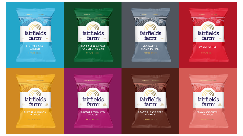
They approached us in a stage of rapid growth, with a brief to shift their brand focus away from the founders and dial up the story around their independent farm and sustainability efforts, standing them apart from the big players Pipers and Kettle Chips. Creatively, they were looking for an evolved and refreshed packaging design.
Idea
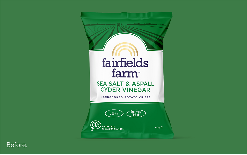
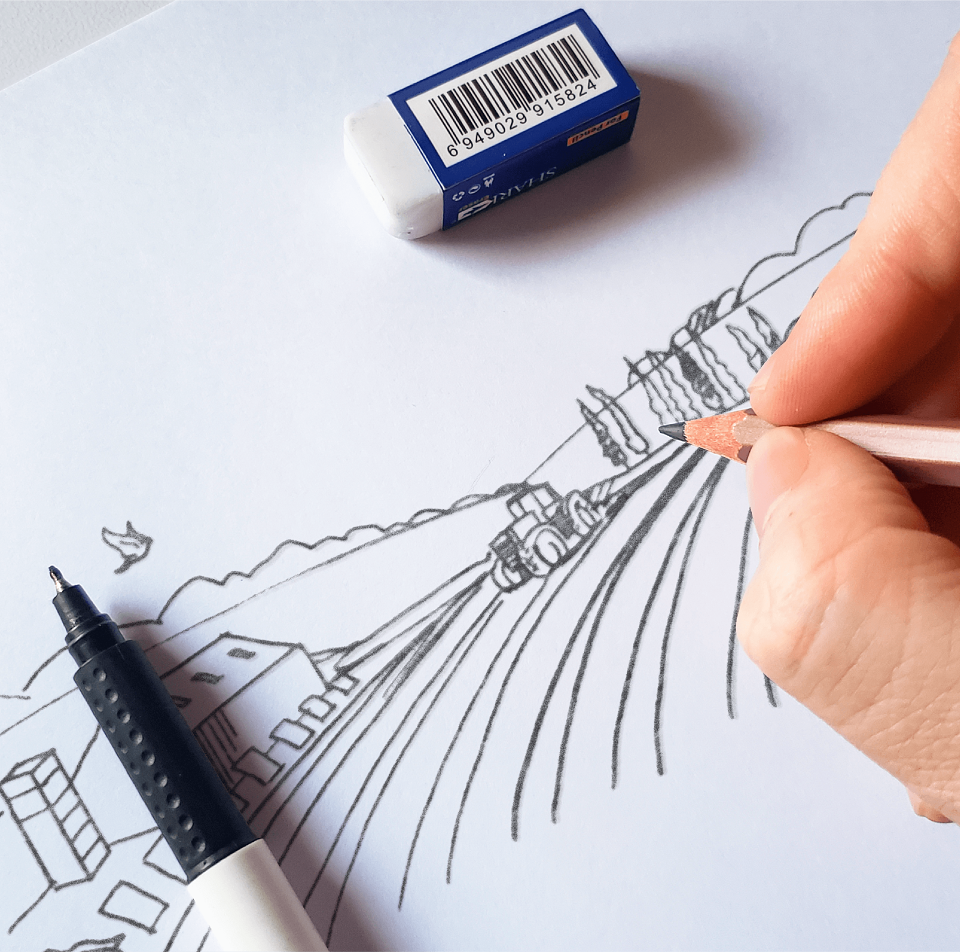
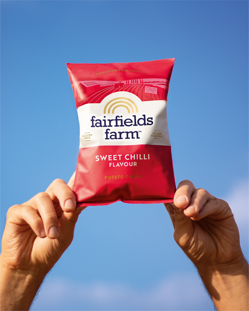
We respectfully updated their logo to complement the straight secondary font. Introducing a new illustration to the top of pack, heroing the farm-founded story, putting real meaning behind the brand name. Illustrated in-house, it plays up the farm’s carbon neutral credentials, giving more meaning to the homegrown & hand-cooked message. The illustration includes the farm’s solar panels, reservoir & wildflower planting.
Results
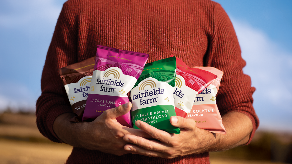
Our sensitively evolved packaging design, brings the farm to the forefront, with the strength to unlock new independent food service listings looking for a top quality, hand-cooked crisp offering. The updated design has now launched across all 8 flavours and has helped Fairfields Farm secure new listings across a number of food service outlets.
AWARDS
World Brand Design Society (WBDS)