One Rise East
London
ABOUT
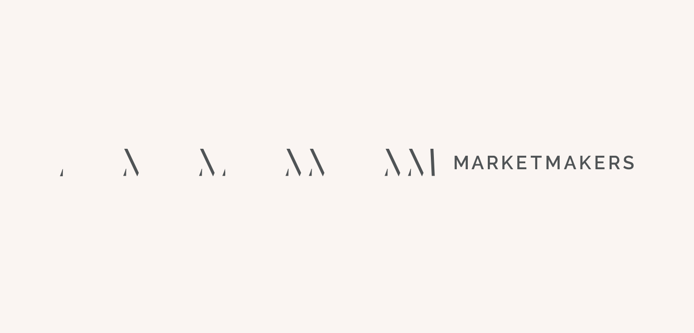
We started with pen and paper, sketching and refining ideas for the logo. The final marque is a monogram – formed as much out of negative space as it is solid shapes it suggests building blocks and ‘things taking shape’.
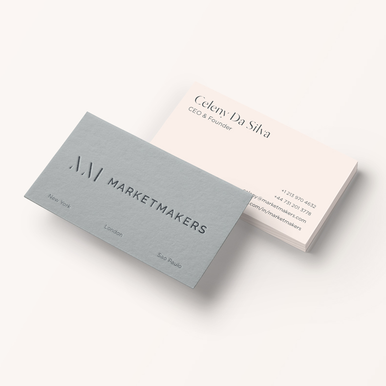
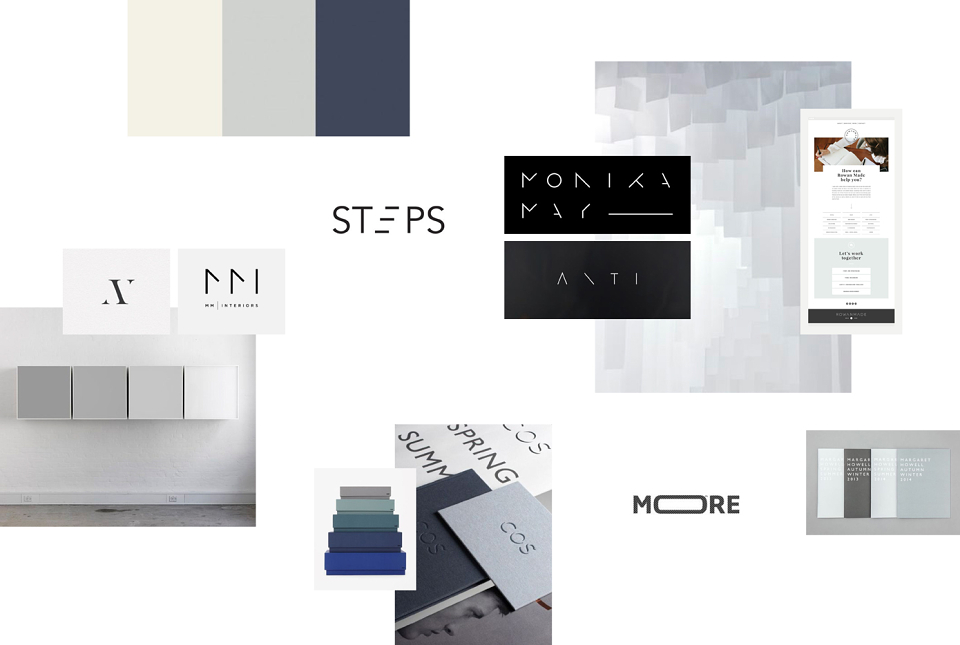
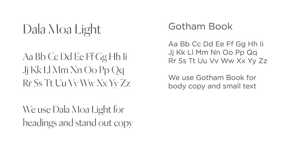
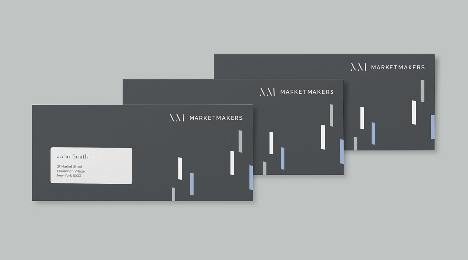
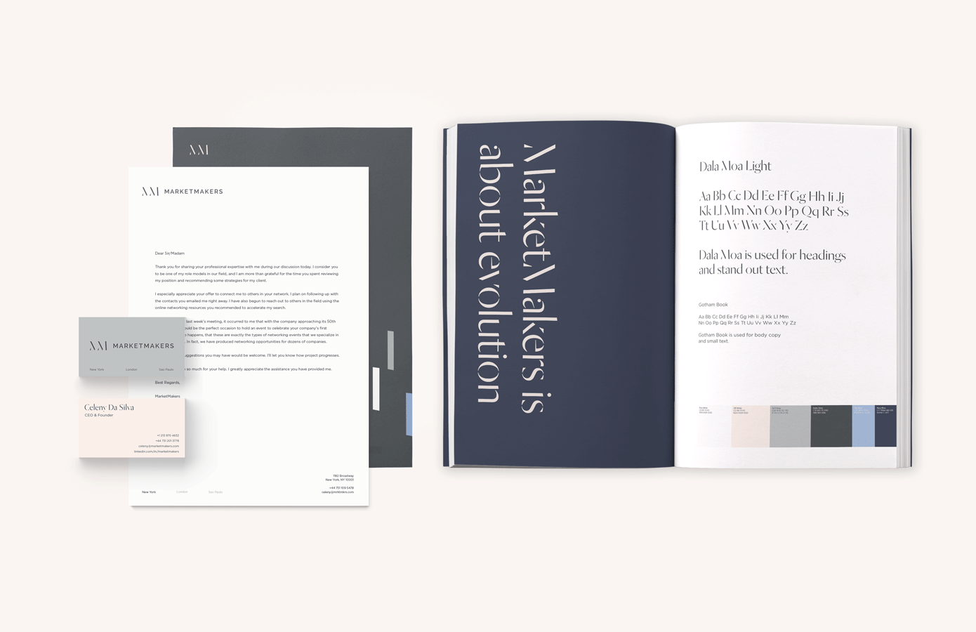
With the logo as the foundation, we could construct the rest of the identity. We created a bespoke tonal colour palette that shifts from warm off-white to dark slate grey and carefully chose fonts that complement the brand’s concept. Using keen attention to detail we transformed all MarketMakers touch points from luxury business cards to an entirely revamped website.