One Rise East
London
ABOUT
How do you explain a complex piece of technology like GroundTruths’s Ads Manager in a way that is clear and informative AND interesting and accessible AND acts as a signature showpiece for their new branding – in a way that is above all clean, simple and seamless?
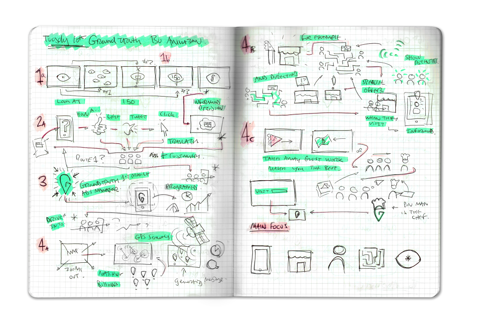
Our team started by jumping head first into learning everything they could about Ads Manager. From there it was a process of channeling this understanding into a series of icons before building out a storyboard that would that would best tell the Ads Manager story.
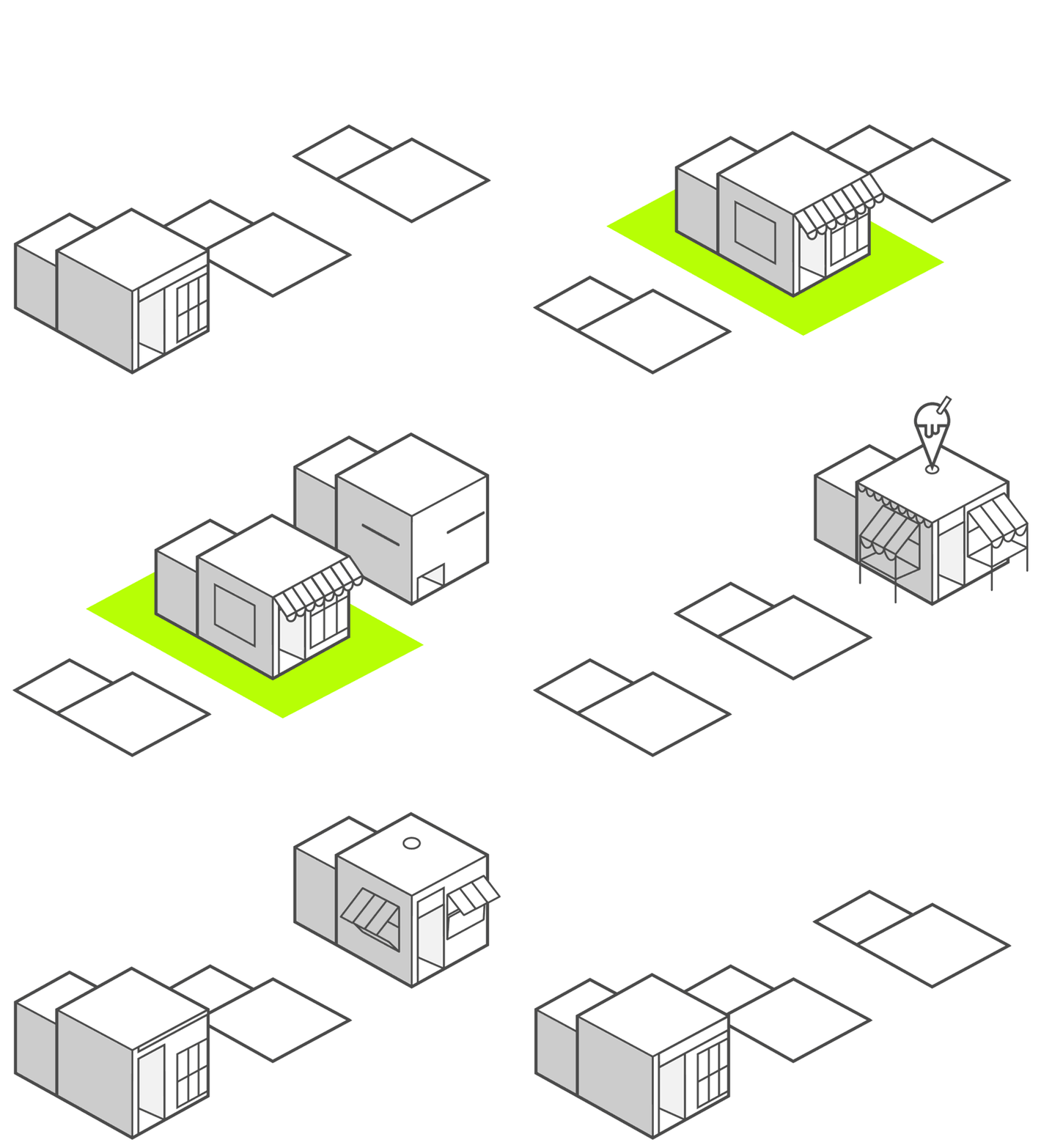
Displaying the ease and accuracy of their technology within a hectic city environment was essential to the client. Using the single line within the brand logo as a starting point, we developed an animation style that began simple and slowly developed into a full, thriving isometric metropolis. This provided a blank canvas to use the striking GroundTruth Green as the cause and effect of everything within the narrative, allowing the animation to show the technologies limitless potential.