

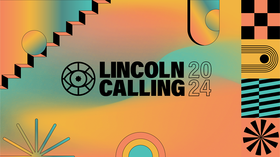
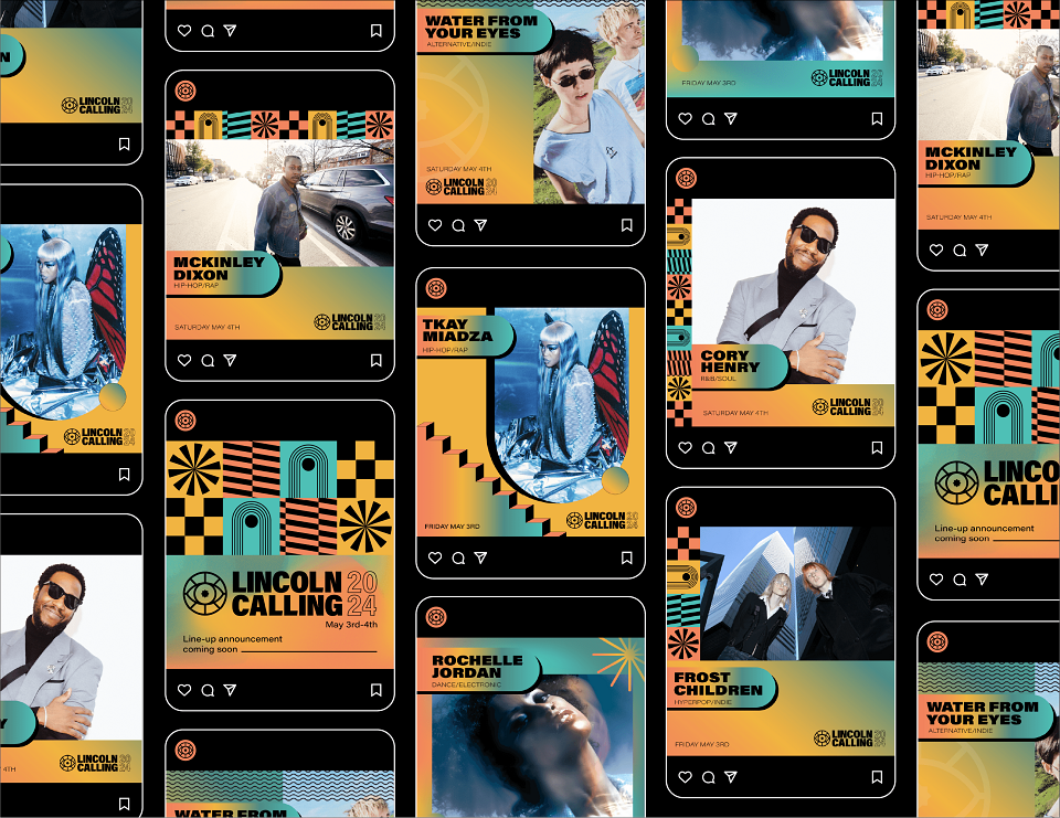
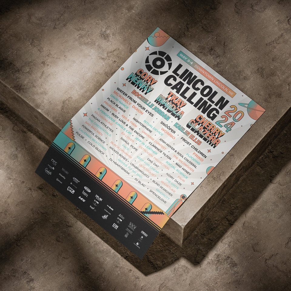
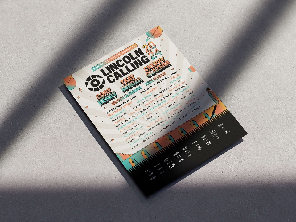
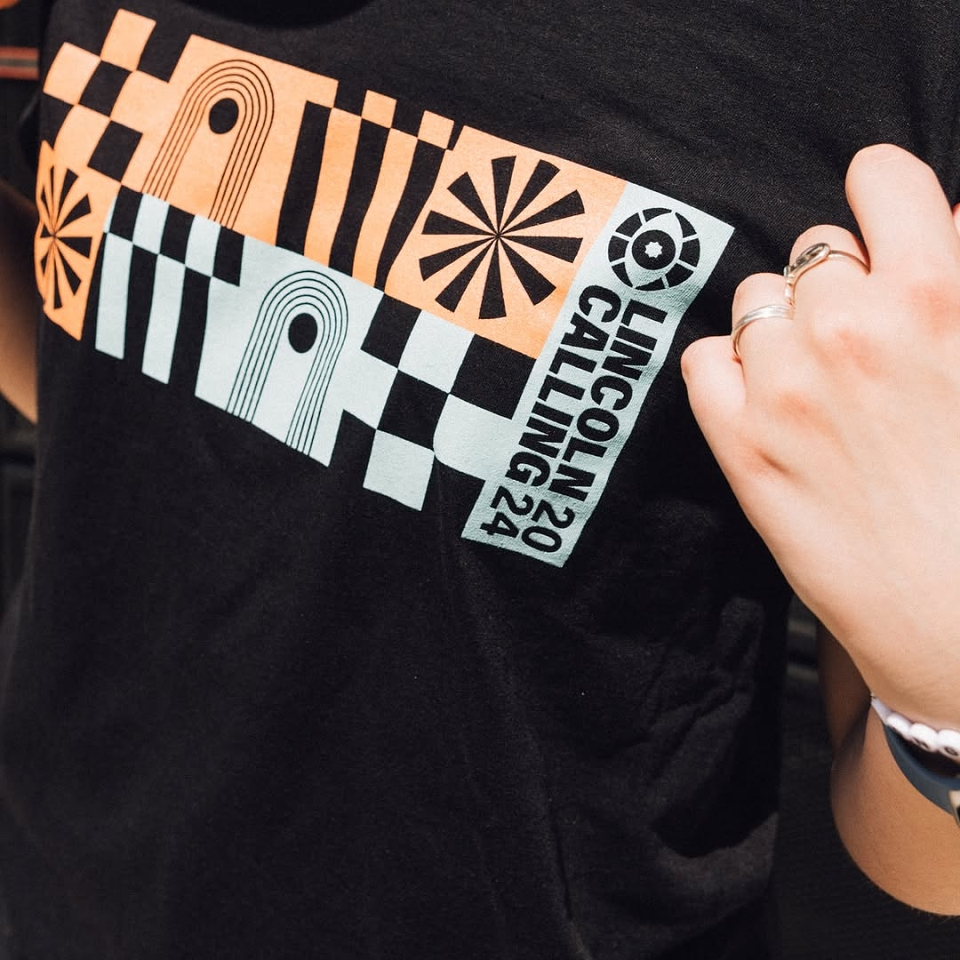

In 2024, Lincoln Calling celebrated its 20th anniversary. To commemorate this significant milestone, Lincoln Calling aims to rebrand to attract new fans to the already well-established music festival. During our initial call, it was emphasised that the festival is all about music "discovery." Their national artists are often emerging talents, recently signed, and might only be recognised by dedicated music enthusiasts across various genres. Therefore, I wanted to highlight that sense of exploration within the rebrand.
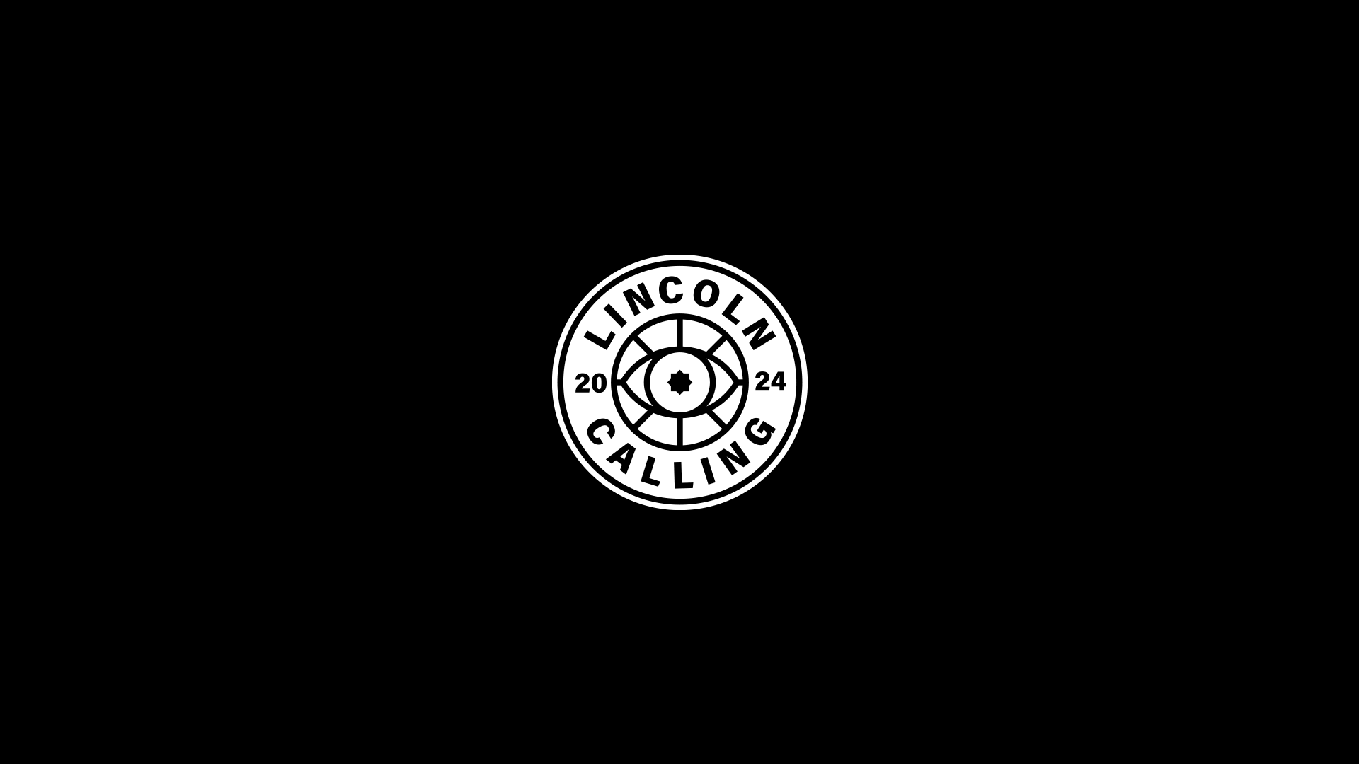
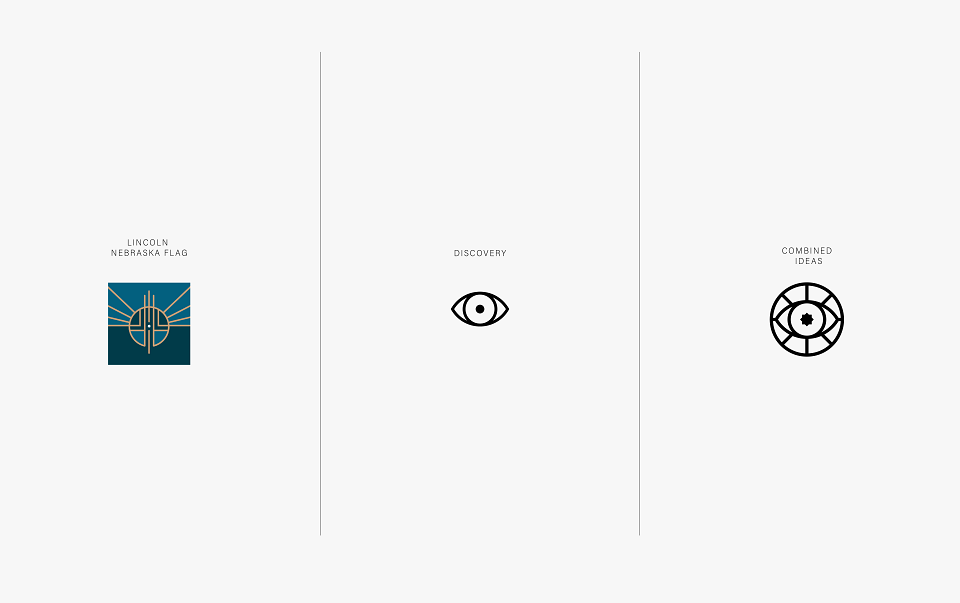
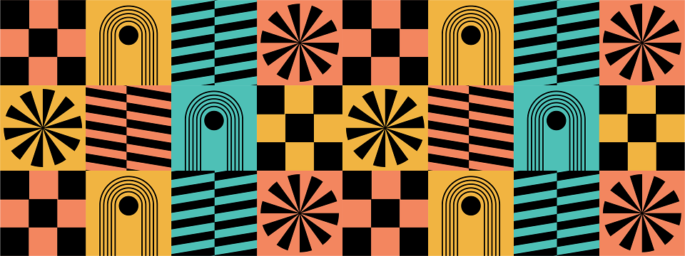
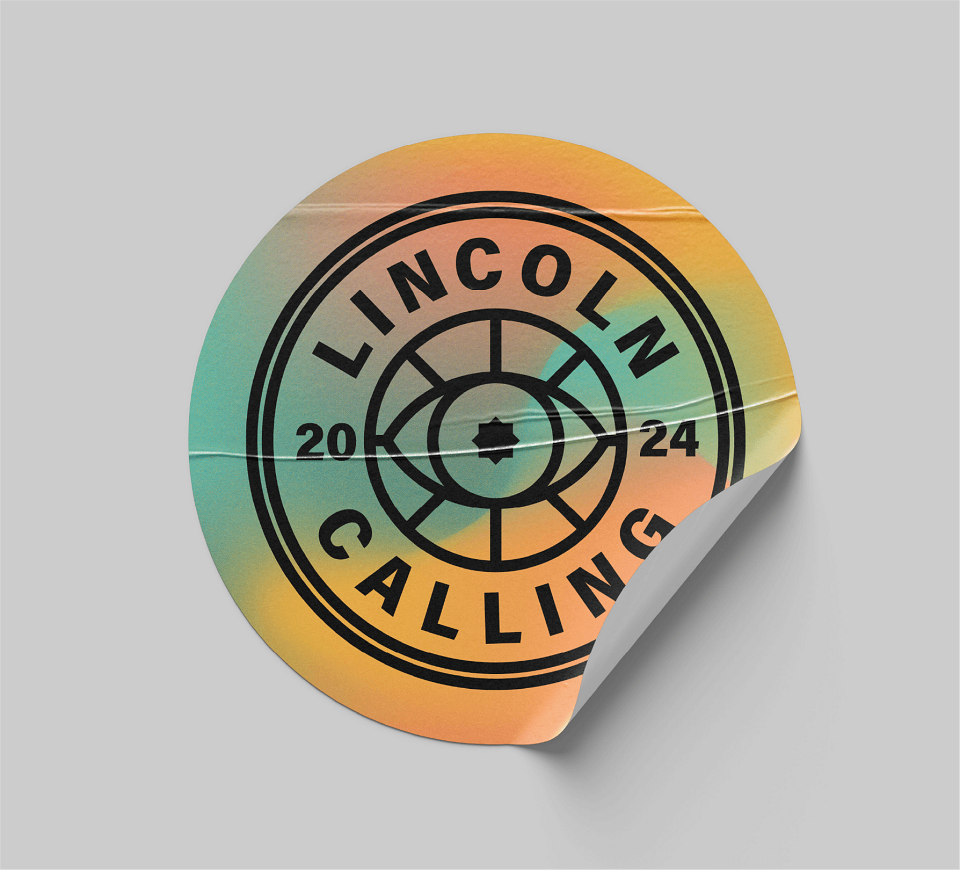
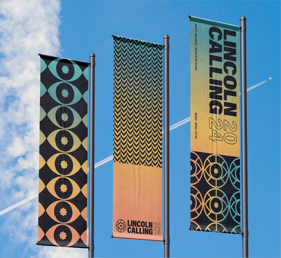
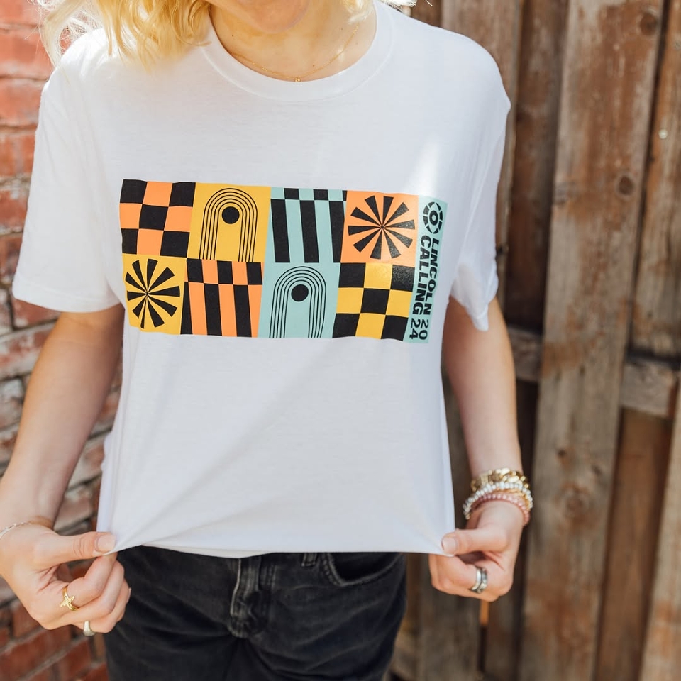
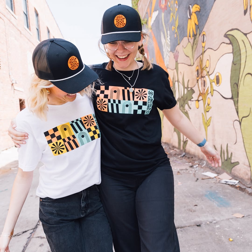
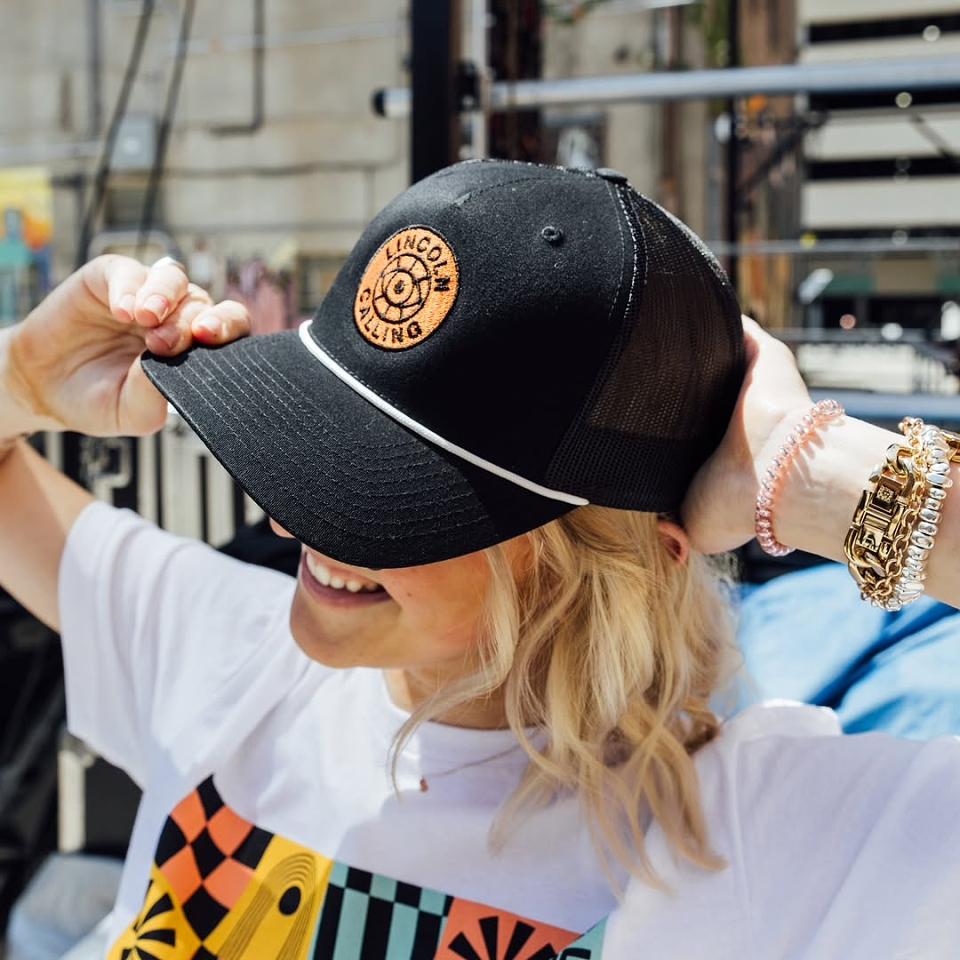
The logo design brings together two main inspirations: the bold, geometric shapes from the Lincoln, Nebraska flag and the symbolic image of an eye. The flag’s clean lines and circular layout give the logo a strong connection to the city, while the eye adds a sense of curiosity, exploration, and the excitement of finding something new. Combined, they create a mark that captures the festival’s mission, introducing people to fresh talent and inspiring moments of creative discovery.