


As any wine connoisseur knows, choosing the right bottle of wine can be an art in itself. From the region and vintage to the grape and label design, every detail matters. That's why when Mereworth, an award-winning English sparkling wine producer, approached Novagram for a label redesign, we knew we had to create something truly special.
Our challenge was to create a simple, unique, and recognisable design that could unite all of Mereworth's current and future products while conveying their brand characteristics of high quality, precision, and honesty. It needed to look and feel expensive and be worthy of their premium prices.
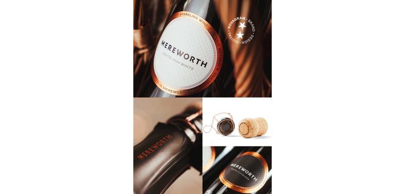
To achieve this, we employed a simple circle—the 'Mereworth halo'—rendered in copper foil. Through research, we found that no other competing drinks brand was using this device in quite the same way, making it a unique identifier for Mereworth. The overall design is modern, clean, and confident, with fine foiled lines inspired by horology, a marker for luxury.
Mereworth wanted to make sure that the label was tactile and durable enough to withstand being in an ice bucket all day. This was achieved using Super White OPQ Plus FSC from Avery Dennison. It was complemented by luxurious black, copper-lined neck foil, a copper cage, cap, and cork from Bruni Erben in Germany.
The result? A rare level of refinement that has caught the eye of consumers and proved highly successful for Mereworth. Founder William Boscawen has praised Novagram's work, saying that the rebranded products "have made a profound difference to our business" and contributed greatly to the feeling that they are no longer just artisans, but professionals.
At Novagram, we believe that every brand deserves a design that sets them apart and communicates their values to consumers. This project for Mereworth was a true testament to that belief, and we are proud to have played a part in helping them achieve their goals.
Inspired? We’d love to discuss what Novagram could do for your brand. Let’s connect.