Noramble
Manchester
ABOUT
NPD growth for a supplement brand wanting a slice of the protein bar category.
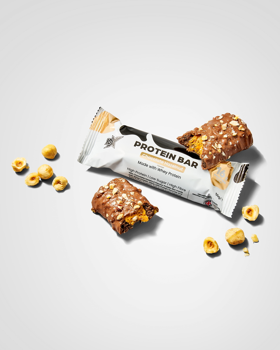
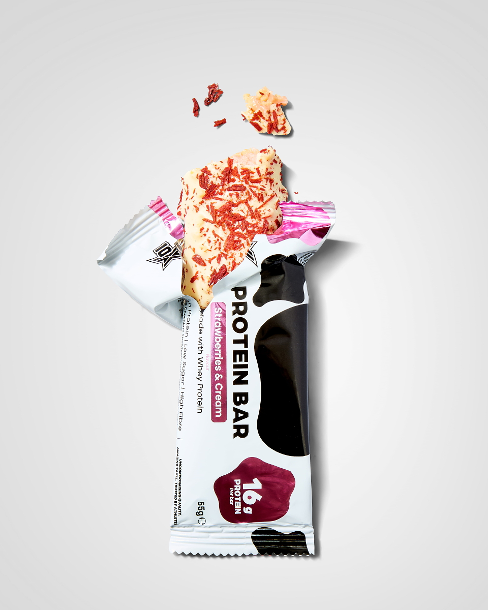
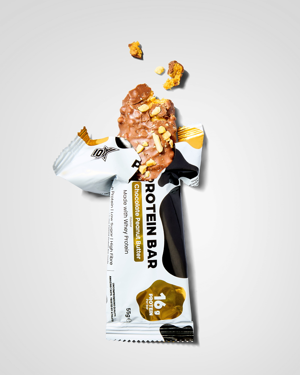
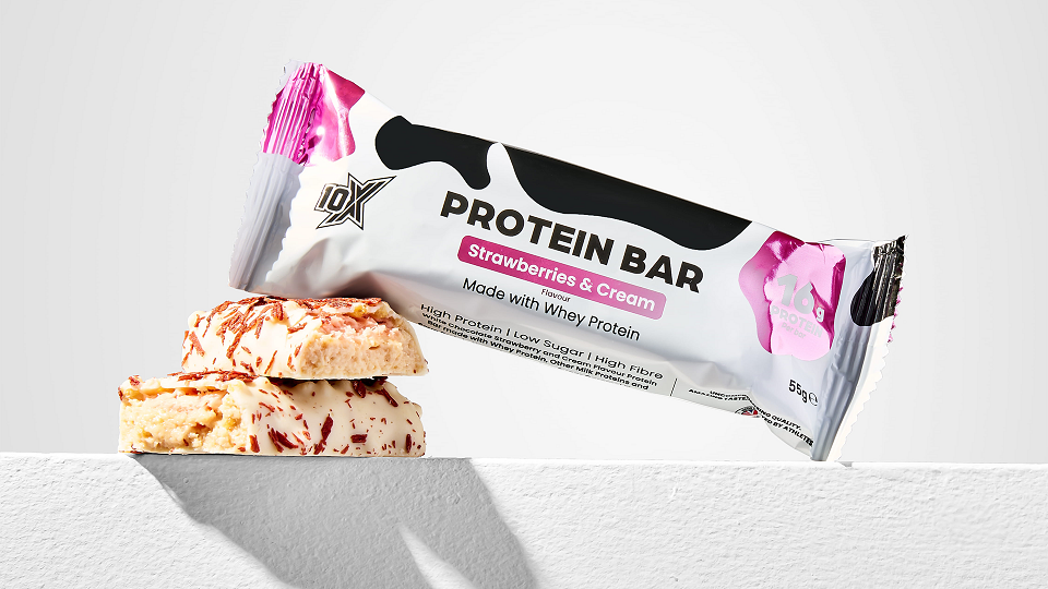
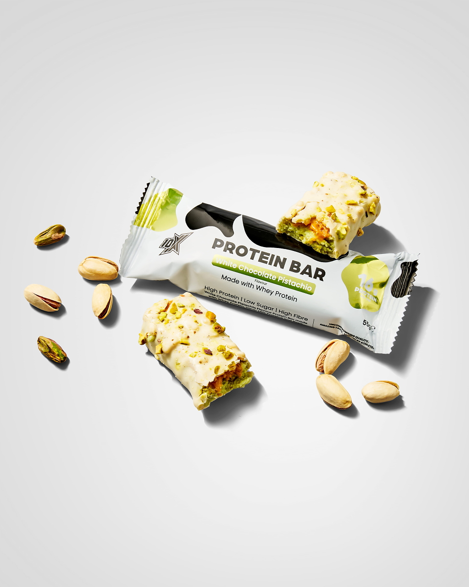
Most protein bars rely on cheaper protein blends; 10X Athletic has produced a protein bar built around whey protein. The challenge was to create a visual that feels cohesive with the brand’s new premium direction, while also expressing the USP of whey protein.
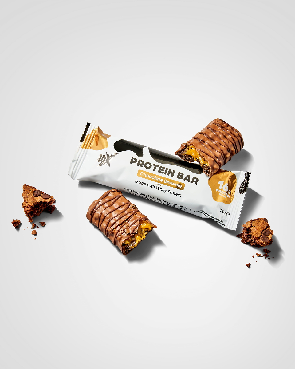
Most packs lean into flavour: gooey shots, glossy coatings, food photography built to look like dessert. It's a health halo. Gym branding and a protein number on the front lead people to assume the bar is healthier than a chocolate bar, even when the sugar or saturated fat content says otherwise. The closer the imagery gets to confectionery, the more it invites the scrutiny it's trying to dodge. And once every brand chases the same craveable shot, none of them stands out. The photography ends up selling taste, not the nutritional credibility that was meant to be the whole point.
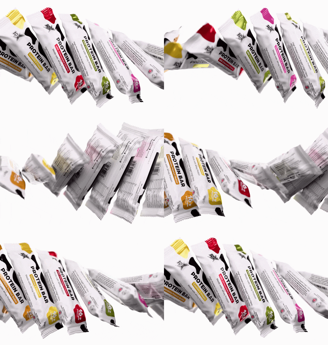
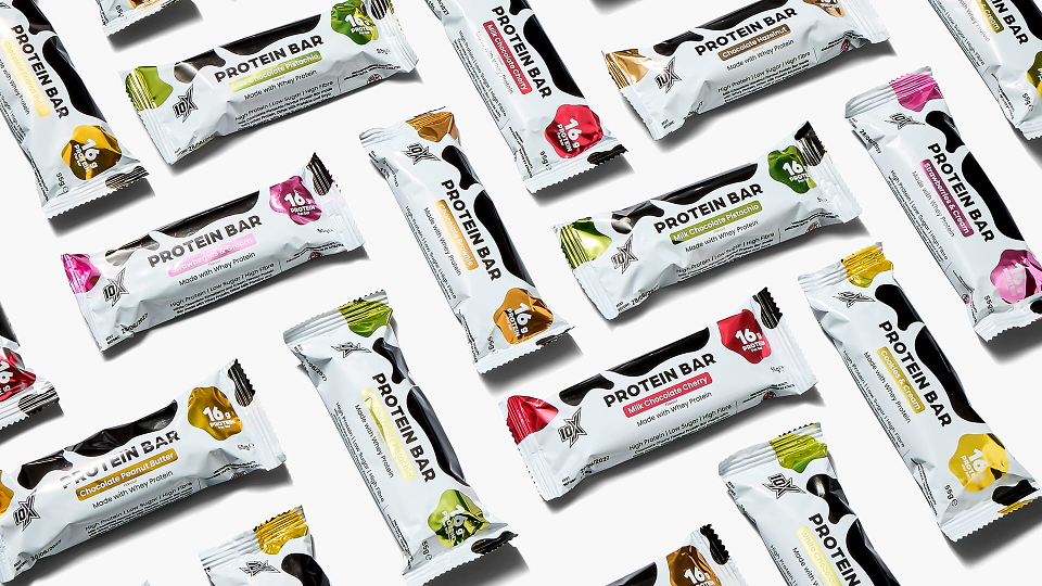
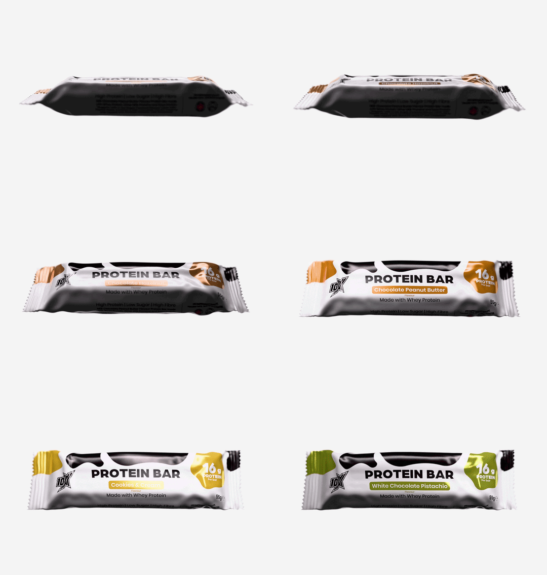
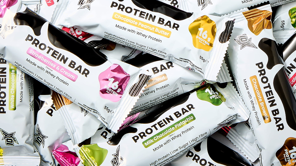
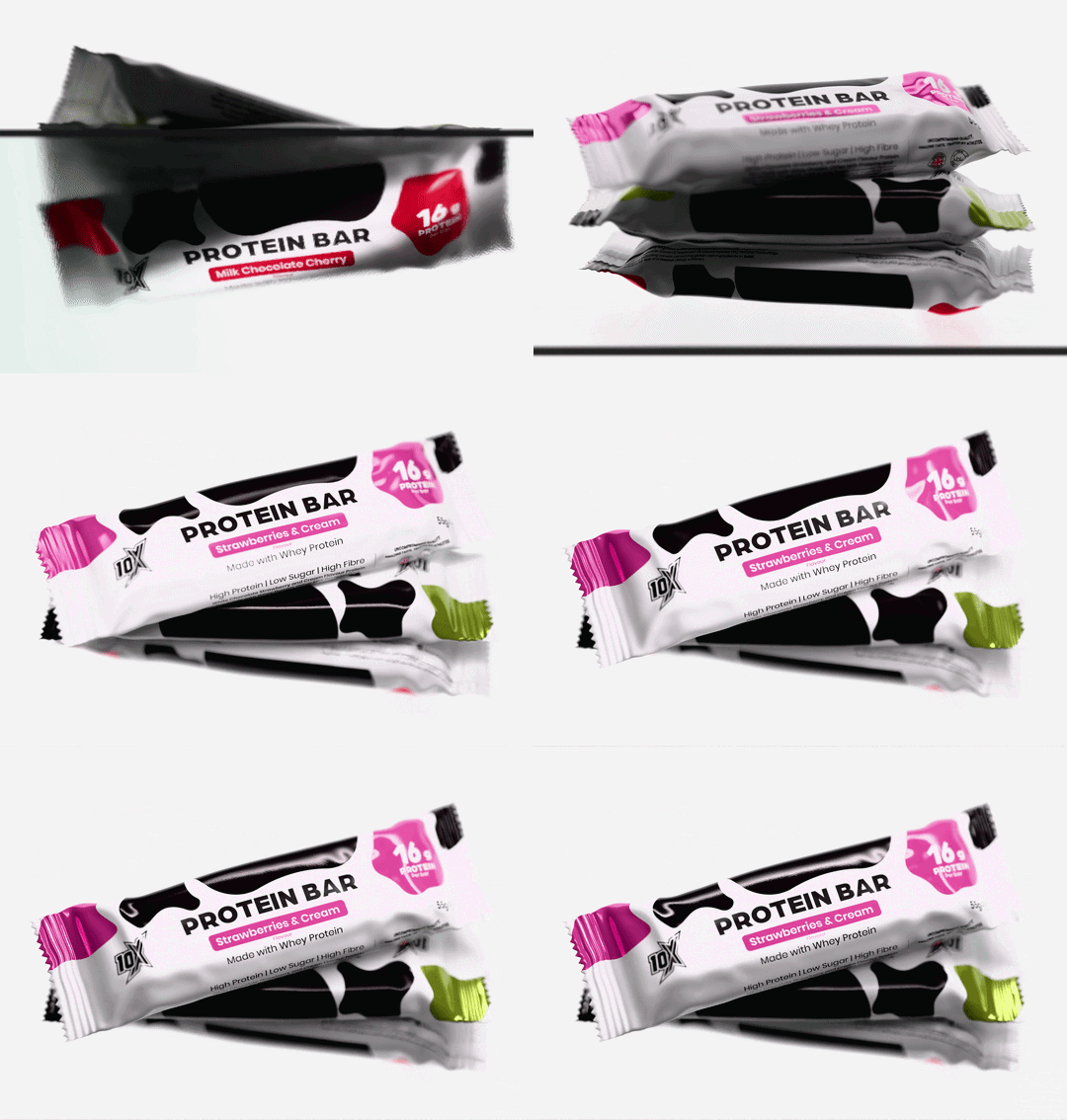
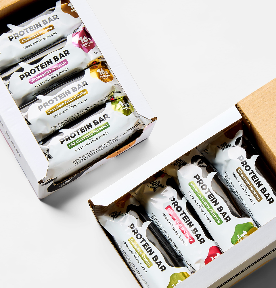
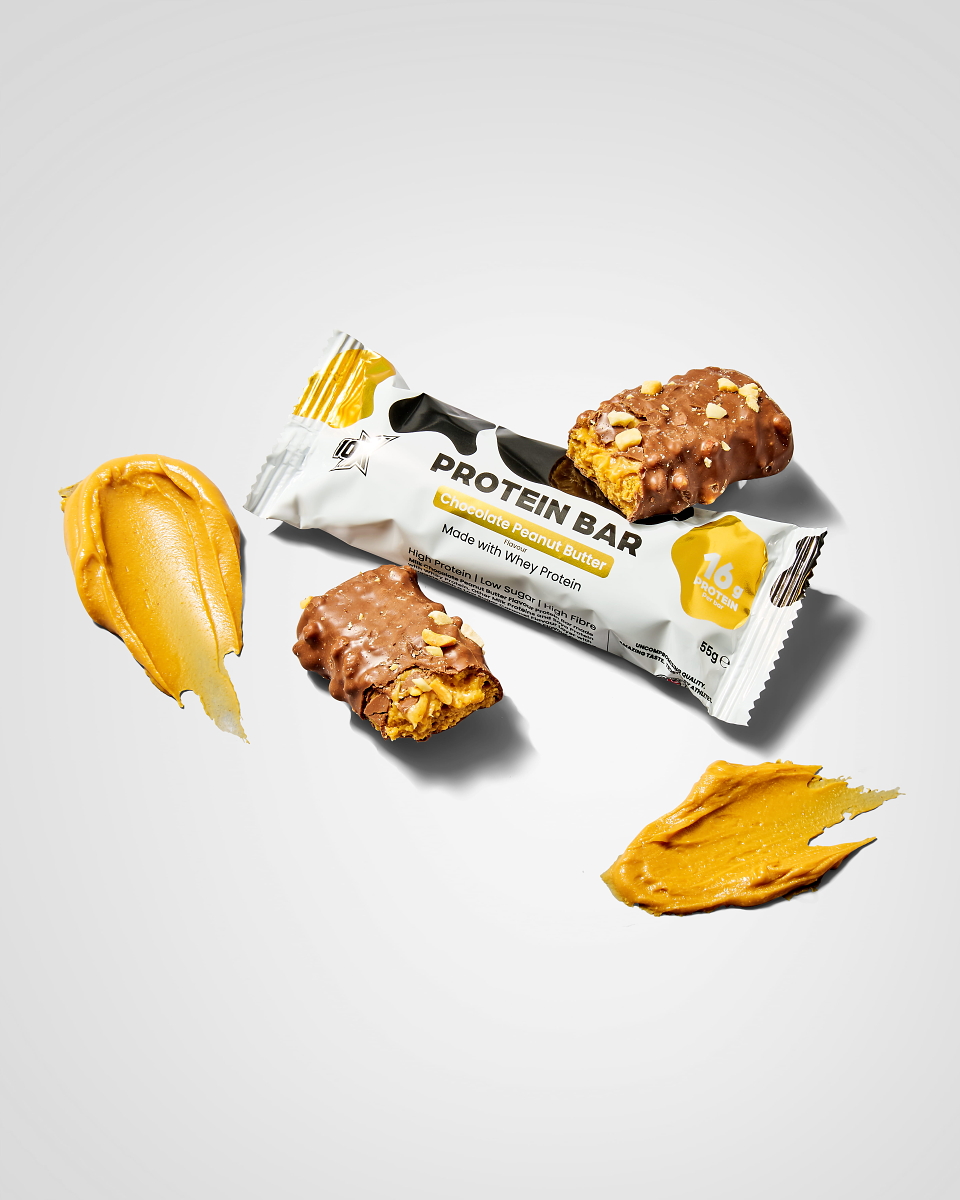
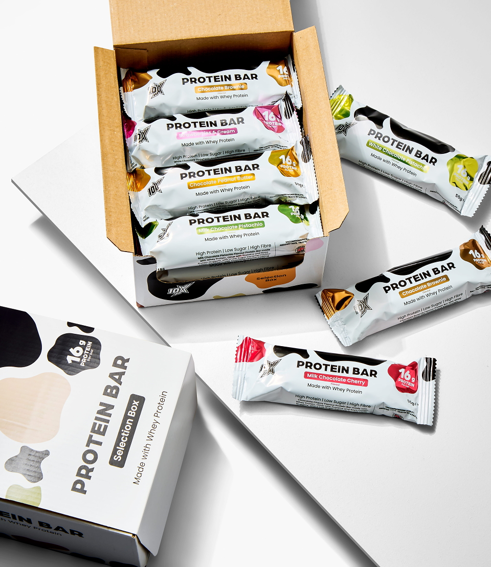
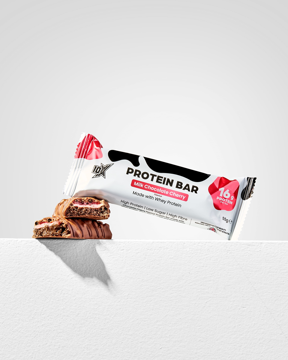
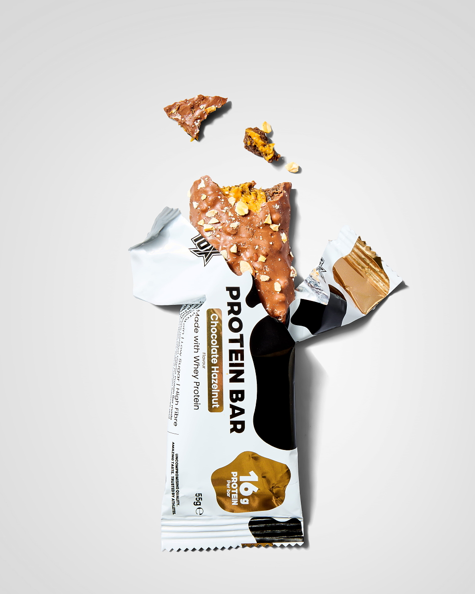
We dropped the dessert-style photography in favour of a cow-spot-inspired visual to communicate the product's Whey Protein USP, which is derived from cow's milk. To build familiarity and credibility, we kept a prominent protein value callout on the front of the pack. We paired this with a bold sans-serif font family and a clean, minimalist layout to ensure the NPD feels cohesive and part of the 10X Athletic product family.