Nonconform
Liverpool
ABOUT
Overview
Savera UK is a Merseyside-based national charity working to end ‘honour’-based abuse (HBA) and other culturally specific abuse and harmful practices. It aims to eliminate all such practices for good, through safeguarding, advocacy, education, engagement, awareness-raising and campaigning for policy, attitude, and behaviour change. It also provides life-saving direct intervention services to survivors and those at risk, regardless of age, culture, sexuality, gender, or ethnicity.
After designing the charity’s first formal brand in 2016, rebranding from Savera Liverpool to Savera UK, to indicate the geographical extension of its services, and acting as its brand agency for almost seven years, Nonconform was invited to undertake a brand refresh for Savera UK. The refresh was in line with the development of the charity’s first-ever three-year business strategy.
The charity has grown significantly since 2016, expanding its direct intervention services, implementing national campaigns, broadening the people it works with from just women to people of all genders and backgrounds, and taking a leading role in policy change at a regional and national level. The brand refresh needed to reflect this growth and a change in tone, approach, and audience.
Concept
Evolving from its small, grassroots beginnings, Savera UK is now a leading charity working to end HBA and harmful practices. Its previous brand had focused on its direct intervention services, with the soft lines of its logo reflecting the protective nature of the services it provides to those at risk of HBA and harmful practices. ‘Savera’ itself means ‘new beginning’ in Hindi as this is what it offers to the survivors and people at risk.
Its new brand position remains protective, but now more confident and front-footed in pursuit of its mission ‘to end HBA and harmful practices’ and its vision of ‘a world without HBA and harmful practices’.
The issues that Savera UK works to end are present in all communities and backgrounds, so the brand also needed to communicate that reaching its goal is everyone’s responsibility, that it is a collective problem that we must work together to resolve, with all key brand messages leading with ‘we will’.
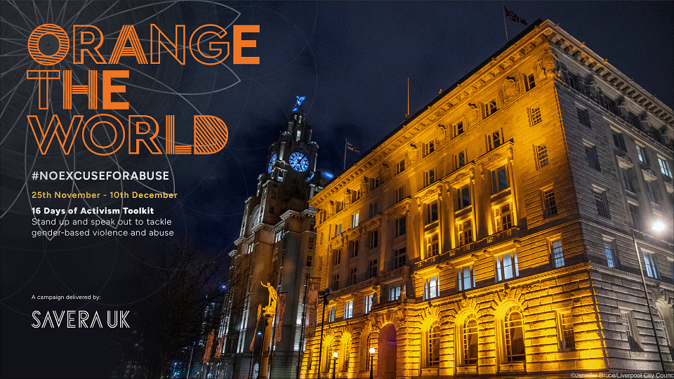
Due to the nature of its work and the high lifetime risk of its clients, Savera UK is often unable to use imagery of people, so its supporting graphics and fonts are vital in communication of its message. Fonts and imagery needed to represent both the individual role in addressing the widespread issues and the relentless pursuit of that objective.
Execution
The concept was executed in several ways:
Logo redesign
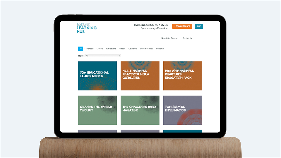
The logo was altered slightly, keeping its protective element, but with a sharper appearance to reflect the new brand position. This logo was also applied as parent logo to its sub-brands, Savera UK Youth, and the Savera UK Learning Hub, to endorse these elements of its organisation.
New Font
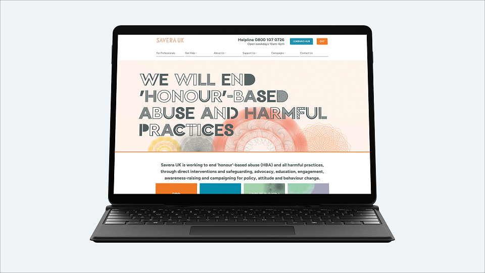
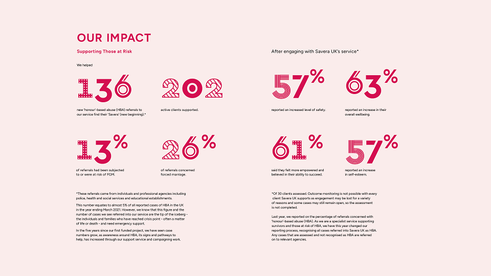
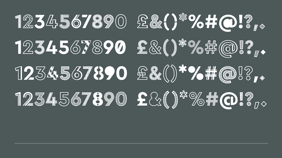
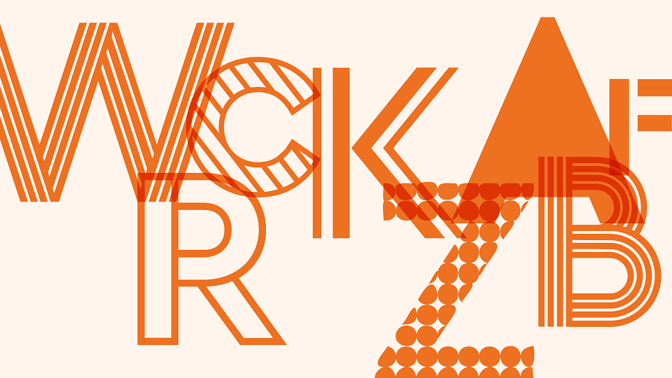
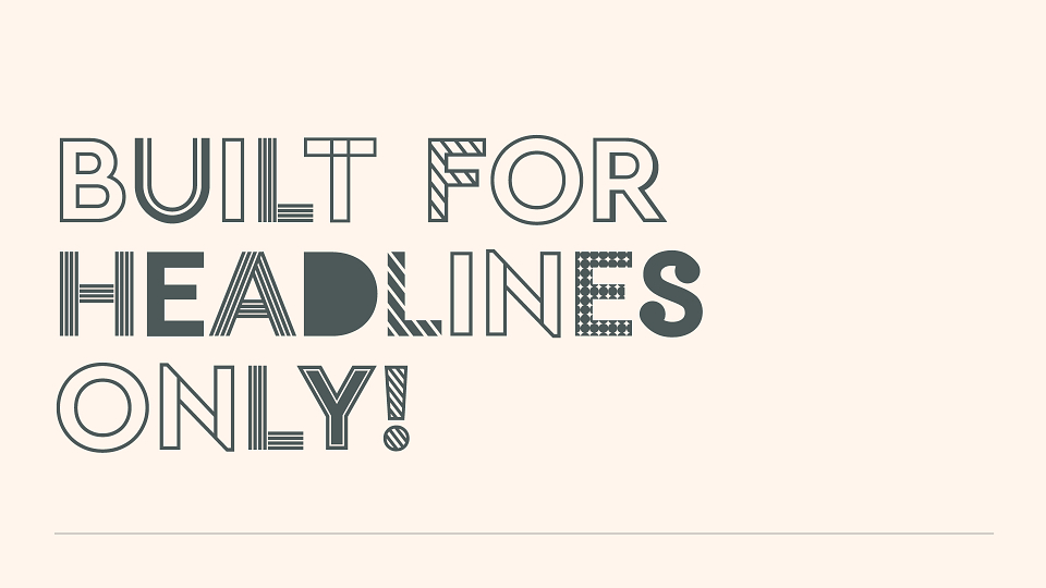
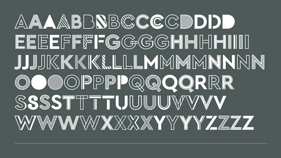
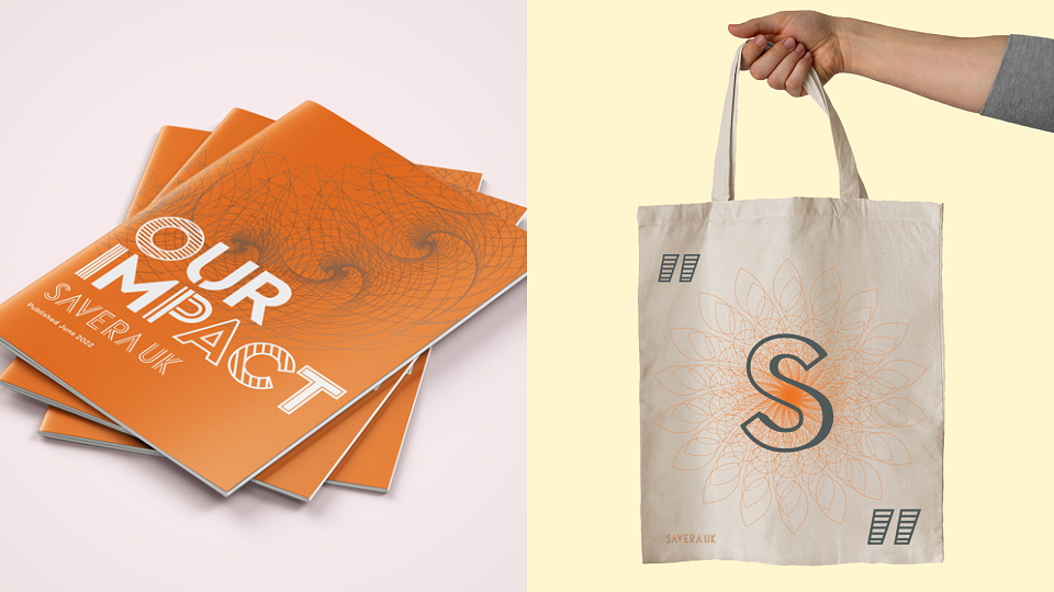
A bespoke headline typeface was created to capture attention and provide versatility. There are four versions of each letter within the font, that can be swapped around for legibility and variety. The use of different characters combining to create complete statements or headlines represent the diversity of the issues Savera UK works to end and the individuals joining its mission - providing a sense of community within the work.
Many of the ‘headlines’ applied using this font are statements and facts about HBA and harmful practices, for example “100,000s of people face violence, abuse or death due to HBA and harmful practices” and “Every year more than 5000 people are killed due to ‘honour’-based abuse”. These are designed to alert the audience to the issue and provide a clear reason why they should take action.
New colour palette
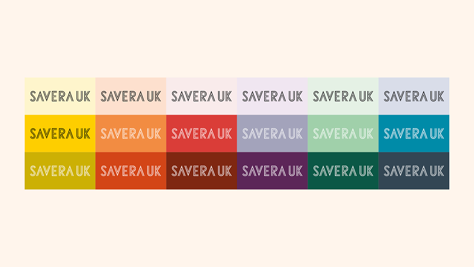
The new brand maintained its parent colour palette of orange and dark grey, as this is now synonymous with the organisation. Their supporting colours were drawn from sunrise, sky tones and rich earthy hues, from which an endless range of colours, organised into tiers, can be derived to support the charity’s varied initiatives, events, and sub-brands.
Supporting graphics
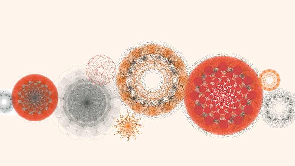
Mandalas are a unifying, spiritual and meditative structure. They signify and are associated with deeply emotional meanings. Some of these are: A journey, inner strength, healing, safety, transformation, and guidance, all which reflect the nature of Savera UK’s work, the outcomes for its clients and its wider impact.
To further support the new brand positioning, we created our mandalas using Fibonacci inspired patterns. The Fibonacci sequence is nature’s mathematical formula for growth and signifies positive energy. It also underpins Savera UK’s relentless move forward towards its vision.
The mandalas can be used whole, anchored to collateral/artwork corners, or as ‘sunrise’ mandalas. These can be single and bold in contrasting colours, or on a horizon line for headers, footers, graphic devices and also to divide information. This usage also supports the charity’s ‘new beginning’ message.
AWARDS
social good