Nina Bosanac
Design lead
ABOUT
British Airways wanted their suite of digital and print communications to look like one coherent global brand.
Typesetting
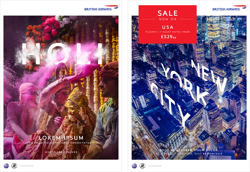
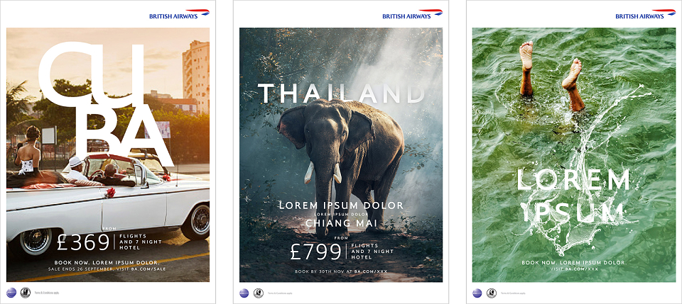
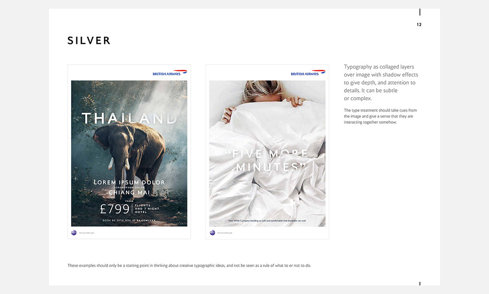
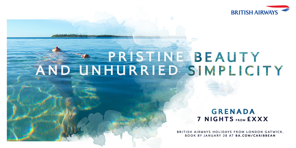
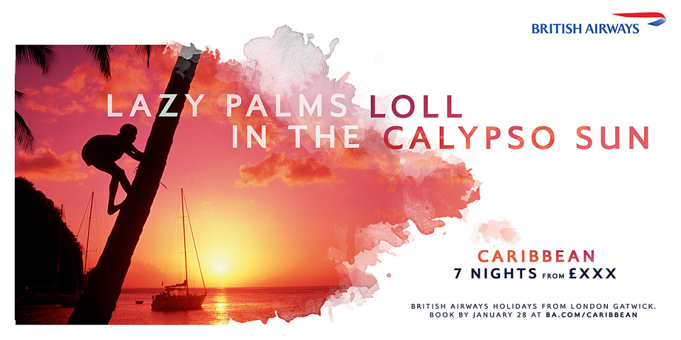
My role was to first look at tightening and unifying the typesetting across digital and print that had become disjointed across many business units. This then developed into visual typographic style exploration that used BA’s Mylius typeface as the centre point for all future creative output. I explored various type treatments and how type might interact with possible campaign imagery*.
Four tiers of Mylius
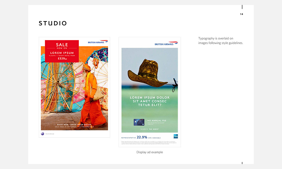
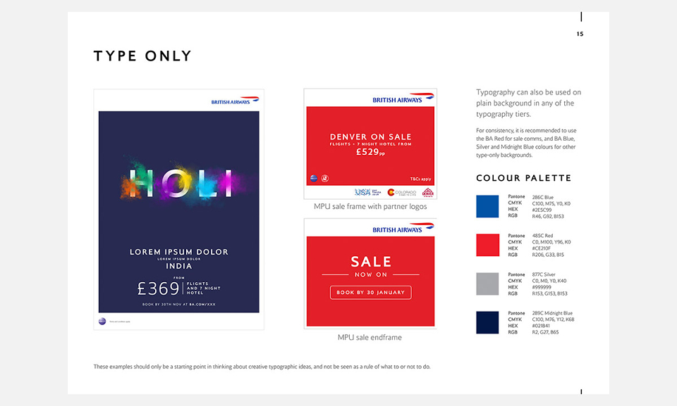
We developed four tiers of effects for typography – Gold, Silver, Bronze, and Studio – that would cover all communication volumes (from large, crafted campaigns, to high-volume sales communications). Each tier would have different crafting levels – from 3D effects and complex retouching for Gold, to more simple masking for Bronze and simple typesetting-only for quick turnaround Studio work.
Guardrails
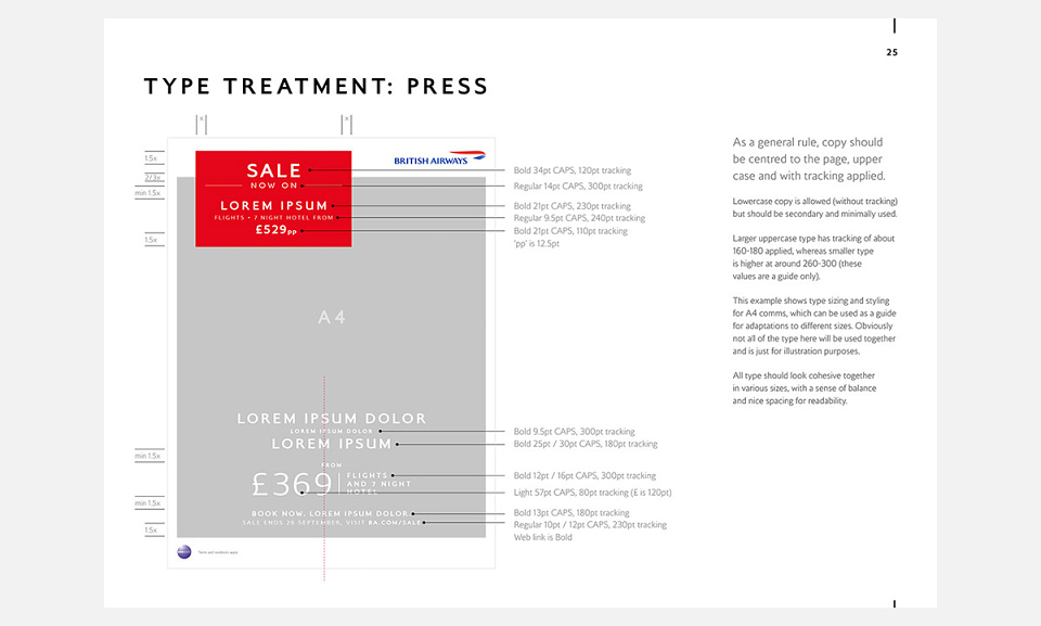
The typographic work was developed into a Guardrails document to serve as a reference for all communications teams and unify the global brand. I created typesetting and layout templates for print and digital formats to be included (as well as the document itself).
'Take You There' campaign
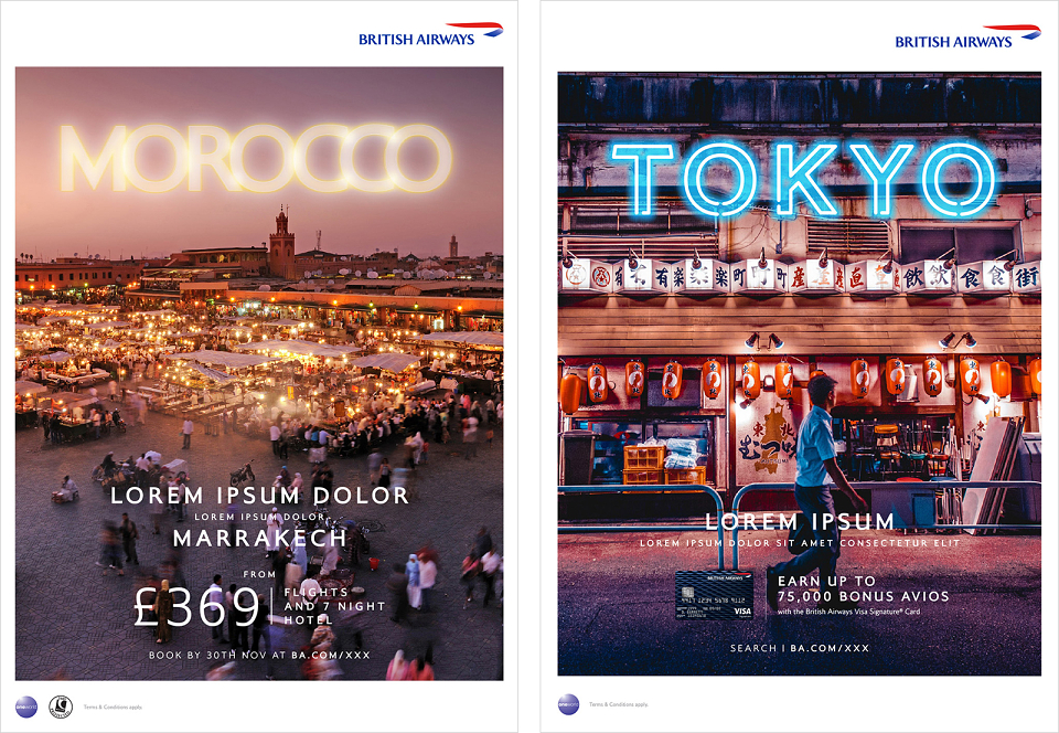
I was also involved in the early visual development of the Take You There campaign, the last two images are some of the explorations I did.
* Please note I don't own any rights to the imagery, they were used as placeholders.
GUARDRAILS ART DIRECTION: MARTHA RILEY
CARRIBEAN ‘TAKE YOU THERE’ ART DIRECTION: JAMIE ROMAIN & DAN SHONE | ANDY DAVIS