Nick Carson
Content strategist and copywriter
ABOUT
Virgin By Design marks the 50th birthday of one of the world's most daring and versatile brands.
The brief was to go behind-the-scenes, and share the lessons learned from successes and challenges, highs and lows, with an audience of brand designers, creative marketeers and ambitious entrepreneurs.
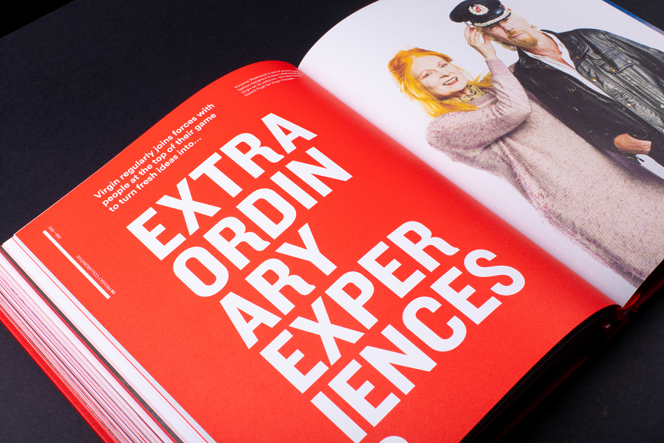
Rather than a chronological retrospective, the book takes readers on an inspiring visual journey through 10 themed chapters, representing the values that have helped Virgin shake up so many different sectors – and will help the brand stay relevant for the next half-century.
Virgin is made by many, and the book captures first-hand perspectives of over 120 of the people responsible for shaping its past, present and future. Fascinating archive photography, striking campaign visuals and playful commissioned illustration bring those stories to life.
The design encourages different levels of engagement with the content, catering to readers who want to flick through for visual inspiration as well as those keen to deep dive into each chapter’s themes.
Varied content formats help achieve pace and variety, from bite-sized captions detailing specific moments, to longer self-contained stories exploring how different Virgin companies have evolved and adapted to make their mark.
Each chapter leads with several spreads of full-bleed images that capture the essence of the theme. Longer reads that dig deeper into each topic are bound-in as smaller inserts, giving readers the option for richer engagement without compromising the overall visual impact. At key points, gatefolds are also used to expand the canvas and do milestone moments justice.
The polished visuals of campaign artwork and branded environments are interspersed with more intimate personal moments – humorous anecdotes are playfully illustrated, while hand-drawn typography on chapter openers and quote pages adds a fluid, human touch that make the book feel accessible as well as inspirational.
It had to speak the language of a high-end design book, but with a playful twist. Virgin's iconic red is one of its most distinctive brand assets. It is used to full effect on the subtly debossed canvas cover, employed throughout the flat plan as a spot-colour accent, edge-painted on the pages and also used for twin marker ribbons.
These ribbons are printed with phrases that capture the brand's unique appeal from two different perspectives: 'Screw it, let's do it!' is Richard Branson's mantra, symbolising Virgin's entrepreneurial drive to explore and experiment; while '50 years of changing business for good' emphasises how the brand's modern-day purpose has been there from the beginning.
The short section of the ribbons dangling beneath the book combine to form a rallying cry for readers keen to apply the insights found inside to their own practice: 'Let's do it! For good'.
Each chapter is colour-coded with a different pastel that complements the core Virgin red. Chapter openers and giant pull-quote spreads introduce simple typographic twists on the theme, from the 'e's in 'Cheeky start-up' peeking over the page edge, to the 'A' in 'Future ready' pointing skywards like a giant rocket.
AWARDS
Graphis Annual 2021 (Silver Award)
The Drum Design Awards (Highly Commended)
MADEIT CREDITS
-

VirginClient
-
Pete RossiDesigner -

Thames & HudsonPublishing Company -

Nick CarsonCopywriter