Nalla Design
London
ABOUT
Working together to reduce suffering.
Overview
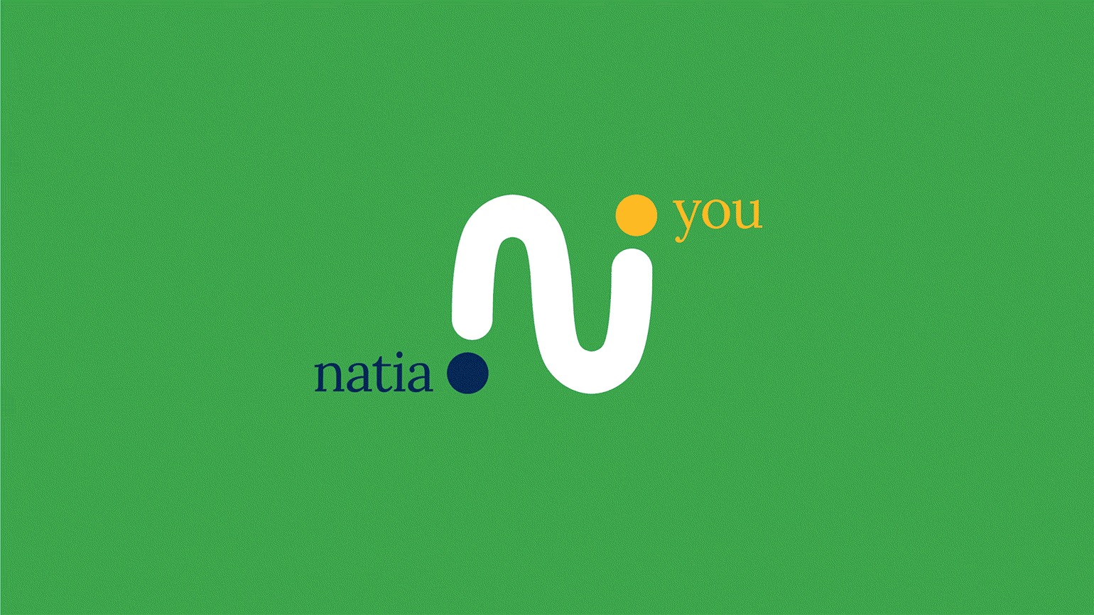
Natia supports people affected by cancer by providing easy access to mind/body techniques, including yoga, meditation, music, and conversation. Their aim is to provide complementary therapies to add to the existing ecosystem of support; the medical profession focuses on eliminating or curing the specific illness whereas Natia focuses on alleviating suffering by enhancing well-being.
Objectives
To differentiate Natia from other wellness apps and ensure the brand feels relevant for a wide-ranging audience.
Solution
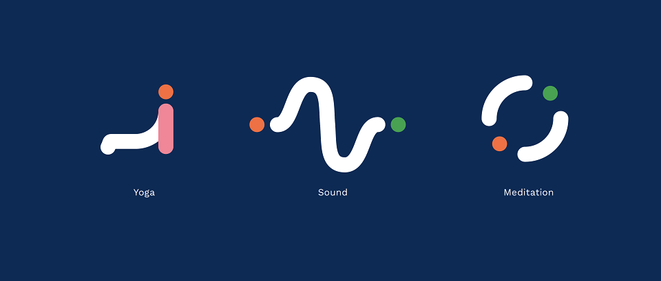
A visual identity system based on the concept of a feeling of connection and an ecosystem of support. Fluid, calming animation was used to bring life to the brand icon and express different mind/body techniques.
Result
Supported by Maggie’s Centres and now collaborating with the Medway NHS Foundation Trust, undertaking a joint feasibility study, with the view to launching a full NHS-run pilot.
We created a brand purpose and positioning which reflected Natia's vision – helping them stand out in a saturated wellness market. Natia provides support to patients, care-givers and medical professionals alike; individually they may feel isolated but collectively they can come together and create an ecosystem of support. It’s this idea of support, coming together and being connected that is reflected in the brand identity.
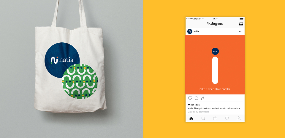
The brand needed to convey compassion and understanding while also maintain a level of trust in order to elevate the brand above the usual wellness crowd. A warming colour palette was chosen to reflect Natia’s compassion and understanding of what their users are experiencing.
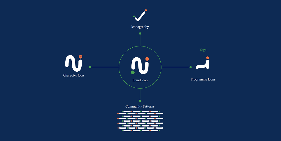
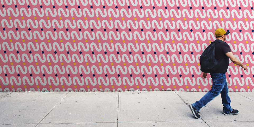
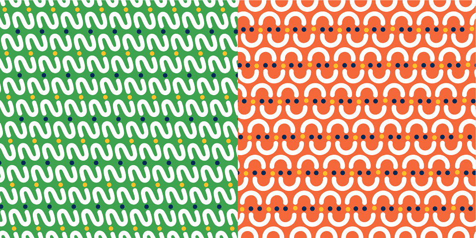
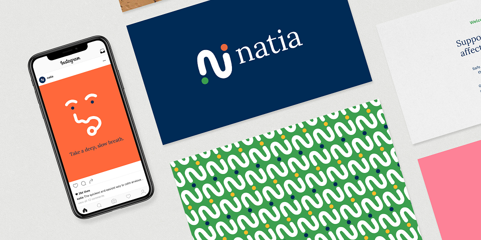
The brand icon is a central part of the brand identity; it symbolises the relationship between cancer and the individual, between Natia and the individual and between the individual and the wider community of support. All the brand assets originate from this icon; from functional iconography through to community driven pattern generation and playful in-app character illustrations.
The brand icon morphs into living and breathing animated characters and shapes to guide the user through Natia’s unique set of programmes. Designed for inclusivity, without a face or defining features, the character is able to connect with any user at any point in their relationship with cancer.
MADEIT CREDITS
-

NatiaClient
-
Katherine StephenAnimator -

Nalla Design -

Bethan ThomasAccount Director -

Kirsty TavendaleDesigner
Annual 2020 BronzeNatia brand identityBranding
Project featured: on 16th September 2020
Contributor:
Invite
x3
Nalla Design has been a Contributor since 25th November 2015.