Mutatio Creative Ltd
Warrington
ABOUT
Capitalize Ltd is a next-generation financial investment platform built around the values of trust, growth, and collaboration. In an era where financial services are rapidly evolving—especially with the emergence of digital assets and tokenisation—Capitalize Ltd recognised the need to distinguish itself through both strategic market positioning and a cohesive, future-facing brand identity. To achieve this, they partnered with Mutatio Creative Ltd, aiming to create a branding and research-led strategy that would not only appeal to their audience but also convey credibility, innovation, and long-term relevance.
The process began with deep market research and competitor analysis. This involved a thorough investigation into emerging trends in the financial sector, shifts in investor behaviour, and an evaluation of leading platforms such as Republic, known for blending equity crowdfunding with digital asset investment. The branding and visual strategy took inspiration from these insights but aimed to offer something fresh and differentiated. Key values such as trust, dependability, innovation, and ease of use were consistently highlighted as priorities across Capitalize’s target audience—ranging from seasoned investors to startup-focused business owners. These insights became the foundation for every creative and strategic decision that followed.
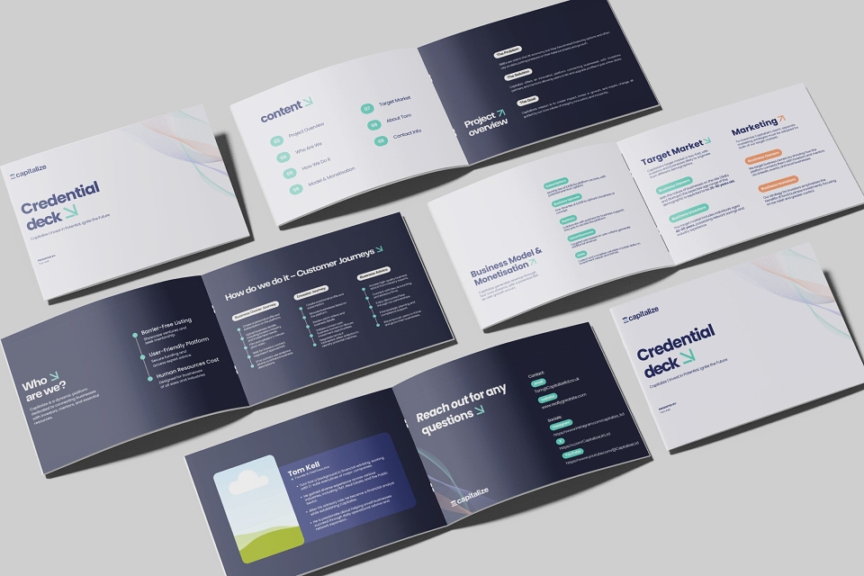
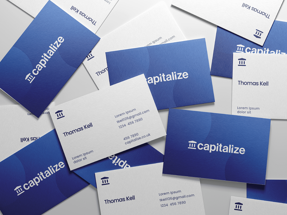
A core part of the execution involved building a visual identity that communicates both stability and modernity. At the heart of this design is the Capitalize logo: a clean, bold structure composed of three stylised pillars. These pillars represent the company’s foundational values—stability, growth, and collaboration—while also serving as visual metaphors for a solid, forward-looking platform. Their rounded edges lend a contemporary feel, suited for both digital applications and mobile interface design, ensuring the brand remains adaptable as it scales.
The branding system was further strengthened by the selection of the Poppins typeface, a modern, geometric sans-serif font known for its clarity and versatility. Poppins offers a clean and professional appearance that enhances readability—a critical consideration in the finance sector where information clarity is paramount. Its varied font weights allowed Capitalize to establish a natural visual hierarchy across their website and communications without needing to introduce secondary fonts, maintaining a seamless and cohesive visual experience across platforms.
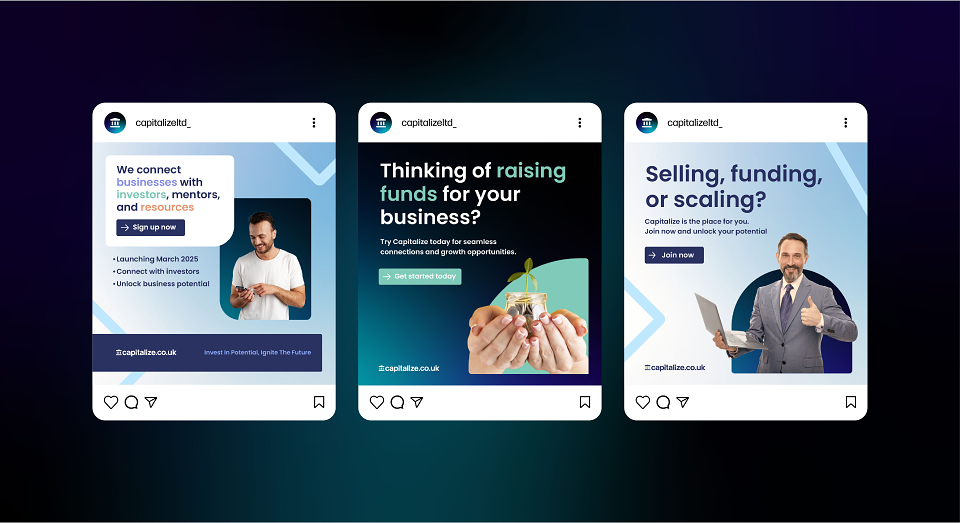
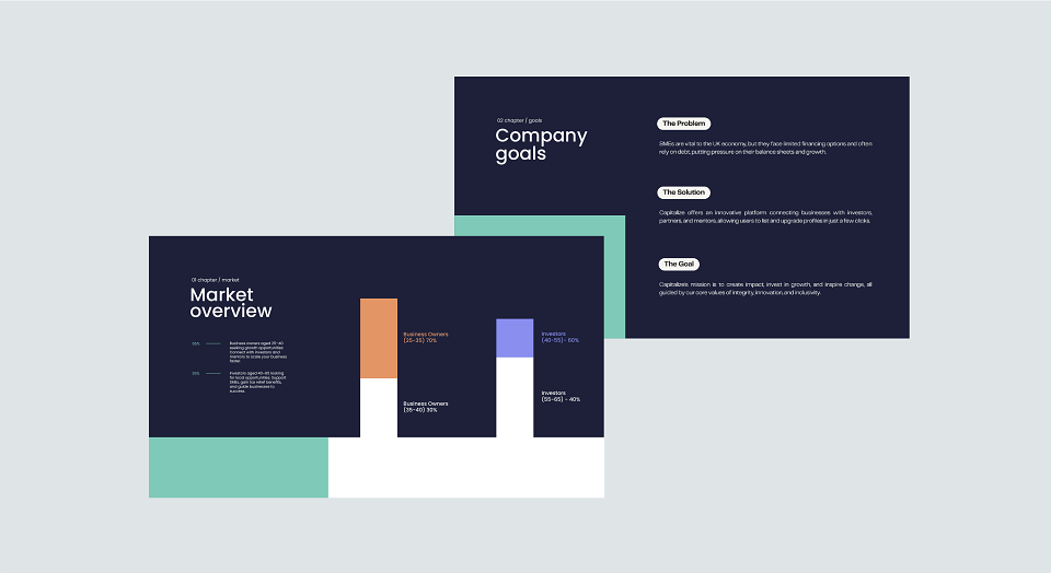
Complementing the typography and logo, the colour palette was meticulously curated to reflect the emotional and psychological attributes aligned with Capitalize Ltd’s values. Deep blue serves as the dominant colour, symbolising trust, professionalism, and stability—ideal for a financial brand seeking to establish confidence among clients and investors. This is balanced by vibrant teal, which brings a sense of freshness, balance, and modernity, making the brand feel energetic and accessible. Soft purple introduces a touch of sophistication and creativity, suggesting forward-thinking and innovative approaches. Finally, warm orange functions as a strategic accent, exuding optimism, enthusiasm, and progress—perfect for calls to action and highlighting essential brand moments. These colours, when used together, create a rich yet approachable brand profile that appeals to both traditional and future-focused investors.
Every design choice, from layout to palette, was made to shift Capitalize away from the sterile, impersonal aesthetic typical of legacy finance brands. Instead, the identity feels open, fresh, and human—conveying both authority and approachability. The result is a modern yet timeless visual language that can function across all touchpoints, from web and print to mobile and app environments. Importantly, the branding strategy was not just about aesthetics—it was a deliberate move to position Capitalize Ltd as a trustworthy, forward-thinking player in the financial space. The brand exudes clarity, structure, and professionalism while ensuring even complex financial concepts are digestible and engaging.
The end result of this collaboration is a powerful, unified brand identity that has firmly positioned Capitalize Ltd at the forefront of the modern financial services sector. They now possess not only a distinctive and future-proof look but a brand system built to grow with them—one that resonates deeply with their core audience. With a clear understanding of their market, an agile strategic foundation, and a compelling visual identity, Capitalize Ltd is equipped to build long-term trust, forge strong partnerships, and remain competitive in an ever-evolving financial landscape.