Marie O'Shepherd
Art Director | Book Designer
ABOUT
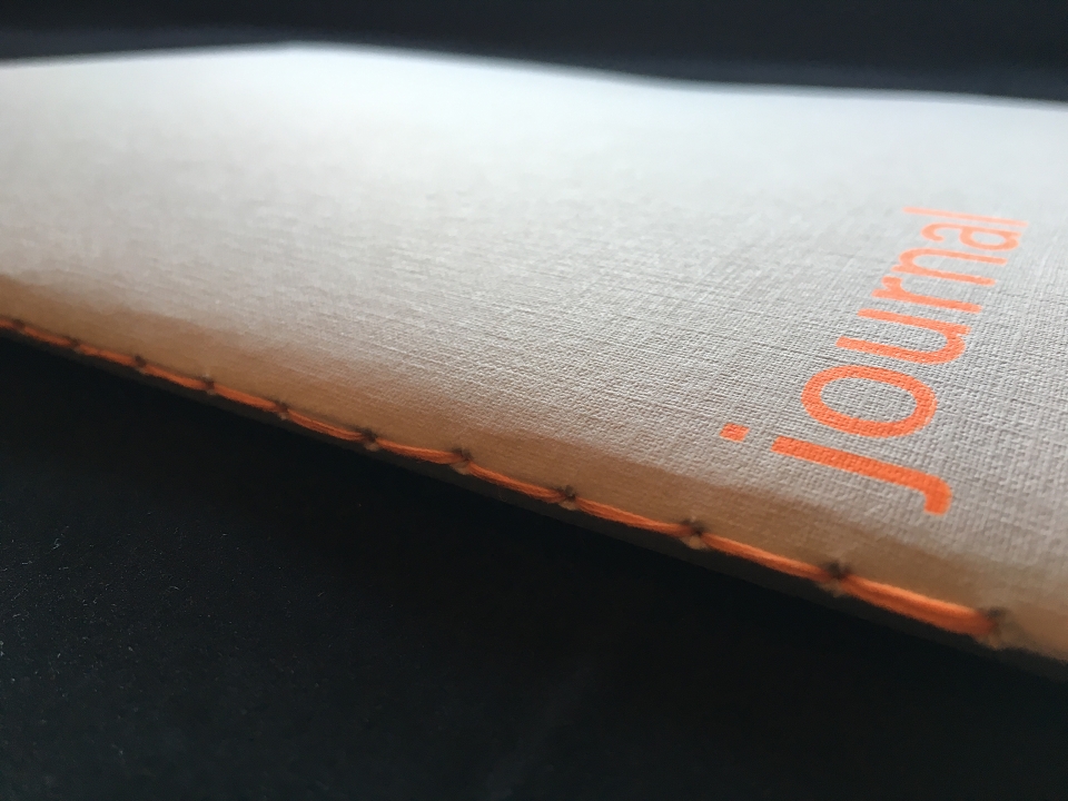
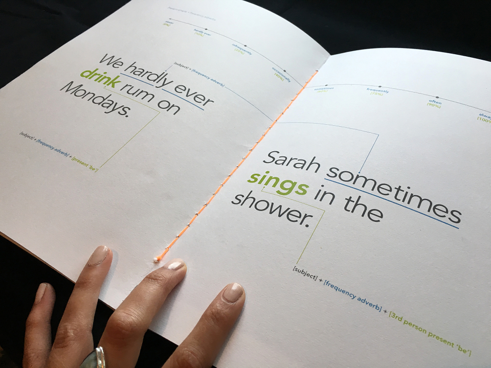
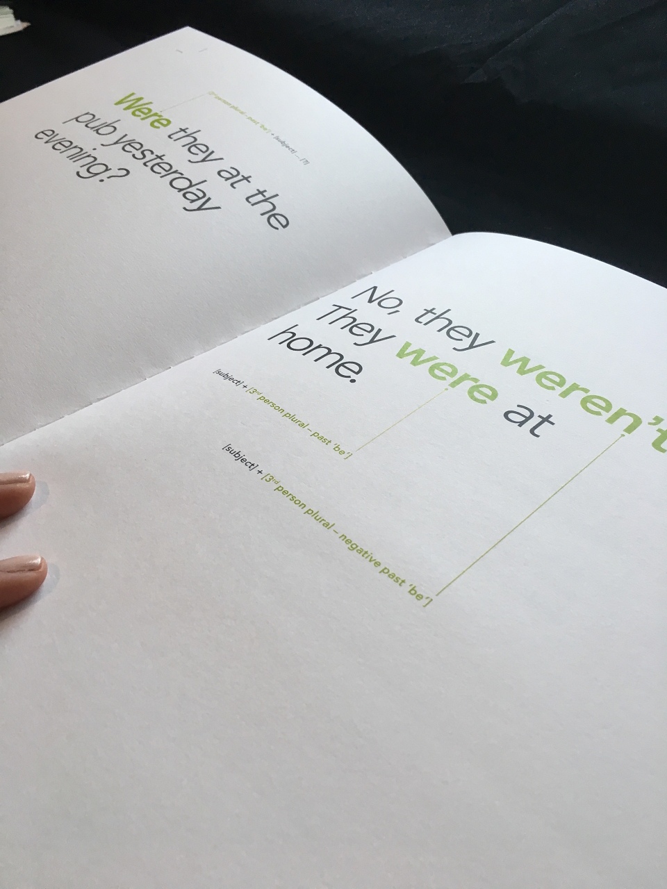
This piece is my exploration of bringing visual communication in to the field of textbook design for language students.
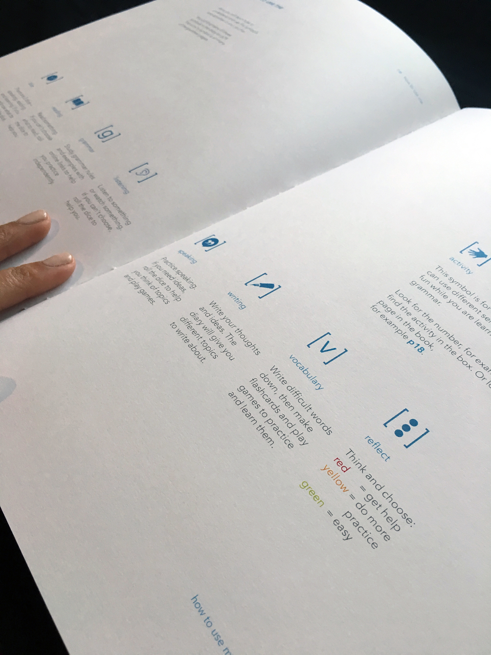
I used bright neon orange (produced in letterpress) in order to stimulate and engage learners, whilst including relaxing greys, blues and greens to put the learner at ease and not get overwhelmed. This is particularly important as I designed this book for adult elementary-level learners who can often feel disillusioned with learning a language in adulthood.
It is part grammar reference book, part diary for independent guidance, and part interactive card games.
MADEIT CREDITS
-

Marie O'ShepherdGraphic Designer