Steve Millard
Designer
ABOUT
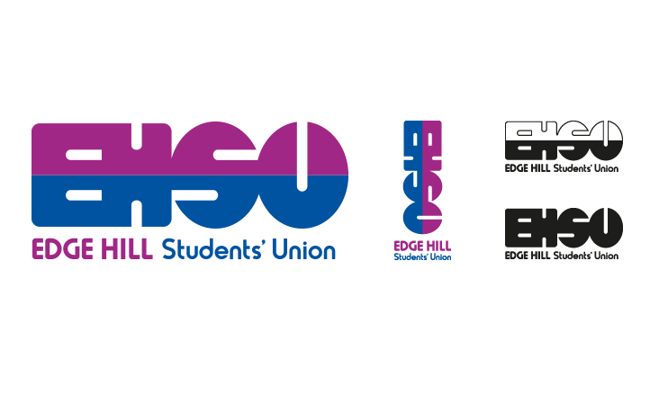
Dissatisfied with their hastily designed logo, Edge Hill’s Students’ Union approached us to design a new identity which would give them a professional yet student-friendly image. During initial discussions the dual nature of the organisation’s role soon became clear, highlighting the need to engage with its students but also to act as their representatives to the university and other stakeholders. To illustrate this balance we came up with a logo which contrasts a straight edged EH with a more rounded SU, reinforced with a two tone colour scheme but which retains the unity of the EHSU by splitting it horizontally.
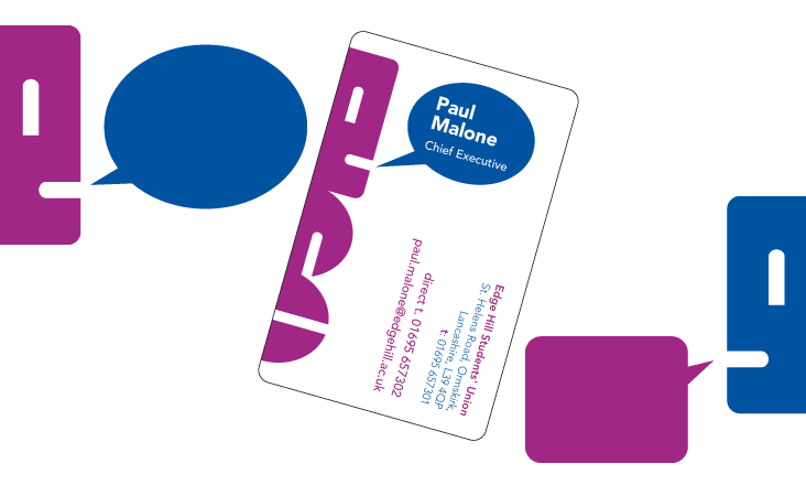
The horizontal split also gives the logo an extra dual facing personality by creating two opposite face profiles, lending a sense of fun to the logo and giving the opportunity for the identity to literally speak for itself with the addition of speech bubbles!
The logo also comes in vertical and monotone flavours for added versatility.