Mike Somin | Elephant Elements
Art Director & Brand Designer
ABOUT
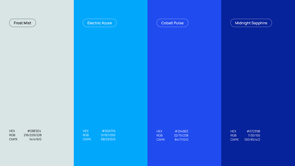
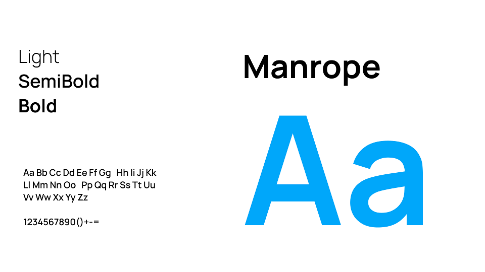
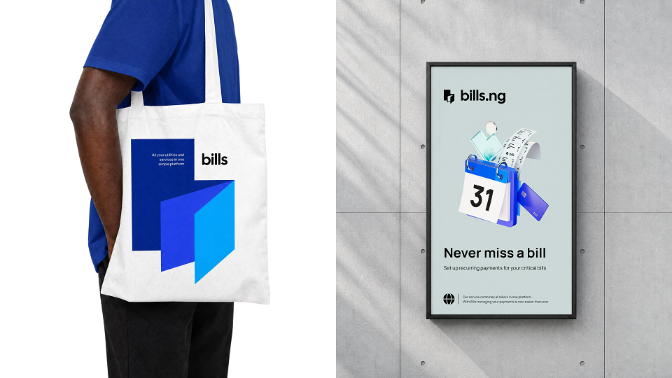
The Bills identity is built on a bold blue palette moving from deep navy through vivid azure, creating a confident, tech-forward tone. The mark is based on a stylized lowercase "b" formed from an angled, layered shape — a subtle nod to a stack of bills or receipts folded together, reinforcing the idea of consolidating multiple payments into one simple form. Manrope typeface with clean geometric letterforms supports the sense of clarity and efficiency central to the brand.
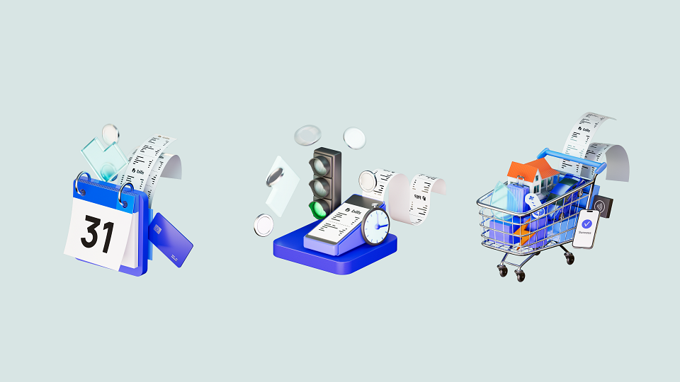
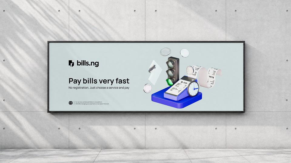
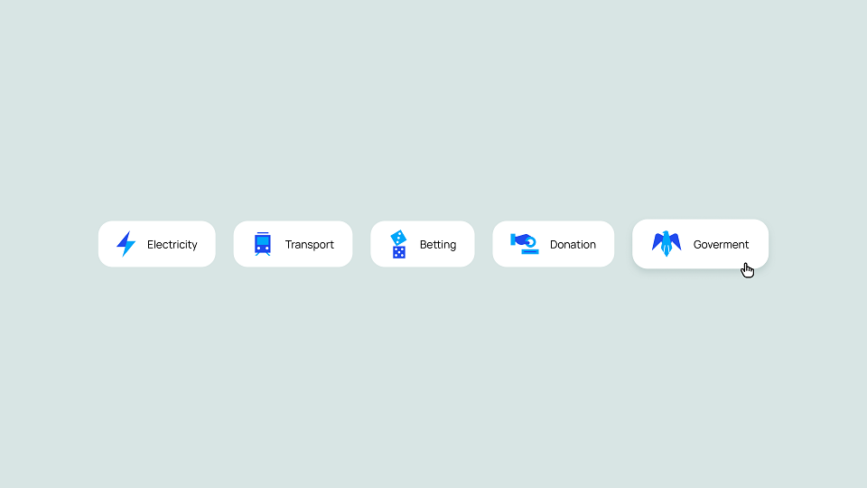
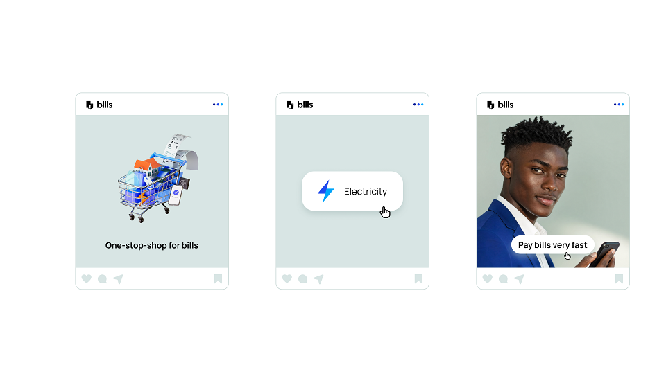
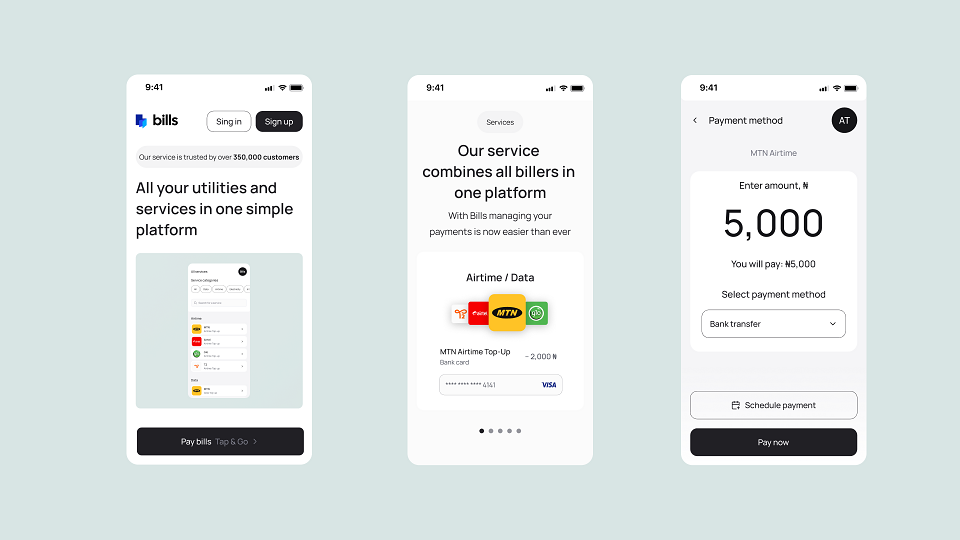
The identity system was developed comprehensively across a unique custom iconography set for service categories, 3D illustrations that give the product a tangible, approachable feel, photo imagery featuring diverse people using the app in everyday moments, outdoor advertising applications, the mobile app interface itself, and branded corporate merchandise. Together, these elements create a cohesive, recognizable system that positions Bills as a fast, trustworthy, all-in-one platform for managing everyday payments.
All rights belong to Fourcorp Advisory FZCO, all materials are the property of Fourcorp Advisory FZCO.