MIchelle Clark
Freelance Graphic Designer
ABOUT
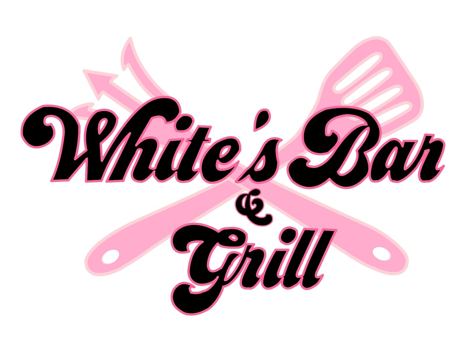
My client wanted a logo that represented her youthfulness being and a new, bold female in the field of cookery on the Barbadian street food scene. They appreciated the hint of softness as shown in the choice of typeface with smooth, curvy edges, yet a bold, thick and line which depicts their courage and bravery. Their choice of the colour baby pink breathes youthfulness, and freshness.
One of the cooking utensils is designed as a trident as it prongs, which pays homage to their country, Barbados whose flag bears a broken trident as well.
MADEIT CREDITS
-

MIchelle ClarkFreelance Graphic Designer