Mayara Monteiro
Graphic Designer
ABOUT
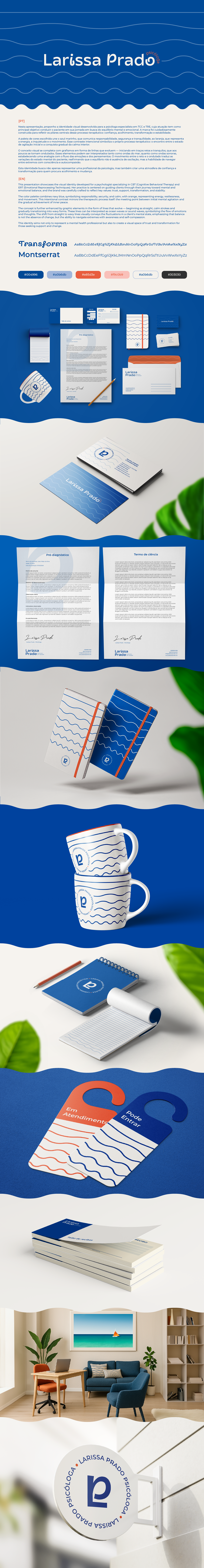
Visual identity developed for a psychologist specializing in CBT (Cognitive Behavioral Therapy) and ERT (Emotional Reprocessing Techniques). Her practice is centered on guiding clients through their journey toward mental and emotional balance, and the brand was carefully crafted to reflect key values: trust, support, transformation, and stability.
The color palette combines navy blue, symbolizing responsibility, security, and calm, with orange, representing energy, restlessness, and movement. This intentional contrast mirrors the therapeutic process itself: the meeting point between initial mental agitation and the gradual achievement of inner peace.
The concept is further enhanced by graphic elements in the form of lines that evolve — beginning as straight, calm strokes and gradually transitioning into wavy forms. These lines can be interpreted as ocean waves or sound waves, symbolizing the flow of emotions and thoughts. The shift from straight to wavy lines visually conveys the fluctuations in a client’s mental state, emphasizing that balance is not the absence of change, but the ability to navigate extremes with awareness and self-compassion.
This identity aims not only to represent a mental health professional but also to create a visual space of trust and transformation for those seeking support and change.