Mauricio Munoz
Design Director/Art Director
ABOUT
For the millions living with Primary Immunodeficiency, the daily reality is invisible to most. PID is a rare inherited condition in which the immune system fails to function properly — frequently misunderstood, misdiagnosed and isolating for those who live with it.
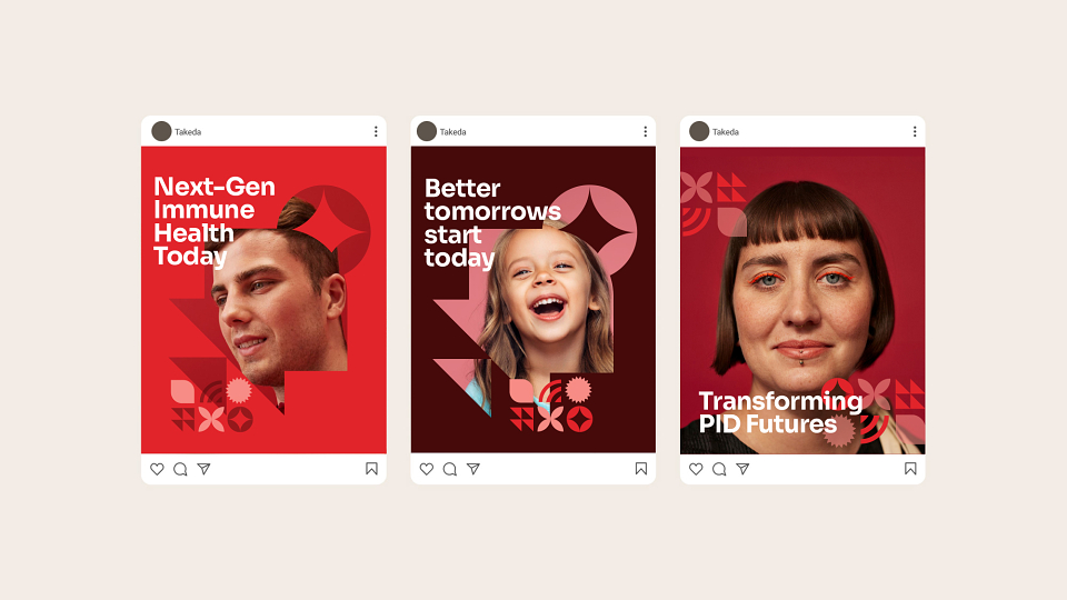
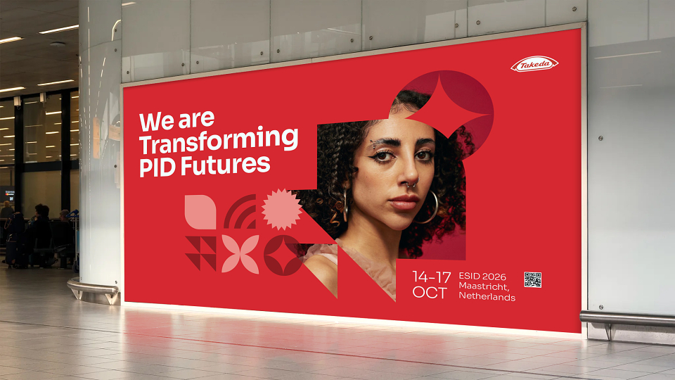
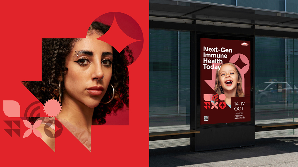
Takeda's ambition was to create a patient-centric brand platform that could do two things at once: humanise the lived experience of PID, while confidently communicating groundbreaking innovations — from AI-assisted genetic diagnosis to quality-of-life apps.
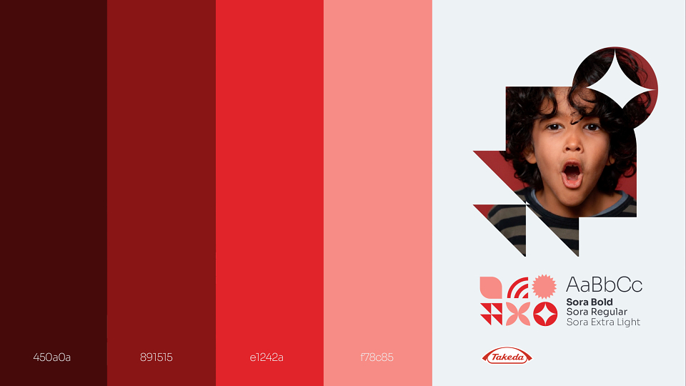
The visual language holds both truths. Real patients sit at the heart of every composition, intersected by a bold geometric system that signals precision and scientific progress. Warm reds and deep burgundies, drawn from the Takeda colour palette, bring energy and optimism without clinical detachment — a brand that speaks to patients, caregivers and clinicians alike: Better tomorrows start today.