Matt J Gluszek
Lead Product Designer
ABOUT
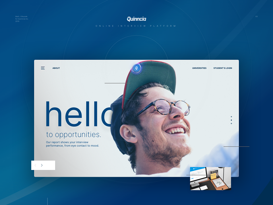
A complete re-design, both UX and UI of Quinncia Interview Platform. I began with branding - slight refinements to consolidate everything under the logotype, rather than a symbol. Also improved the kerning.
Typography creates a layer of information over a text, giving it a feeling and purpose beyond the meaning of the words themselves. I simplified typography to only three weights in one Google font - Lato.
Alongside the UX and UI redesign of the platform, I decided to build up a design system that will help maintain consistency and repeatability of the elements like Typography, Colours, Forms, Icons and Buttons. I used Abstract App to arise and maintain the library with all the Sketch files in it.
I have to admit this was one of the biggest UX challenges in my career so far. The complexity of the app and its features was overwhelming when I started working on it.
I started the UX process from Personas and Experience mapping to understand the users and the best way to we should communicate with them. Journey mapping was next, which helped a lot in learning the big frustrations and concluded the main UX mistakes.
Finally, the ideation brainstorming helped to recognise users' key issues and answer them with ideas and actions. Then it was just a matter of sketching and wireframing. Prototypes were also in scope.
I have always been UI orientated hence attention to detail is my device... this project was no different!
I’ve redesigned the entire navigation, structure, dashboard, resume and interview features. All of the panels, charts, graphs and doughnuts were specifically designed for this app.
I've incorporated 3 level scoring method - gold, silver and bronze for the students Resume and Interview analysis to motivate them. The goal is to iterate on their resume and record better interviews to achieve gold.