Matt Bagnall
Creative Director
ABOUT
In print design, wayfinding is the invisible hand that guides the reader. It's how you help someone move through pages without ever having to ask, "Where am I?" or "What should I read next?". Done well, it makes even the most complex documents feel effortless. Done poorly, and you lose your reader before they’ve even started. But Matt, why does it matter? (I hear you say) Because great print design isn’t just about looking good, it’s about feeling easy to use. Wayfinding turns a beautiful publication into a readable one.
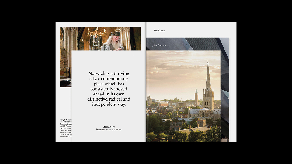
The example shown is the award winning prospectus for Norwich University of the Arts that I designed back in 2016. We used 'tip-ins' (pages of varying sizes bound together) to create 'flick-ability' within the publication, allowing a moment of pause, reflection and choice — a tactile version of digital UX.
Wayfinding in print isn’t just arrows and labels. It’s about building a journey.