Marta Wasilewska
Graphic Designer
ABOUT
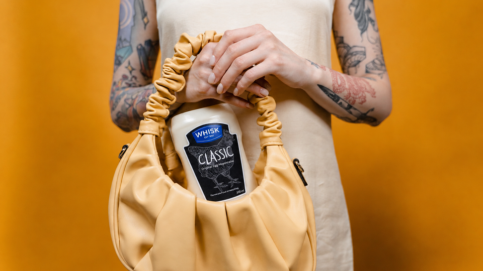
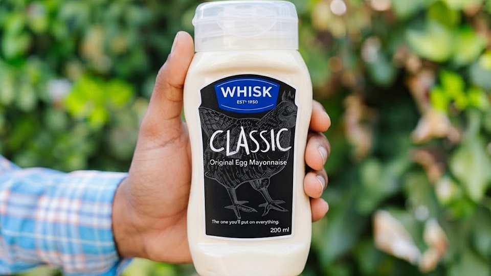
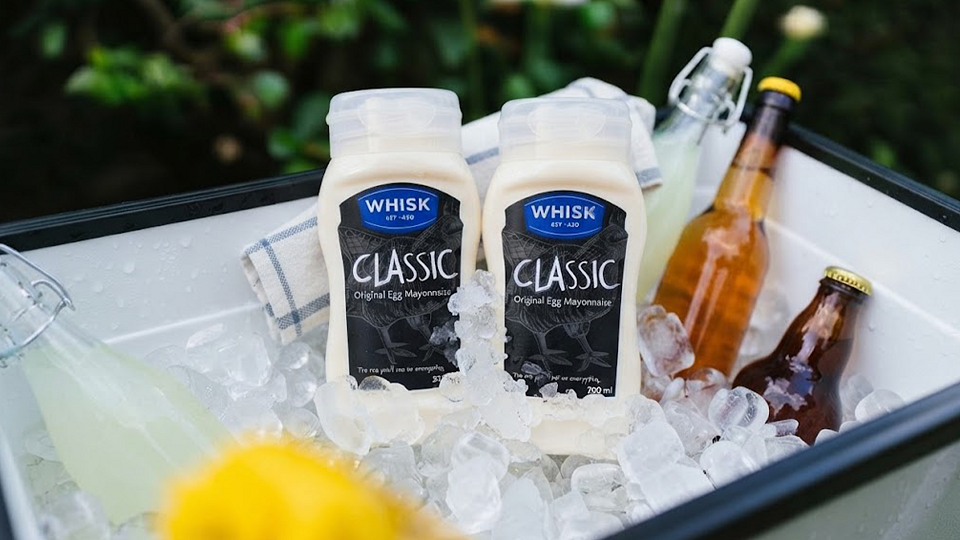
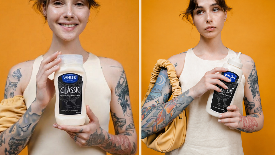
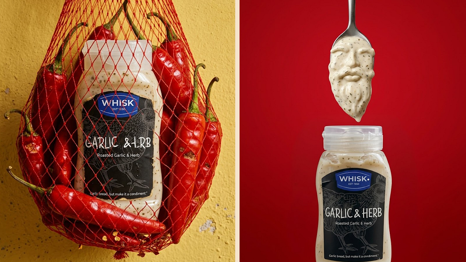
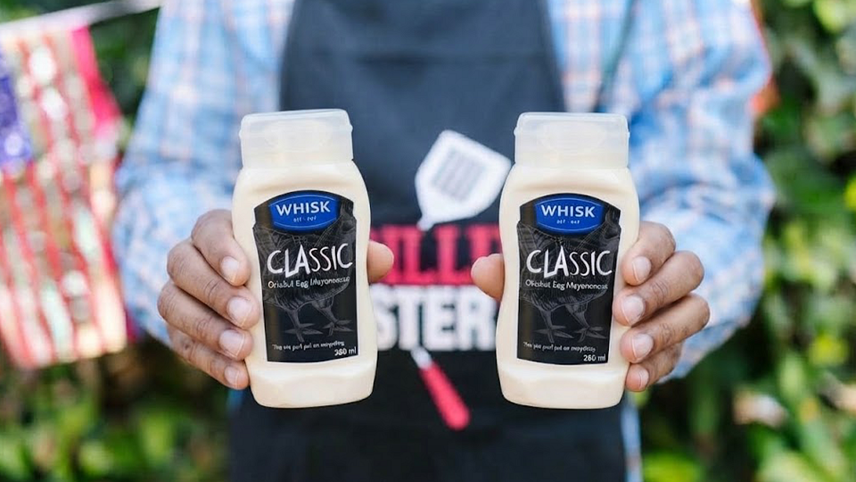
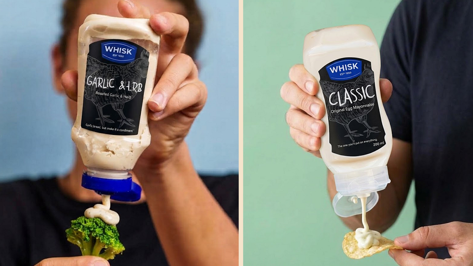
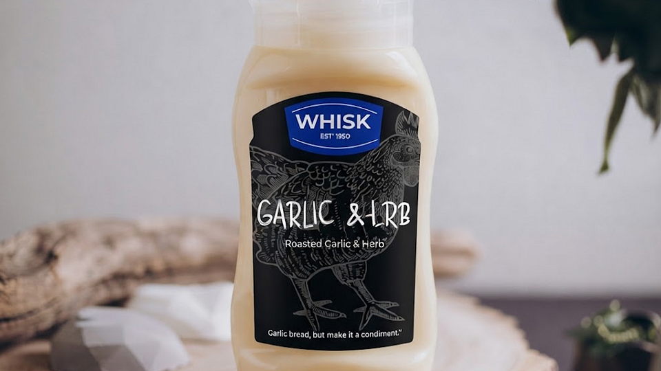
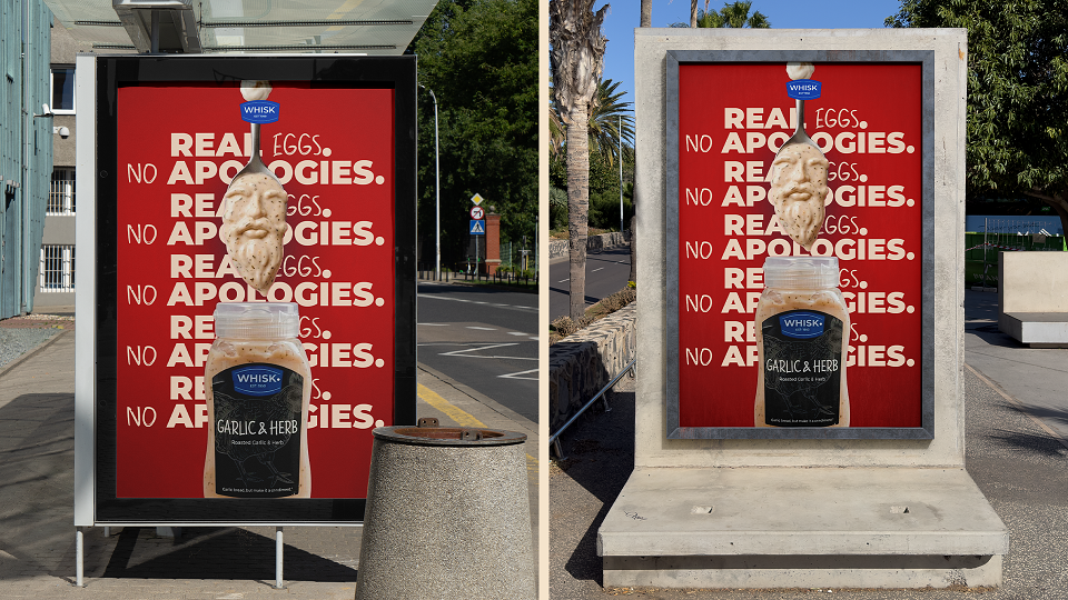
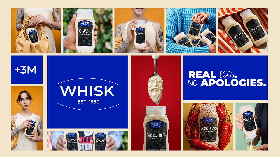
WHISK is a complete brand identity and packaging system for an artisan mayonnaise brand, built on one idea: even the most overlooked item in the fridge deserves a brand that takes it seriously. Where most mayonnaise is treated as an afterthought, a squeeze bottle with a label designed to disappear into the shelf, WHISK treats it as a product with character: real eggs, short ingredient lists, and a glass jar that lets the product speak for itself.
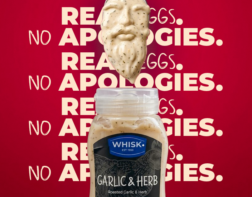
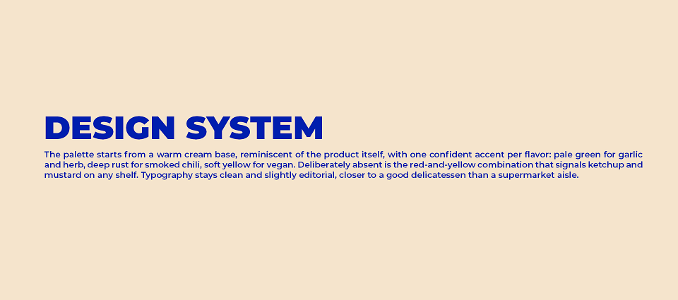
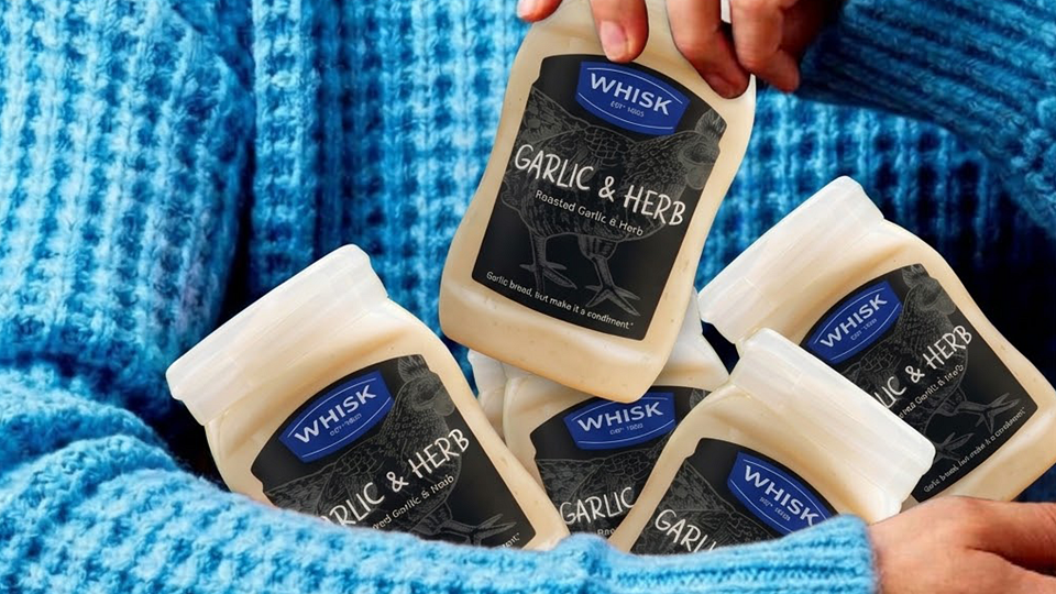
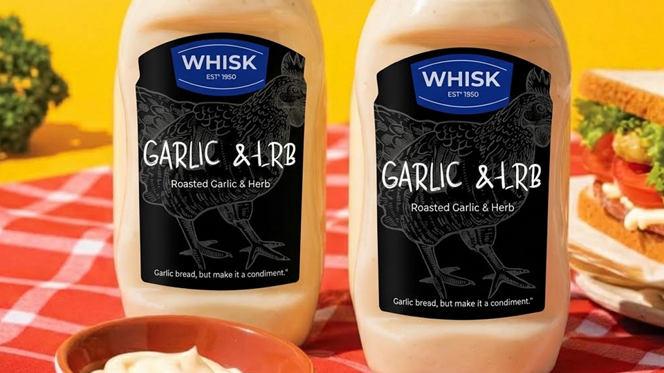
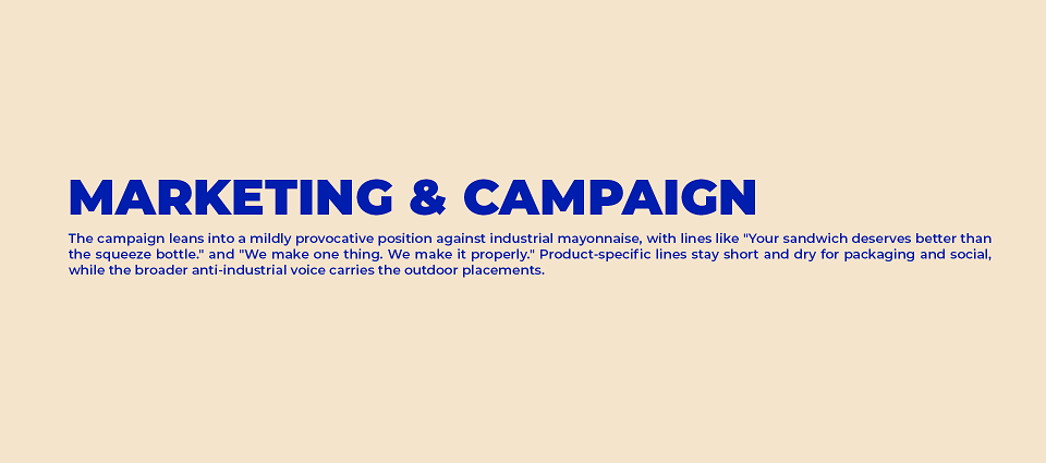
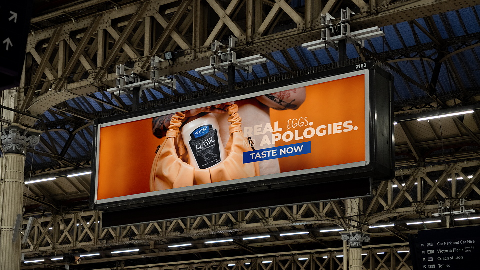
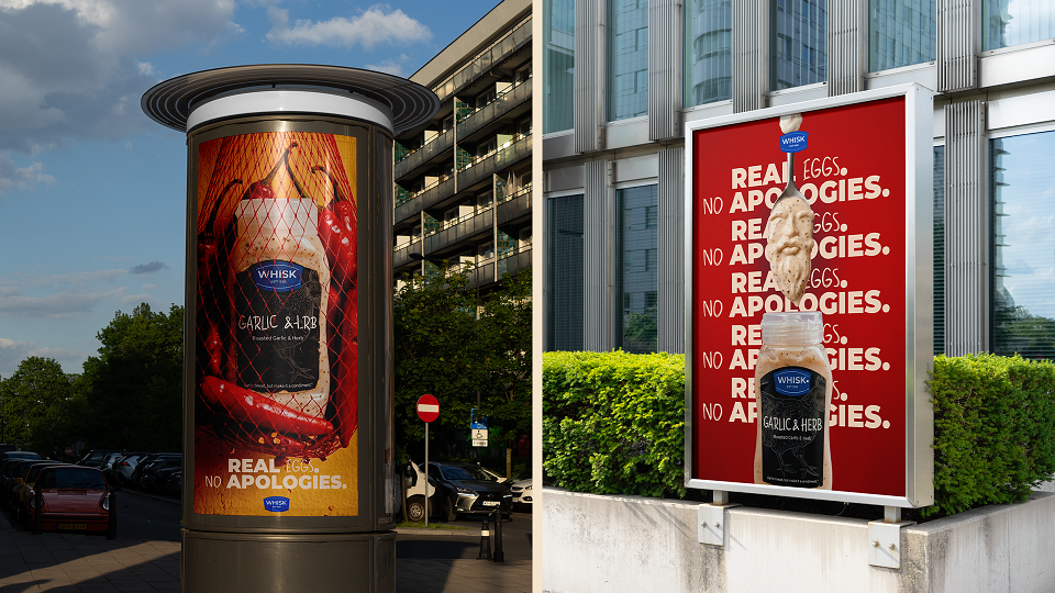
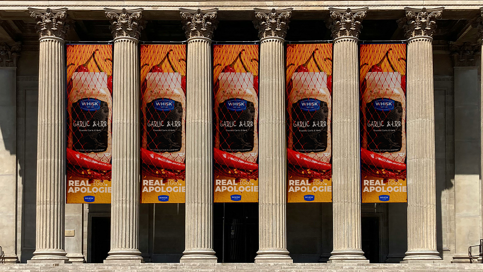
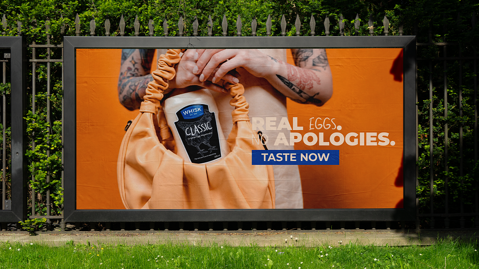
This case study covers the full identity: logo and visual system, a four-flavor jar line told apart by one accent color per variety against a shared cream base, shipping packaging, and a campaign built on dry, confident copy that takes a quiet stand against industrial mayonnaise.
Role: Brand Identity & Packaging Design (end-to-end)
Scope: Logo & visual system, packaging, campaign design
MADEIT CREDITS
-

Marta WasilewskaGraphic Designer