Marta Wasilewska
Graphic Designer
ABOUT
Ketchup has looked the same for decades.
POMORA was designed to make the category look again.
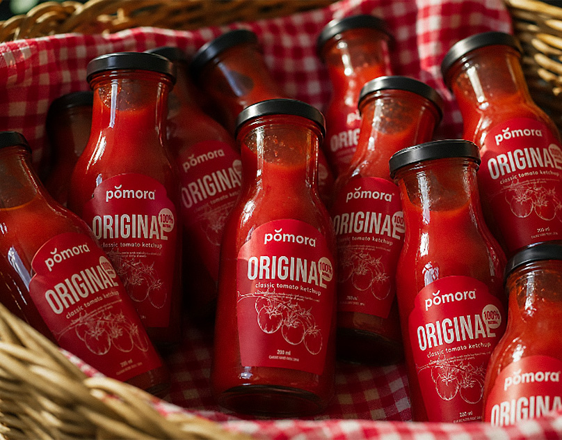
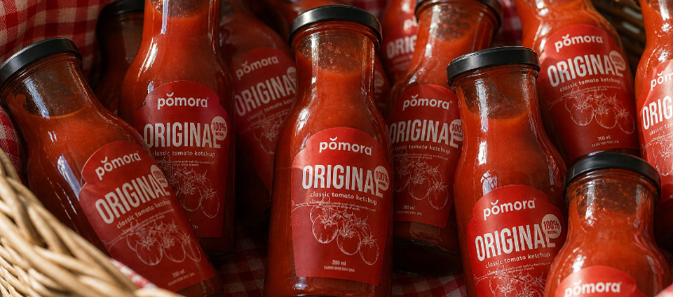
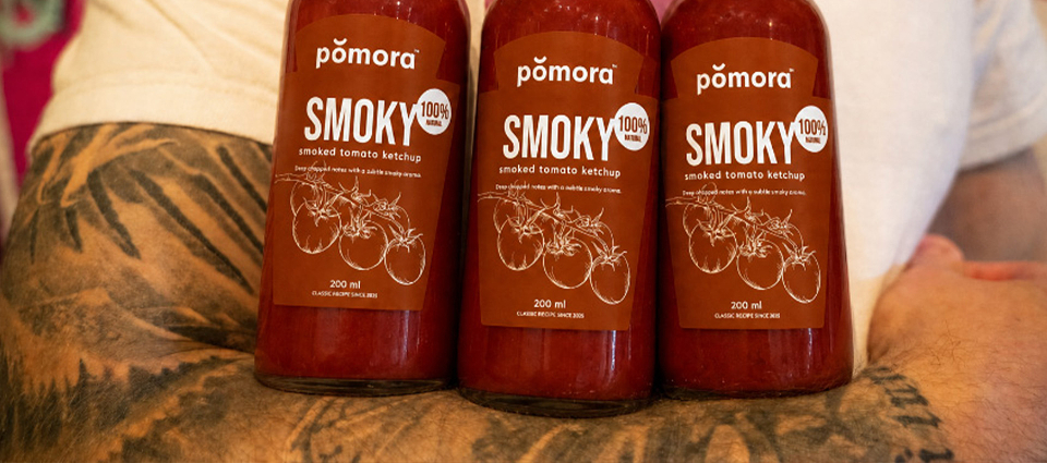
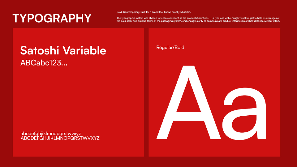
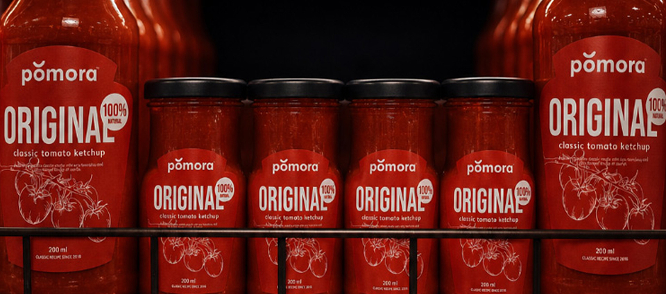
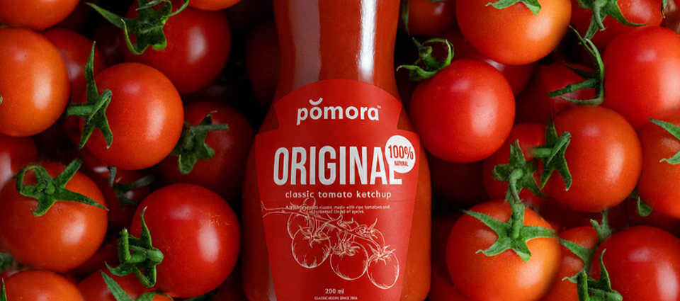
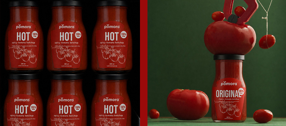
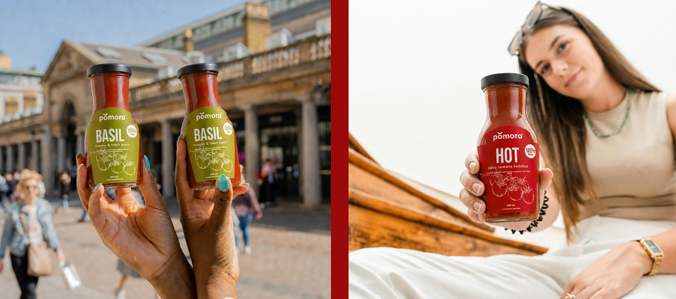
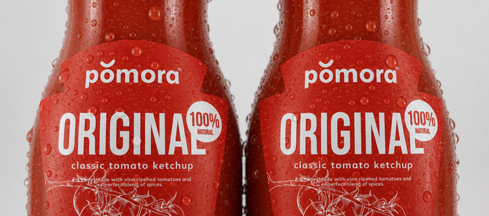
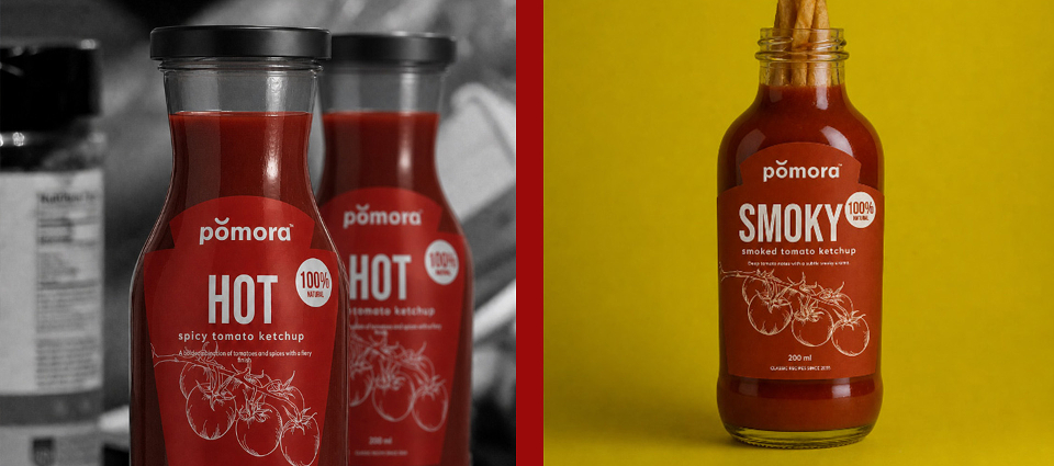
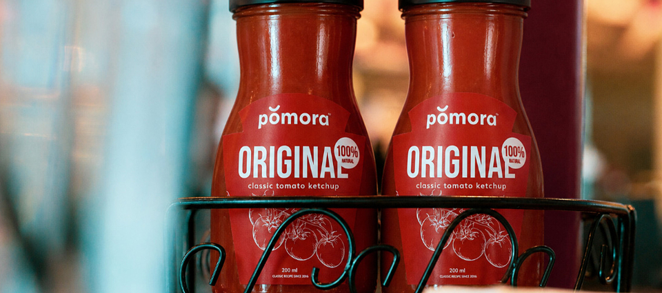
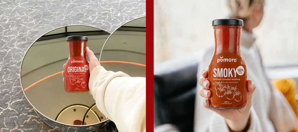
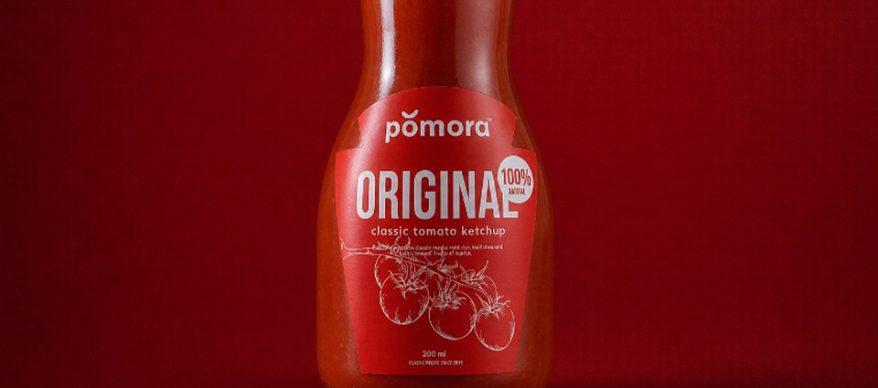
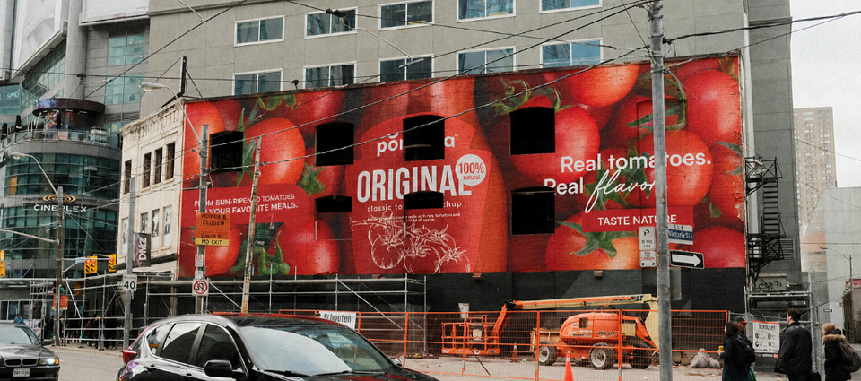
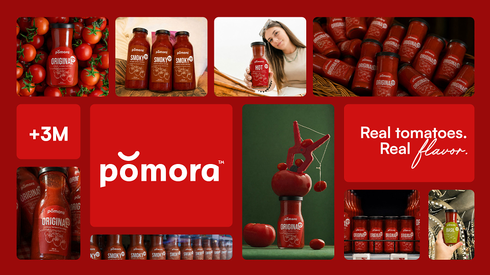
A complete brand identity and packaging system for a contemporary ketchup brand — built around one conviction: that a classic product with genuine quality deserves visual language that communicates that quality before the bottle is opened.
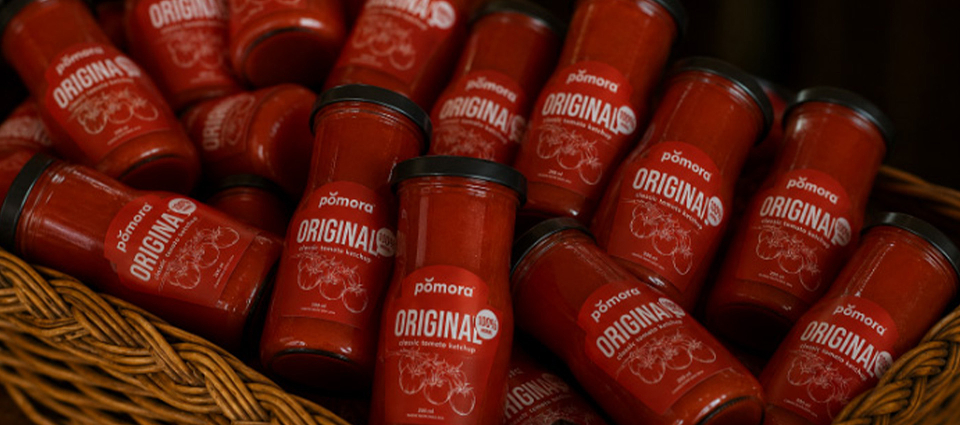
Bold red palette. Organic tomato-inspired graphic forms. A packaging system that stops someone on a shelf full of familiar bottles and makes them reach for something different.
The tomato deserved better packaging. Finally.
MADEIT CREDITS
-

Marta WasilewskaGraphic Designer